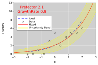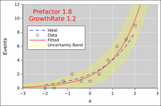
Figure 1: Exponential Fitted to Noisy Data, a=2
When an exponential process is producing on a few events, it requires a bit of skill to model the process. The methods discussed here are quite general. They could apply to radioactive decay, or to the growth of yeast in bread or beer, or to the spread of disease in some local area.
Figure 1 shows an exponential fitted to some data. You can see that there is noise in the data. Also, the fitted function (red line) does not exactly agree with the idea (dashed blue line). To understand what’s going on, lets discuss where the data came from.
We use a Poisson process to account for the fact that we always have an integer number of events. We can’t have a fractional number of radioactive decays, or a fractional number of deaths due to a disease. For example, at x=−2, the Poisson rate is 0.5, so we would expect to see 0 events sometimes, and 1 event sometimes, and rarely more than that. At x=2, the Poisson rate is 8, so we would expect to see about 8 events, plus or minus a few.
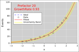
Here is another run of the same process, with all the same conditions, just another random sample from the Poisson process. You can see that the fitted parameters are different from the previous example, and also from the ideal. In section 2 we shall see that most of the differences are due to randomness (as opposed to systematic bias).
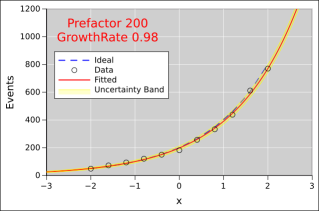
Here’s the same idea again, but with higher numbers of events at each x-value. The statistics are better, so the fitted function does a better job of approximating the ideal.
Here’s the same idea again, but with even higher numbers of events at each x-value.
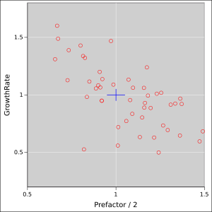
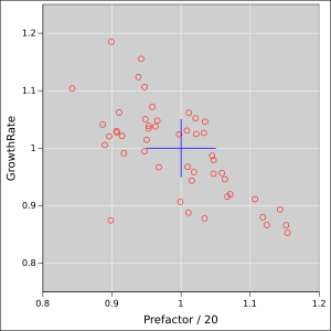
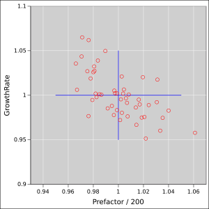
At this point we have to wonder to what degree the plots in section 1 are typical. So we collect some statistics. We create an ensemble of 50 fits. Each element of the ensemble corresponds to a plot of the kind shown in section 1; that is, it involves fitting to an 11-point data set.
Figure 5 shows the fitted parameters, as a scatter plot. The ideal values are at the center of the blue cross. The arms of the cross represent 5% uncertainty in each parameter.
You can see that the Poisson noise in the data creates a tremendous amount of uncertainty in the fitted values.
You can also see that there is a nontrivial amount of correlation. If the estimated growth-rate is too small, the fitting procedure can partially make up for it by increasing the prefactor, and vice versa.
The fits discussed here were performed using weighted nonlinear least squares fitting.
You cannot get away using an unweighted fit. That would introduce huge amounts of bias. That’s because the uncertainty band is a lot smaller near x=−2 than it is near x=2. The uncertainty band is shown – approximately – in the diagrams.
This is an approximation because it assumes the peak of the Poisson distribution looks like the peak of a Gaussian. This is a bad assumption when the number of events is small. It would be possible to calculate the exact uncertainty band, but that is more work than I feel like doing at the moment.Furthermore, the whole idea of least squares fitting is fundamentally unsound when the peak is not Gaussian. The thing we are minimizing is the log probability. For a Gaussian that scales like Δx squared, but for anything else it doesn’t.
These two phenomena introduce some amount of systematic bias into our model.
As is often the case, the size of the uncertainty band comes from the model, not from the data. The data points in figure 1 do not have error bars, nor should they. Any error bar you could assign to the points would be wrong. This is obvious for the points where the ordinate is zero. It is less obvious but no less true for the other points. The model is nonzero everywhere, and the model tells us what the uncertainties (and the weights) should be.
As you can see by comparing figure 1 with figure 2, the undertainty band attaches to the fitted curve (not to the ideal). It has to be this way, because the fitting process knows nothing of the ideal. Since the uncertainties (aka weights) are needed for the fit, and also depend on the results of the fit, this requires iterating until things settle down.
Another thing you cannot get away with in situations like this is taking the logarithm of the ordinate and fitting a straight line to it using linear regression. You can appreciated this by looking at figure 1: Some of the data points are zero. If you take the logarithm of that, you get minus infinity. You cannot fit to such points using a straight line. And you cannot afford to ignore these points. So skip the logarithm and skip the linear regression, and use the industrial-strength nonlinear fit.
If you have a huge number of events at each x-value, you might try the trick of fitting a straight line on semi-log paper, but even then you risk introducing bias into the results.
By way of analogy, consider a simple three-beam balance. It is reasonably robust and reliable, but even so, it needs to be calibrated every so often. This is done by loading it with known masses, then debugging it and adjusting it until it reads correctly.
By the same token, it is important to debug and calibrate curve-fit routines. There are a lot of things that can go wrong. It is hard to predict how accurate the fitted parameters will be, especially when there are correlations and/or when there is some systematic discrepancy between the model and reality, e.g. when using a polynomial to approximate a sine wave or other transcendental function – or, as in our case, approximating a Poisson distribution with a Gaussian.
This explains why we went to the trouble of fitting to artificial data, where we knew the right answer a priori. It must be emphasized that the right answer was not used during the fitting process; it was only used (a) beforehand, to generate the noisy data, and (b) afterwards, to evaluate the results of the fit.
To say the same thing the other way, it is generally a bad idea to use real data to calibrate the curve-fit procedures, especially in a research situation where you don’t entirely know what the data is supposed do look like. Even if you have already taken the data and even analyzed it, set all that aside for a moment and calibrate the analysis procedure by feeding it Monte Carlo data. That’s sometimes the only way to detect bugs in the analysis.
We call this “closing the loop” because it goes parameters → synthesis → data → analysis → parameters.