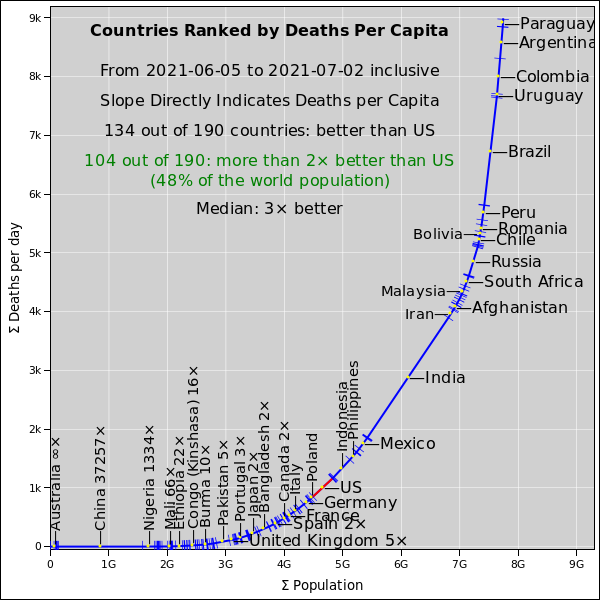
Figure 1: Recent Death Toll, Country by Country
We are not on track to achieve herd immunity any time soon. Too many children, and too many idiots.
It would be nice to have policies based on reliable data, but we don’t have the data we need. For policy purposes, it is almost useless to talk about the US as a whole, or even a state or a single county as a whole. There are a whole bunch of different communities with wildly different vaccination rates. The virus will continue to spread in the unvaccinated communities. Many of the people who refuse vaccinations also refuse masks and other basic public health measures.
The virus will continue to mutate.
Here’s a graph that lets you see, at a glance, how the US compares to other countries, in terms of coronavirus deaths per capita during the last 4 weeks.
Other jurisdictions are under-reporting also, but probably not quite to the same extent.
The axes on the plot are cumulative population and cumulative deaths, so the slope directly indicates deaths per capita. For more about the provenance and interpretation of this data, see section 8. Also see the caveats in section 7.
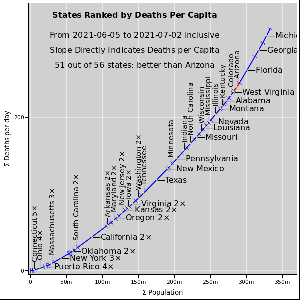
Here’s a graph that lets you see, at a glance, how the various states compare to each other, in terms of coronavirus deaths per capita during the last 4 weeks.
Arizona is significantly worse than the US average.
For more about the provenance and interpretation of this data, see section 8. Also see the caveats in section 7.
It is likely that Arizona’s ranking (as seen in figure 2) will soon get even worse, because the states that are worse than Arizona are improving, while Arizona is not. On the other hand, Colorado is bad and getting worse, and could well overtake Arizona.
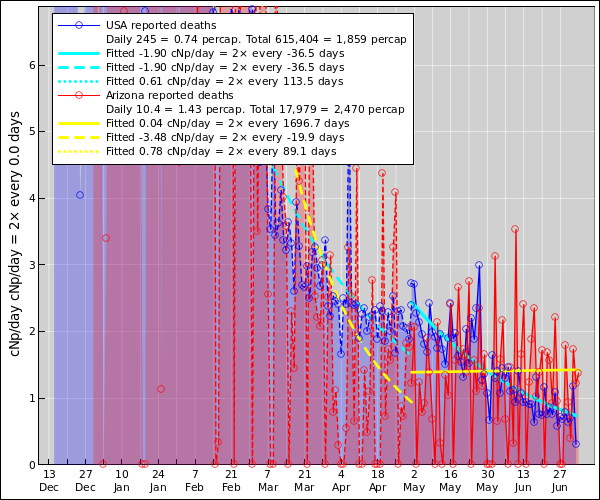
Arizona is already significantly worse than the US average. This is sad, because just a few weeks ago it was significantly better. Arizona has stayed about the same (or gotten slightly worse), while the US overall has improved, as you can see in figure 3.
For more about the provenance and interpretation of this data, see section 8. Also see the caveats in section 7.
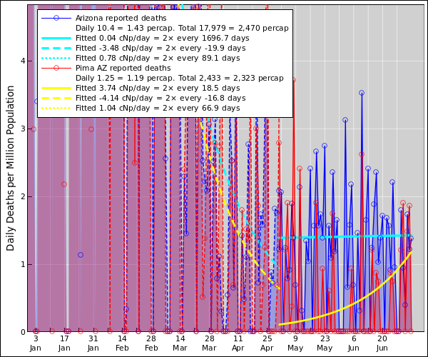
Pima County is getting rapidly worse. This is sad, because a few weeks ago the county death rate was very much smaller than the statewide average; indeed it was nearly zero. Very soon it will catch up to the statewide average.
I don’t know how to explain this. I don’t think there are any major policy issues here. That is, I assume the previous low numbers were just a fluke, and regression to the mean is to be expected.
In more detail: Pima and Maricopa are sufficiently similar, demographics-wise and policy-wise, that I would not expect any major systematic differences in the death rate. The main difference is that Pima has only 1/4th as much population, which means that random fluctuations (upward and downward) will be more frequent and more noticeable, i.e. a larger percentage of the average.
For more about the provenance and interpretation of this data, see section 8. Also see the caveats in section 7.
It helps to frame the discussion in terms of the reproduction number R. If R is greater than 1, things get worse exponentially. Conversely, if R is less than 1, things get better exponentially. Actually you want R to be quite a bit less than 1, because if it’s only slightly less then 1, any improvement is excruciatingly slow.
Many policy elements contribute:
All these helpful contributions add up.
Conversely, framing the discussion in terms of 100% this-or-that is unhelpful. Relying on any one approach (such as vaccination) is very unwise.
The fact is, we are not on track to get to 100% vaccination of the populace. Not soon, maybe not ever. That’s because there are lots of young children and lots of idiots. There is no vaccine approved for use in children, and idiots refuse to get vaccinated.
Talking about “herd immunity” is unhelpful. We are not on track to achieve herd immunity. Not soon, maybe not ever. OTOH we should not over-react to this fact.
Since Day One I have avoided paying attention to the number of “cases”. That’s because an infection doesn’t become a “case” until it is diagnosed, and the testing program is abysmally inadequate. There are lots of mild or asymptomatic infections that go undiagnosed. The rate of new “cases” can go up and down, depending on whether people choose to get tested. The makes the numbers nearly impossible to interpret.
In contrast, hospitalization numbers and death numbers are more reliable.
Focusing on death rates has one big disadvantage, if you are trying make policy decisions, namely this: Deaths lag infections by several weeks.
In figure 1, each country is represented by a line segment. The US segment is highlighted in red. For selected countries, a label is attached to the midpoint of the segment. The horizontal extent of the segment represents population, while the vertical extent represents the death toll per day. So the slope of the segment directly represents the per-capita death rate per day.
The axes on the plot represent cumulative population and cumulative deaths. If you were to draw the chord line from the origin to the upper-right end of the curve, that would represent the world as a whole.
In the labels, a number like 200× indicates how well the country is doing, expressed as a ratio, relative to the US.
This representation in is something I cooked up. It packs a great deal of information into one plot. It’s like the ultra-dense freeze-dried meals used by backpackers and astronauts. You can easily see the basic points, but it will take a bit of effort to unpack some of the finer points.
Rationale: A major objective was to portray all countries evenhandedly. In particular:
Figure 2 uses the same representation as figure 1 except that it compares states of the US (rather than countries of the world). Each state is represented by a line segment. See the discussion in section 8.1.
Each of the yellow and cyan smooth curves in figure 3 was created using nonlinear least-squares fitting. It’s an 8 parameter fit to the data. That is, we model the data as exponential growth (or decay), with a certain rate constant (one parameter), along with a separate amplitude for each day of the week (seven more parameters). It must be emphasized that all seven exponentials share the same rate constant.
It is necessary to have separate amplitudes for each day of the week, because of tremendous reporting bias.
The each cyan or yellow curve is a simple exponential, using the fitted rate constant and the average amplitude, averaged over all days of the week.
The raw data is curated by Hopkins CSSE https://coronavirus.jhu.edu/.