Figure 1: The US, with NY Separated Out
Here is the data for the US, with NY separated out. The story of April was NY narrowly averting a worst-case horror show. As for the rest of the country, as of the first week of May, if you ignore the meaningless weekend dips, the death rate is about where it was a week earlier, higher than it was two weeks earlier, and much higher than it was three weeks earlier.
Winning the battle requires a steep decline, not merely leveling off at some gruesomely high level.
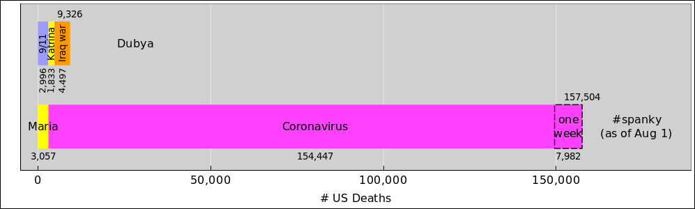
Here is a comparison to put things in perspective. In one week, the death toll of US persons in the current outbreak is worse than a new 9/11, a new Katrina, and an entire new Iraq war combined. Week after week.
Here is a graph that compares South Korea to the US in terms of coronavirus response. Note (!!!!) that the South Korea data is scaled up by a factor of 10. Otherwise it would be next to impossible to see what’s going on.
The height of the curve shows the number of deaths per day. The area under the curve represents total deaths.
You can see that South Korea has done a reasonably good job of suppressing the virus. The US is already more than 40 times worse, per capita, and is on track to do much much worse than that. On an absolute (not per capita) basis, the US is hundreds of times worse.
Just for fun, here’s the data for New Zealand. Even with 10× magnification and even after dividing by their small population, there’s not much area under the curve. They have done a very good job.
In contrast, here’s Italy. Italy is perhaps close to getting the virus under control, but they are not out of the woods yet. This is what happens if suppression measures are (a) tardy and (b) only marginally effective. The death rate grew quickly and then decreased only slowly. The current growth rate is negative, but not infinitely so. Any decrease is better than a rapid increase, but a faster decrease would be preferable.
Meanwhile, the US is already worse than Italy in terms of the absolute number of deaths, and is on track to do worse even on a per-capita basis. The way things are going, it won’t take long to catch up with Italy.
Iran screwed up – not as badly as the US or Italy, but still pretty badly. They are better than the US by a factor of 3, on a per capita basis (and by a factor of 30 on an absolute basis) ... but any time your data shows up on the same scale as the US, with out a 10× scale factor, you have screwed the pooch.
Applying per-capita ideas to China is tricky. They were able to confine most of the outbreak to Hubei province, so the population of the rest of the country almost doesn’t matter for present purposes. Therefore, rather than normalizing to the entire population of China, here is the data normalized to Hubei.
Let’s be clear: There are two China stories: They screwed the pooch in Hubei, but did very well elsewhere.
One can also see from the graph that even after a very serious outbreak is underway, it is possible to bring it under control, although it is not quick or easy. Even after a negative growth rate is established, it takes a while for things to settle down to a manageable level. The growth rate is negative, but not infintely so.
The purpose of this section is to refute the lie about the virus supposedly “dies with the hotter weather” and “will go away in April”. We know that’s a lie for multiple reasons.
For starters, the closely-related MERS virus was not deterred by warm weather in 2012.
Also, the virus is increasingly problematic in Mexico, even though the climate there is warmer than in the US, and even though the outbreak got started there in a warmer part of the year. It has now reached the point where the per-capita death rate is worse in Mexico than in the US. It seems hard to believe that anybody could screw up worse than the US, but in fact it’s possible.