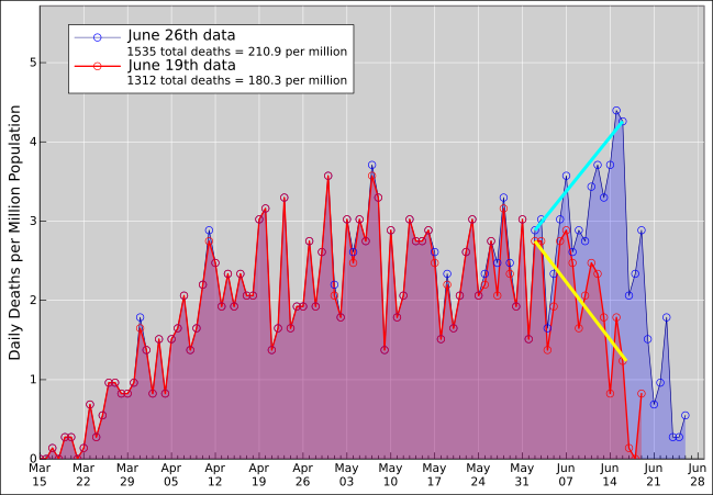
Figure 1: Data versus One-Week-Older Data, Reporting Date
In figure 1, the blue curve shows the data that AZDHS put out on June 26. The height of the curve represents the number of deaths per day, while the area under the curve represents the cumulative number of deaths. The abscissa is the date on which the death was first reported.
The red curve shows the corresponding data that AZDHS put out a week earlier.
This data has the useful property that old data points are considered immutable, and the graph changes over time only insofar as new points are added at the end. This is typical of time series data.
Because of this property, the curve tells you two things at a glance: The area under the curve is the cumulative number of deaths, and the height of the curve tells you the rate at which new deaths are being reported. These two interpretations are intimately related, exactly as we would expect in accordance with the fundamental theorem of calculus, since the shape of the curve doesn’t change except by tacking on new points at the end. In particular, you can clearly see a week’s worth of newly-reported data tacked on at the end.
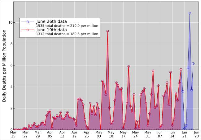
Figure 2 is the same, except that the abscissa is the certified date, i.e. the date of death as shown on the death certificate (not the date on which it was first reported).
The blue data is not merely tacked on at the end. It updates the counts for previous days. Most of the updates apply to the most recent two weeks, but some go farther back, even as far back as March.
If you had looked at the red data when it came out, you might think that the death rate had declined rather steeply over the time period from June 2nd to June 16th, as indicated by the yellow guide line. However (!) when you look at the updated data, i.e. the blue data, you see that the actual death rate was increasing during this time period, as indicated by the cyan guide line.
The decline in the red data was completely illusory. It resulted from the fact that many of the most recent deaths have not been reported yet. This is a bias that is built into the way the data is presented.
By the same token, it might appear that the blue data is sharply decreasing over the time period from June 15th to June 26, but it is a safe bet that this is completely illusory also.
Note that the added area is the same in the two diagrams; it is just distributed differently. In both cases it represents one week’s worth of newly-reported deaths.
In one small sense, the data in figure 1 is easier to interpret, because you know where to look to find the newly added area. However, both diagrams are open to misinterpretation, due to not-very-timely reporting.
Death numbers are somewhat more reliable than “case” numbers based on testing. However, death is a lagging indicator, lagging behind the new infections by roughly 4 weeks. The reporting delays add to the lag. That means the consequences of the governor’s recent evil decisions will not show up in the death rates for another few weeks.
For planning and policymaking purposes, we need comprehensive, reliable, and timely testing, to tell us about the number of new infections. Alas, we don’t have that. Currently the testing is abysmally inadequate testing. We’re not even on a path to get what we need any time soon.