Figure 1: Arizona Legislative District Distribution
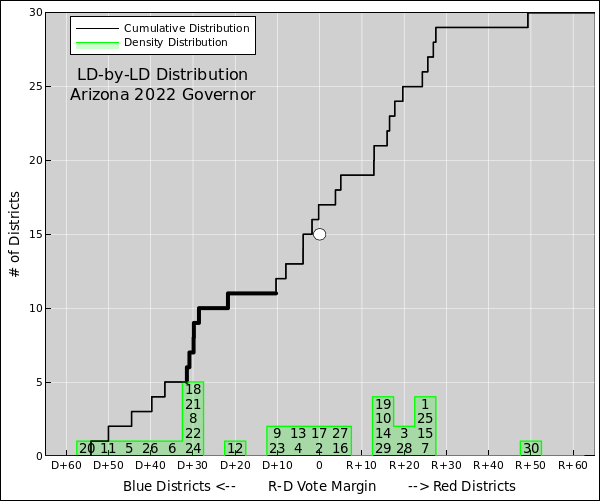
Let’s start by discussing the Arizona legislative districts. They have been gerrymandered, as we can see from figure 1 and otherwise. This was not supposed to happen. The districts are drawn by a commission that is supposed to be independent, but it didn’t work out the way it should.
The people to do the gerrymandering often deny it, but if you graph things properly, then everybody (experts and non-experts alike) can see the truth. In figure 1, the highlighted hump in the black curve is evidence of gerrymandering.
In all these figures, blue districts are plotted toward the left, while red districts are plotted to the right. The green histogram shows the local density of districts with a given vote margin. The black curve shows the cumulative area under the histogram, i.e. the cumulative number of districts to the left of a given vote margin. The two curves present the same information in complementary formats. A steep place in the cumulative distribution corresponds to a peak in the density distribution.
The first thing to notice is the asymmetry. There are 10 districts near or to the left of D+30, but only one near or to the right of R+30. Things like this don’t happen by accident.
The effect of this is that the Rs control both chambers of the state legislature even though the Ds won the statewide races for governor, secretary of state, attorney general, and US senator. The difference is that the statewide races cannot be gerrymandered, while the legislative districts can be (and were).
If the voters stuffed in the ultra-blue districts were distributed more evenly into other districts, it would be more than enough to flip a great many otherwise-close races.
In the figure, the margin is calculated district by district, based on the vote for governor (not the local legislator). This allows us to compare districts to each other, without worrying too much about local candidate quality.
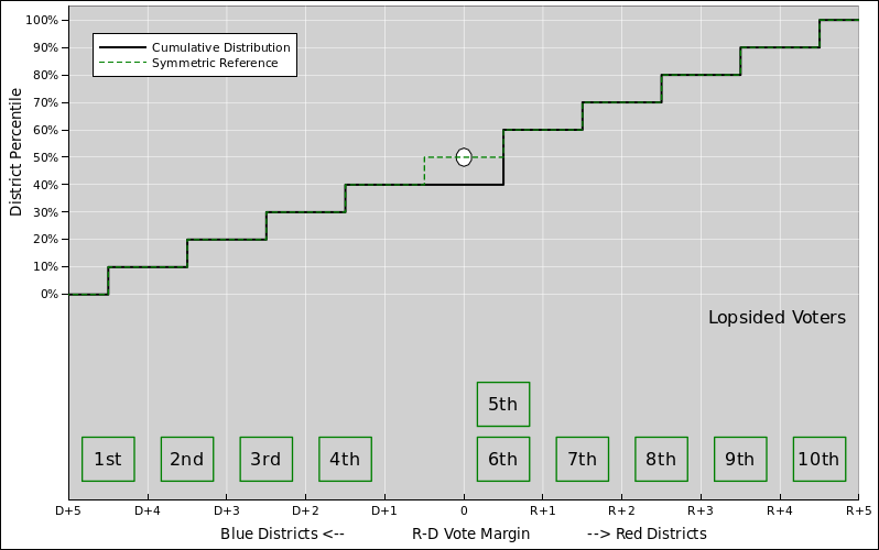
Let’s explore in more detail how gerrymandering works. We will use the concepts of safety (of a candidate’s seat) and efficiency (of a voter’s vote). We proceed step by step, starting with the non-gerrymandered situation shown in figure 2.
The figure shows a simplified model of an election for some legislative body. There are ten districts. The number of R voters is equal to the number of D voters, but they are not uniformly distributed, so that some districts are redder than average, while others are bluer than average. The distribution is fair and symmetrical, so that the delegation winds up evenly split. There is no gerrymandering here. So far so good.
In all these diagrams, the horizontal axis of the diagram represents the vote margin, which reflects the partisan makeup of the districts. The numbered boxes along the bottom of the diagram reprsent the density distribution. The diagonal curve shows the cumulative distribution. That is, the height of the curve indicates how many districts are to the left of any given vote-margin. The two representations provide the same information in complementary formats.
The diagrams plot the political right on the right side of the diagram, and the political left on the left side, which is reasonable and conventional in this business.
In the ultra-simple example shown in figure 2, the median of the distribution is at zero vote-margin. The cumulative curve slices through the bullseye in the center of the plot.
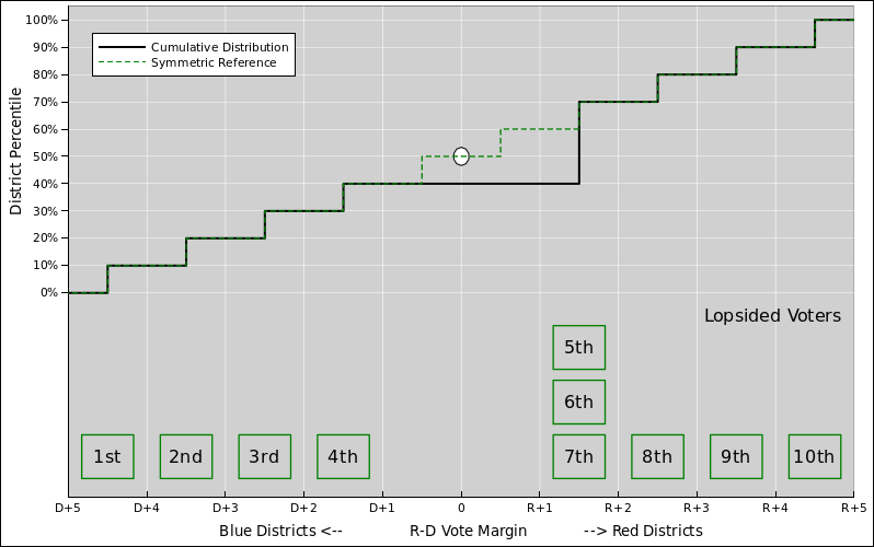
Next, we consider figure 3. This situation differs from figure 2 in that there are a few more R voters. This results in a 60/40 split in the delegation. This is somewhat out of proportion to the distribution of voters, which remains very close to 50/50.
Note that the few additional R voters are distributed super efficiently. That is, they are located where they do the most good, i.e. in a district that the Rs would previously have just barely lost, but now are just barely winning. The high efficiency can be ascribed to a combination of good fortune plus mild gerrymandering.
In all these diagrams, a steep place in the cumulative distribution corresponds to a peak in the density distribution.
The median of the distribution is now at a vote-margin of 0.5. Half of the districts are to the left of there, and half are to the right. You can visualize this in the lower part of the figure by counting boxes. You can also visualize it in the upper part of the figure by noting that the cumulative curve passes below and to the right of the bullseye. In other words, the Ds ran out of majority-D districts before they got to 50% of the delegation.
From the R point of view, figure 3 is good but perhaps not optimal, because the 5th and 6th districts are not particularly safe. If you could manufacture some R voters, it would be nice to stick them in these two districts, to raise the margin a bit. This increases safety. In other words, it means if at some point down the road voter sentiment shifts slightly against the Rs, they will still carry these districts.
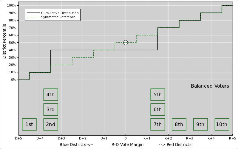
The resulting higher-safety situation is shown in figure 4.
Note that the safety comes at the expense of some efficiency. You are sticking voters into districts that you would have won if there was no shift in voter sentiment, or if there was a shift in your favor.
A more fundamental problem is that if you are assigned the task of gerrymandering the district boundaries, you can’t just manufacture voters. You can transfer voters from one district to another by fiddling with the boundaries, but you can’t change the number of voters, and you can’t convert D voters to R voters.
To say the same thing another way, you can’t change the total statewide vote-margin simply by redrawing boundaries. That is the first moment of the density distribution. That is, each box is weighted by how far it is to the left or right of center. Imagine that the boxes are sitting on a teeter-totter, and the torque must remain the same.
Furthermore, you can’t change the number of districts. In other words, the zeroth moment of the density distribution has to stay the same. The number of boxes in the diagram stays the same.
So, to achieve a genuine gerrymander, we have more work to do. We need check the balance on the teeter-totter. Figure 2 was in balance, but to get to figure 4 we needed to move one box to the right by one step, and another box by two steps, so the teeter-totter is now out of balance by 3 units of torque.
We can restore balance by shifting some other boxes to the left. One way of doing this is shown in figure 5.
This figure has all the same voters as figure 2; they have just been reallocated across district boundaries.
This is a vicious partisan gerrymander. The 3rd and 4th districts have been moved to the left. This makes them safer in the narrowest sense of the word, but not in any practical sense, because they were already plenty safe. All it really does is greatly decrease the efficiency. When the D voters cast their ballots it doesn’t have any practical effect.
So here is a good way (not the only way) to detect gerrymandering: Plot the cumulative distribution. One one side, the curve will be steeper than the generic reference curve in places where it does no good, i.e. in places where the seats were already ridiculously safe. On the other side, the curve will be steeper in places where it does plenty of good, i.e. creating seats that are safe yet still efficient.
Also, the gerrymandered curve will be flat near zero vote-margin, because the erstwhile competitive districts have been made noncompetitive.
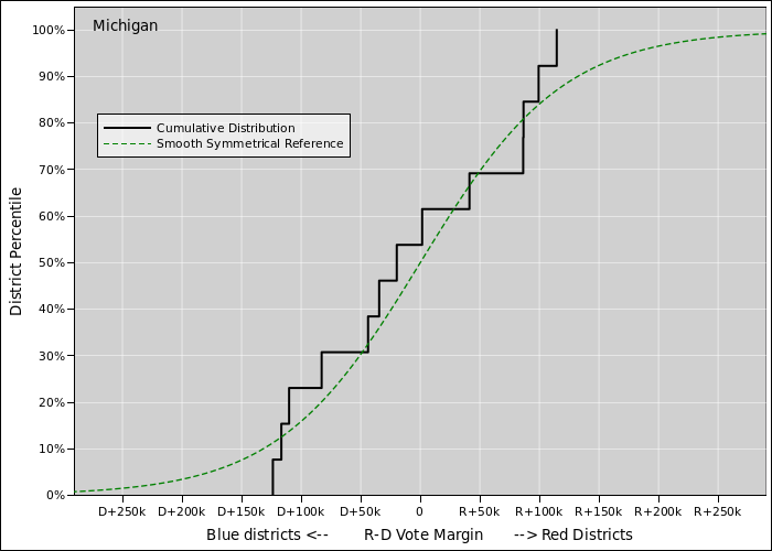
Figure 6 shows the data for Michigan. This is a purple state with no discernible gerrymandering. The district boundaries are set by an independent commission.
In this section, the density distributions are not shown, because the data is so noisy that it is hard to interpret.
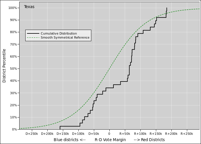
Figure 6 shows the data for Texas. Note the brutal depletion of competitive districts.
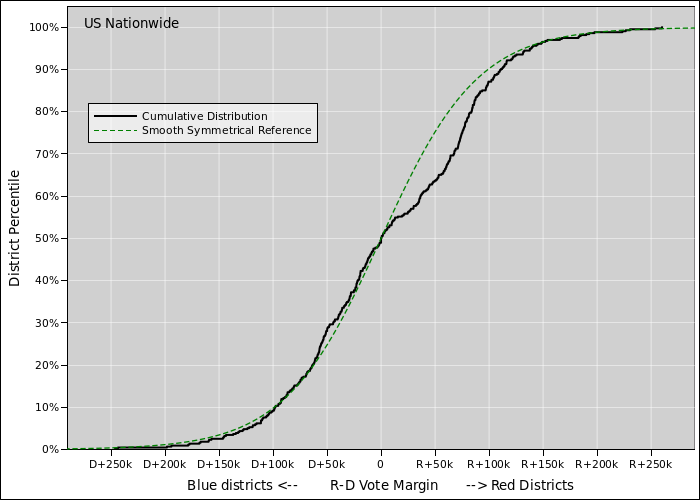
Figure 6 shows the data for the US as a whole. It’s not entirely clear what’s going on here.
Note that some states are gerrymandered while others are not, and some are gerrymandered in the opposite direction, so the nationwide average will necessarily be somewhat muddled.
One hypothesis is that some folks tried to set up a gerrymander and botched it, perhaps because they were more greedy than smart. That is, each of them fixated on maximizing the safety of their own personal seat, sacrificing efficiency and sacrificing the goals of their party as a whole. This fits some of the facts, but it’s not guaranteed to be the correct explanation.
Basic ideas: