| The analysis and the predictions hold up pretty well, considering. | A lot more data is available now. A proper re-analysis would take this into account. |
| Many key conclusions remain unchanged. We know what needs to be done to suppress the virus, and we're still not doing it. | Modeling an outbreak as a simple exponential is interesting until it's not. Modeling over a long term needs to use a more complicated differential equation, perhaps an SEIR model, in order to account for changing conditions (e.g. changing public health policies). |
The answer is that if we hadn't vaccinated everybody, measles *would* be a huge deadly problem. That's where we are now with the coronavirus.
Similarly: Have you ever worn a seatbelt? Most of the time it's not needed. However, by the time you know for sure it's needed, it's too late to put it on.
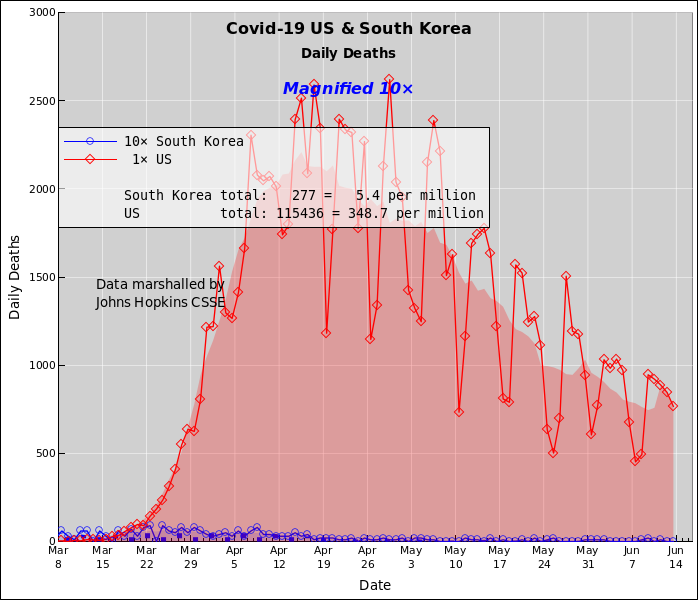
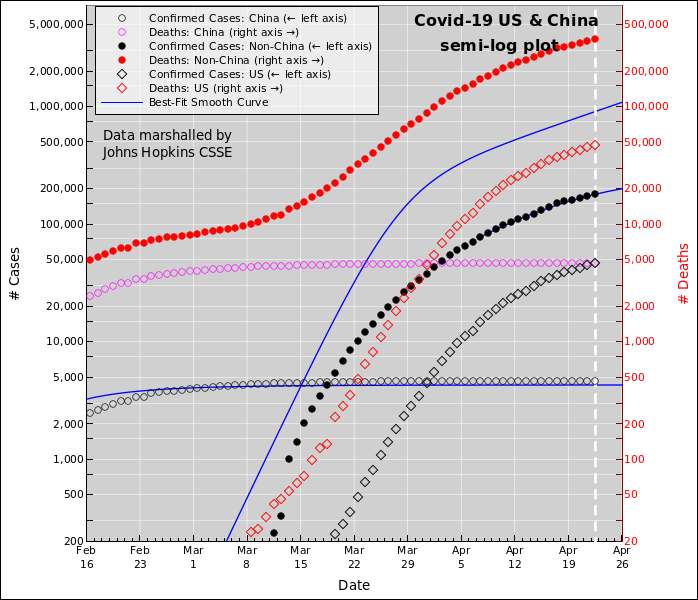
Let's be clear: Even after you correct for the US's somewhat larger population, population, the number of deaths per capita per day in the US is large compared to the corresponding number total, for the whole outbreak in South Korea. The deaths in South Korea are tragic. The deaths in the US are beyond scandalous, beyond outrageous.
Another document has some additional country-by-country comparisons.
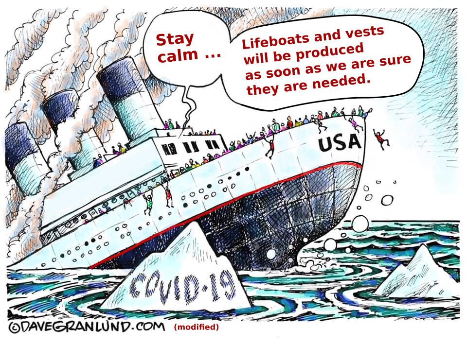
It didn't have to be this way. If the US had implemented basic public-health measures, there would have been vastly fewer deaths, and the outbreak would be nearly over by now. We have seen many successful examples, including New Zealand, Iceland, South Korea, Singapore, and others.
We know what needs to be done. We just aren't doing it.
Right now the number of deaths in the US is doubling every few days. It has slowed down a bit, even so it's too horrible to contemplate, and we don't know what's going to happen in the longer term. The outcome depends on decisions that have not been made yet.
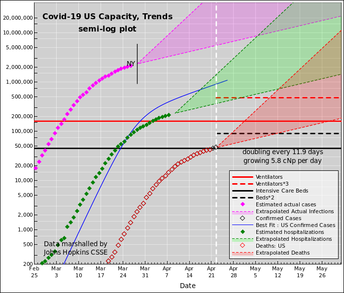
On the "Trends" plot, the key data is the number of deaths, as shown by the red diamonds. This data is relatively reliable. It's hard to hide a dead body. We can use this to draw some useful inferences about things we care about.
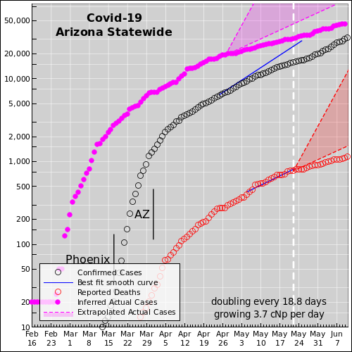
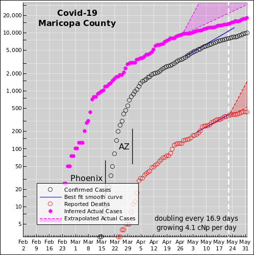
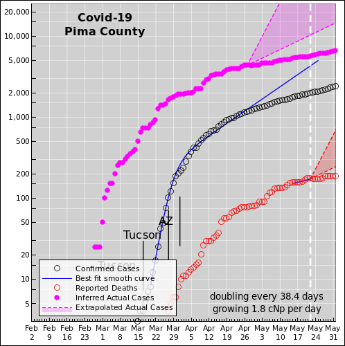
Local government must act, because the state and federal government cannot be trusted to do the right thing. The nature and magnitude of the problem has been known for months. Time that should have been spent preparing was squandered. Washington is fixated on propping up the economy, rather than slowing the spread of the virus. That doesn't deal with the fundamental causative issue. It's like prescribing aspirin to treat a sucking chest wound. There's a good analysis by Ed Pilkington and Tom McCarthy of "the missing six weeks". Here is the corresponding plot for the state of Arizona:
| Deaths per million | Under-Confirmation | Est. Pct. Infected | |
|---|---|---|---|
| Pima | 36 | 39 | 2.9% |
| Maricopa | 14.9 | 23 | 1.2% |
| AZ Statewide | 20 | 28 | 1.7% |
Posible explanation: The high Pima County death rate is probably explained by plain old timing. When something is spreading exponentially, timing is everything. In particular, without stringent control measures, the disease appears to double every 2½ days. So if it arrived in Pima a week earlier, that would explain the Pima/Maricopa ratio.
Non-explanations: People have come up with all sorts of elaborate theories that are unsupported by the data. Maricopa and Pima have comparable numbers of nursing homes, retired people, elderly people, etc., so those factors do not contribute to a convincing explanation. A proper explanation of the Pima/Maricopa ratio has to be based on what's different between the two counties.
Sometimes I assume the IFR is 2%. Sometimes 1%. The CFR (case fatalilty rate) based on the Hubei data is about 4%, but I reckon there are a huge number of asymptomatic and/or mild and/or unreported cases. That means the IFR is much smaller than the CFR.
Picking different IFR number leaves most (albeit not quite all) of the main conclusions unchanged. A lower IFR means the virus will run out of victims sooner ... but unles and until we get near that point, the curves look nearly the same.
To infer the number of hospitalized cases, take each magenta point and shift it to the right 15 days (to account for the latency between the time of infection and the time that hospitalization is required) and shift it down, i.e. multiply it by a factor of 0.1 (to account for the fact that most infections don't require hospitalization at all). This is shown by the solid green diamonds.
We then extrapolate all three of the aforementioned curves using a slope of one doubling every 5 days. The hope is that public health measures, taken in mid-March such as telling people to stay home and hunker down, will soon have an effect, but we haven't seen that in the US data yet.
We know that strong public-health measures do have a big effect. We see this in the data for San Francisco. Also South Korea and several other countries. Here are some country-to-country comparisons.
Don't pollute your brain by worrying about it. We have enough real things to worry about.
The testing situation is, alas, not like an iceberg, where you can only see the tip, but the size of the tip allows you to infer the size of the whole thing. It's more like when somebody hands you a cup of tea and asks you to guess the size of the teapot from whence it came. You really have no idea. And if tomorrow's cup is bigger or smaller, you still have no idea.
You can say the "confirmed" cases provide a lower bound on the number of actual infections, but it's such a loose bound as to be useless. It is a colossal mistake to fixate on it. It underestimates the number of actual infections by some huge factor, at least an order of magnitude, according to our model. Also, the factor is not constant, so you you can't trust the rate-of-change any more than you can trust the absolute number. A less-steep rate-of-change is not evidence that public-health measures are working; it probably just means that testing is not increasing fast enough to keep up with demand.
I look forward to the day when the testing problems are straightened out, but that day will not be soon. Until then, analyzing the number of "confirmed cases" is a waste of time. We need comprehensive, accurate, timely testing the way the Challenger needed reliable O-rings. Just because you want it, just because your life depends on it, doesn't mean you have it.
Also (!) keep in mind that testing is not the only issue. Testing doesn't accomplish much unless you take action based on the test results. We should have spent the last three months building capacity, but that time and effort and cost have been squandered. We need PPE capacity plus testing capacity plus contact-tracing capacity plus subcritical isolation capacity for the people who need it (so we don't have to isolate people who don't need it), plus much much more. The WHO published a six-step checklist for how to safely lift restrictions. The US has not even made it to step 1 yet. And we're not even on a path to get there any time soon.
We know what needs to be done; we're just not doing it.
Confirmed cases: As mentioned above, in the US at the moment, the shortage of testing is absolutely terrible. The testing numbers understate the number of actual infections by more than an order of magnitude. This is a big problem.
The tests that actually get administered have a false negative rate on the order of 30%. This is a problem, although it pales in comparison to the overall shortage of tests.
Eventually we will need reliable tests as one step in a multi-step process, including contact-tracing, isolation of contagious persons, etc.; however, right now we aren't doing any of the steps right.
The crucial point is, failure in one area must not be used as an excuse for failing in the other areas. That would be like a baseball team that has no catcher, and the manager refuses to train one or recruit one, because the pitcher isn't very good.
The whole situation is insane. It didn't have to be this way.
Number of Deaths: The main problem with the reported number of deaths is the long latency.
As a matter of principle, this data is not guaranteed to be completely accurate, but in practice I'm not too worried about it. By the time somebody is sick enough to die, doctors can easily tell the difference between bacterial and viral pneumonia. And the chance nowadays of it being a virus other than covid are small. So unless there is heavy political pressure to lowball the numbers (as may have occurred in China) I reckon all cases of atypical pneumonia are presumed to be covid.
Other: The number of hospitalizations is somewhat less reliable than the number of deaths (but still incomparably better than ``confirmed' cases). It has some lag but not quite as much. This data is not easy to come by.
An interesting source of zero-lag data is the fever data brought to you by Kinsa Health. I haven't entirely figured out how to incorporate that into a predictive model.
The models discussed here are my own work. I have confined myself to cartoonishly simply models, for the following compelling reason: The outcome depends on decisions that have yet to be made. The models are very simple ... but sufficient to show why a more complex model would be pointless.
We know what needs to be done; we're just not doing it. Consider in particular the IHME projection that has gotten a lot of attention lately. I think the lead author on that model was Rose E. Señario. That is to say, the model you see assumes that starting tomorrow, the administration will get its act together and start doing everything right. Alas, even this scenario produces an ugly result.
What's worse, there is no basis for such an optimistic assumption. So far, they have done almost nothing right. We know what a successful pandemic response would look like. Not only do we not have that, we are not even on a path that will get there any time soon. The consequences are too ghastly to contemplate. Here is a detailed takedown of the public IHME model.
Note that the IHME guys are not stupid. Inside their model they have parameters they're not showing you, parameters that could be used to evaluate not-so-rosy scenarios.
As previously mentioned, The steps necessary to stop the outbreak are known; see the article by Donald McNeil. The problem is, we aren't doing any of those things properly. We're not even on track to have a reasonable program in place any time soon.
Some limited understanding of the importance of policy decisions can be seen in the graph near the top of this recent Vox article. There is no reason why every country could not do as well as South Korea. China spent a month trying to gaslight their population before realizing that wasn't going to work, and therefore got an order-of-magnitude worse outcome. The disease spread to the US at the same time as South Korea. As you can see from the graph, the US curve is very high and still rapidly climbing, with no end in sight. More importantly: keep in mind that this shows "confirmed" cases, and the US testing program is not just bad but singularly bad, so the actual US situation is much worse than the figure suggests.
The proper reply goes like this: If we hadn't vaccinated everybody, measles would be a huge deadly problem.
Similarly: Have you ever worn a seatbelt? Most of the time it's not needed. However, by the time you know for sure it's needed, it's too late to put it on. And that's where we are now with the coronavirus.
Taking another step down that road: It is important to work out the worst-case scenario, so you can intervene to prevent it from happening. The fact that it doesn't happen doesn't mean the projection is wrong. The projection never claimed to say what ``would'' happen; it only said what would have happened if you hadn't intervened.