|
| |
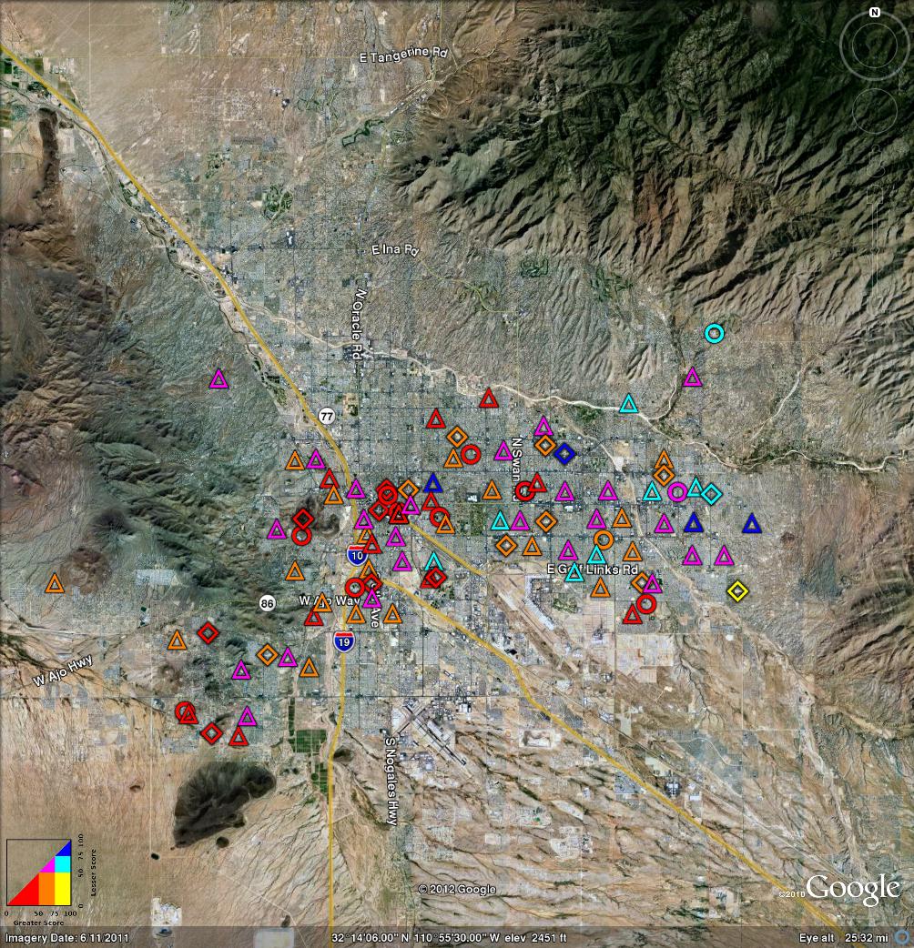
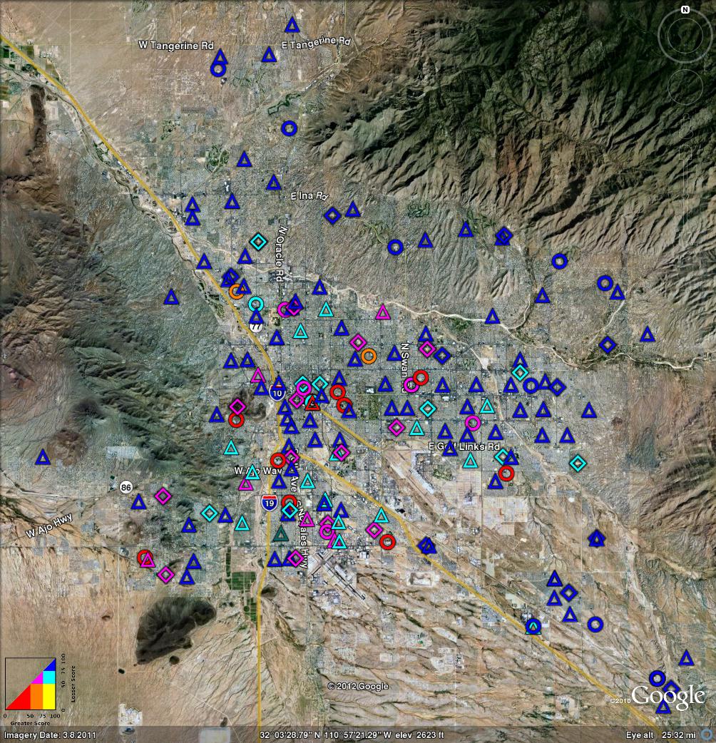
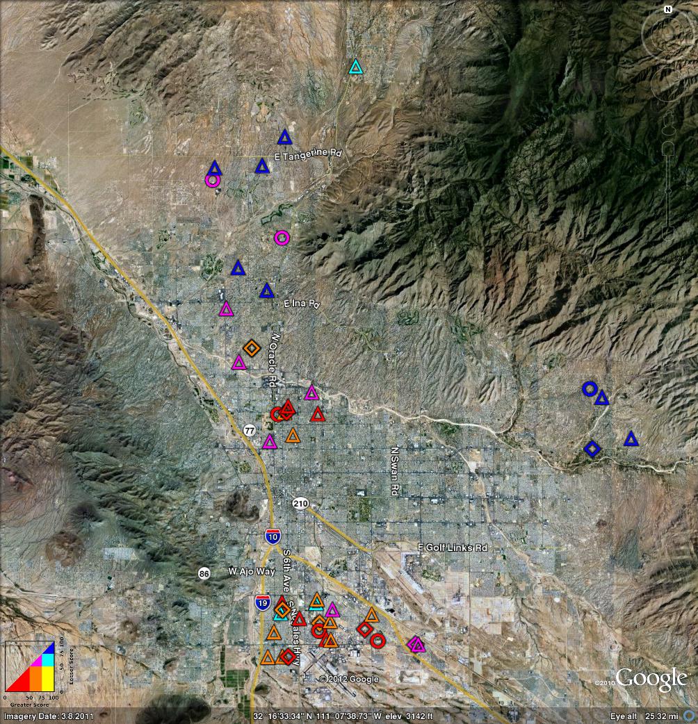
| Figure 1: Percentile – All Seven Districts | Figure 2: Percentile – Just TUSD | |
Copyright © 2012 jsd
On August 2nd, the Arizona Department of Education released the 2012 AIMS results and some other data. See reference 1 and reference 2.
Warning: One should be careful not to assign too much meaning to any of these results, for multiple reasons:
- The questions are almost all trivia questions. (This includes regular AIMS questions as well as the special “nationally normed” questions, as discused below.) These are not the worst questions I’ve ever seen, but still they are not very challenging. In particular, if the released sample questions in reference 3 are any indication, the test makes almost no attempt to measure critical thinking skills. In such a situation, a bad score is informative while a good score is not: Doing well on a trivia test is nothing to be proud of, whereas doing poorly on a not-very-challenging test is cause for alarm.
- Furthermore, even if students get good scores, emphasizing trivia tests is a terrible idea, for reasons discussed in reference 4.
- What’s worse, there are some troubling questions about the intepretation and classification of the AIMS scores. In particular, it appears that some arbitrary and rather strange thresholds were used for classifying AIMS scores as “passing” or not.
The results were released in the form of .XLS files. That’s fine as far as it goes, but if we want to understand what’s going on, we need a way to visualize the data. As a modest step in that direction, consider the following figures. Click on any figure to see a larger version. Or download the .kml files.
We start with the so-called “Nationally Normed” data. (This is in contrast to the regular AIMS data, which is discussed in section 3.)
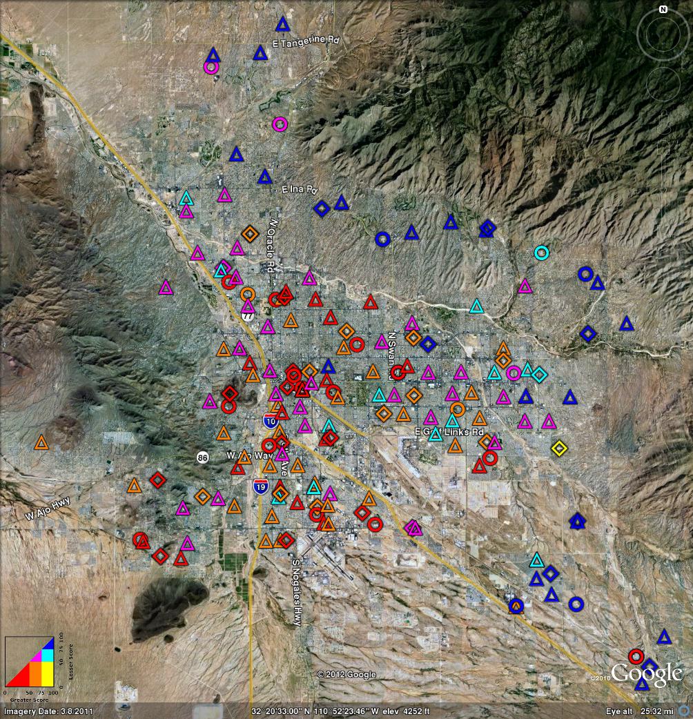
Figure 1 shows the “nationally normed” data for the district schools it all seven districts in Pima County.1 Meanwhile, figure 2 shows only the TUSD schools.
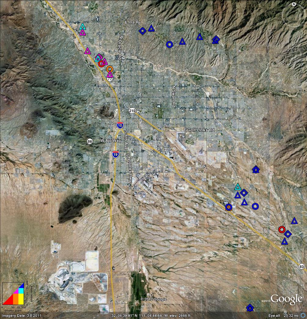
Figure 3 shows three of the outlying districts: Clockwise from the 3:00 position we have Tanque Verde, Sunnyside, and Amphi. Meanwhile, figure 4 shows the other three outlying districts. Clockwise the 12:00 position we have Foothills, Vail, and Flowing Wells. Click on any figure to see a larger version. Or download the .kml files.
|

| |
| Figure 3: Percentile – Tanque Verde, Sunnyside, and Amphi Districts | Figure 4: Percentile – Foothills, Vail, and Flowing Wells Districts | |
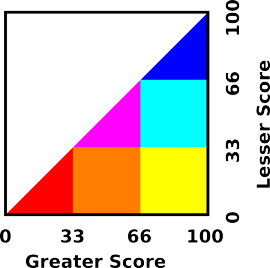
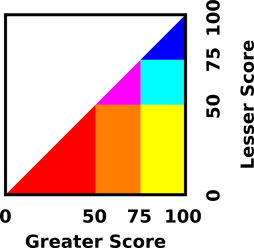
In the diagrams in this section, for any given school, the color indicates how well the school did on the “nationally normed” questions that were sprinkled in amongst the regular AIMS questions. The color scheme is shown in figure 5. We take the school’s “score” to be its national rank, expressed as a percentile. We then find whichever score (math or reading) is the lesser and which is the greater. If both scores are below the 33rd precentile, the color is red. If both scores are above th 66th percentile, the color is blue. If both scores are between the 33rd and 66th percentile, the color is magenta. And so on, as shown in figure 5. Basically, warm colors are bad and bluer colors are good.
For best results, you should download the .kml files to your computer and look at them using the google-earth application.2 If you do that, then
Plotting the data in this way allows us to test some interesting hypotheses.
Very commonly, people hypothesize that “geography is destiny” ... in other words, that there is so much segregation that location determines the quality of the local schools. This hypothesis is partly supported by the data presented in this section, but partly not. The notion that “geography is destiny” fits the Amphi data rather well, as you can see in figure 3. The highest-ranked schools are concentrated in the north, while the lowest-ranked schools are concentrated near the south end of the district, nearer to downtown.
If we look at all seven districts together, as in figure 1 we see a semi-circular nimbus of relatively high-ranked schools on the edge of town, extending from the northwest clockwise around to the southeast. This stands in contrast to the downtown and southwest schools, which are ranked much lower.
There are, however, exceptions to the trends. Sam Hughes and C E Rose and elementary schools are ranked significantly higher than other nearby schools. Unless you think this is a fluke, it indicates that how you run the school matters, and location by itself does not entirely determine destiny.
This data suggests that most TUSD schools are pretty much average schools, relative to national norms. The district as a whole is somewhat below average, as we can see from the fact that slightly-below-average schools (orange) outnumber slightly-above-average schools (cyan).
Again it must be emphasized that these rankings are based on how well students answer trivia questions. It would be a grave mistake to judge any student, teacher, school, or district on this basis. As the saying goes, be careful what you test for, you might get it. Triviality is not what we want to get. Remember: A low score on a trivia test is a bad thing, but a high score doesn’t really tell us very much.
The available data is hard to interpret for yet another reason: At an “average” school, it could be that all students are performing about the same ... or it could be that half the students are doing extremely well while the other half are being completely left behind. That’s a classic problem with averages. In order to attribute any real meaning to the scores, we would need more information. A histogram of the raw scores (on a school-by-school basis) would help.
This section parallels section 2, except that it presents regular AIMS data rather than the “nationally normed” data.
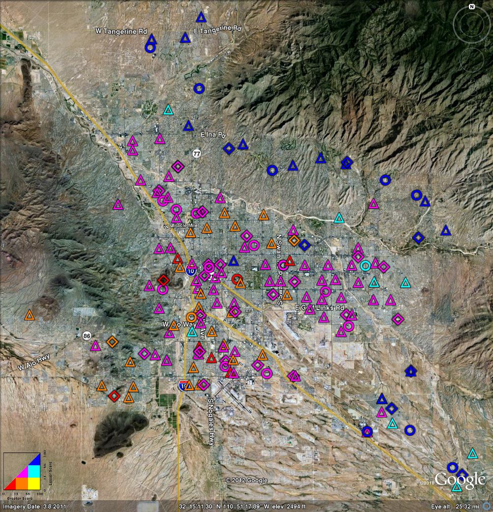
Figure 6 shows AIMS results for the district schools in all seven districts in Pima County. Meanwhile, figure 7 shows only the TUSD schools.
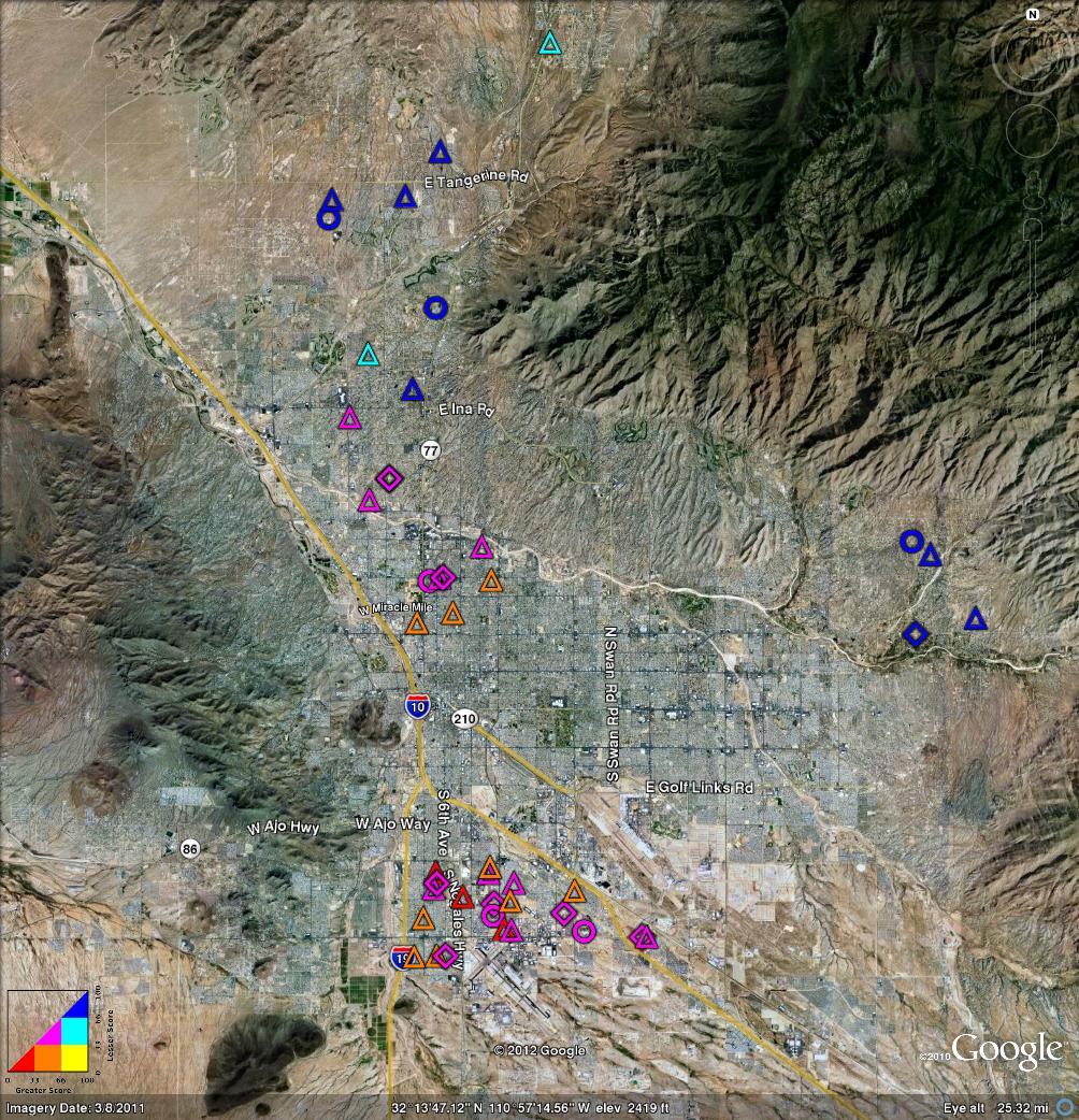
Figure 8 shows three of the outlying districts: Clockwise from the 3:00 position we have Tanque Verde, Sunnyside, and Amphi. Meanwhile, figure 9 shows the other three outlying districts. Clockwise the 12:00 position we have Foothills, Vail, and Flowing Wells. Click on any figure to see a larger version. Or download the .kml files.
|
| |
| Figure 8: AIMS – Tanque Verde, Sunnyside, and Amphi Districts | Figure 9: AIMS – Foothills, Vail, and Flowing Wells Districts | |
Elementary schools are represented by a triangle. Middle schools are represented by a diamond. High schools are represented by a circle.
The color scheme used in this section is different from the color scheme used in section 2. Here, for any given school, the color indicates how well the school did on the 2012 AIMS math and science tests. The colors are shown in figure 10. We take the school’s “score” on a given test to be the percentage of students who receive a passing grade. We then find whichever score (math or science) is the lesser and which is the greater. If both scores are below 50%, the color is red. If both scores are above 75%, the color is blue. If both scores are between 50% and 75%, the color is magenta. And so on, as shown in figure 10. Basically, warm colors are bad and bluer colors are good.
There is a dramatic discrepancy between the nationally-normed data (section 2) and the regular AIMS data (section 3).
This can probably be explained as follows: On any test, whoever is in charge of the test gets to decide what constitutes a “passing” score. Evidently the AIMS folks have decided to set the threshold so high that at an ordinary, average school – average relative to national standards – half of the students will not pass the AIMS test.
This is really quite remarkable. Except in Lake Wobegon, half of the students are going to be below average. However, that does not mean that half of the students are being “left behind” ... or that half the students deserve to flunk out ... or that half the teachers deserve to be fired.
Keep in mind that choosing the threshold that defines a “passing” score is completely arbitrary. To their credit, the AIMS folks presented data using three different thresholds, dividing the results into four categories: far below standards, approaches standards, meets standards, and exceeds standards. This can be considered a rudimentary histogram. The top two categories combine to define the notion of a “passing” score. If we add in the “approach” case, we can form a new classification, as discussed in section 3.3.
Before moving on, let’s discuss a couple of anomalies:
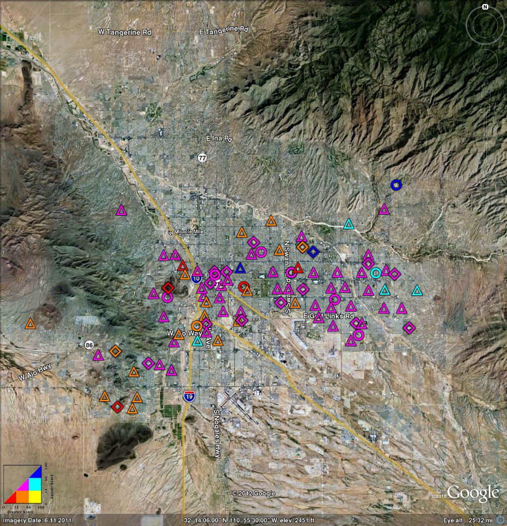
We are not going to redefine what “pass” means, but we are free to define another category, namely the OK category, consisting of “pass” plus “approaches”. The results are shown in figure 11.
In this figure, we would like to see nothing but blue. Red or orange indicate a school where a large percentage of students are doing very badly on a trivia test. This seems like the sort of “left behind” that NCLB was ostensibly intended to prevent.
One thing that leaps out from figure 11 is that the high schools aren’t coping with the AIMS test nearly so well as the elementary schools are. This could be entirely artificial, since the high-school tests are different and the thresholds are set differently ... or it could indicate a real problem.
None of this data is worth very much, for multiple reasons. The biggest problem is that it is all based on trivia questions. Getting a perfect score on a trivia test is nothing to brag about.
There is a lot more that could be done with this data. For example, one could plot charter schools on the same map.
If anybody is interested in pursuing this, let me know. I’d be happy to make available the perl scripts I wrote for analyzing the data and preparing the plots.
On the other hand, I’m not sure it’s worth it. As the saying goes: If it’s not worth doing, it’s not worth doing right. Keep in mind that a good score on the AIMS test doesn’t tell you very much, because the test doesn’t measure much of anything worth knowing.
Copyright © 2012 jsd