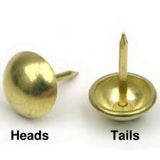
Figure 1: Tack Orientations
Here’s an exercise in basic probability. I’ve seen it used at every level from 5th grade through undergraduate. As you might imagine, the level of analysis goes up with the older students, but the basic idea is the same.
Goals include:
Procedure: Get some upholstery tacks. I think they’re properly called “nails” but everybody I know calls them tacks. They’re cheap and readily obtainable from the local fabric store. Anything similar to the ones shown in figure 1 will work fine.
Each student gets 5 tacks and a small box to toss them in. The box is important; otherwise you get tacks escaping all over the place. For example, you could use the cardboard box that a loaf of cheese comes in. The possible orientations for each tack are named in figure 1.
The procedure is:
The first part of the spreadsheet looks like this:
          batch   batch   heads   total   total   running
          #       size    obsrvd  tossed  heads   average
                                  0       0
          1       5       2       5       2       40.0%
          2       5       3       10      5       50.0%
          3       5       3       15      8       53.3%
          4       5       1       20      9       45.0%
          5       5       3       25      12      48.0%
          6       5       2       30      14      46.7%
          7       5       2       35      16      45.7%
          9       5       3       45      21      46.7%
          8       5       2       40      18      45.0%
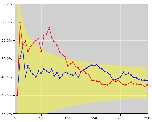
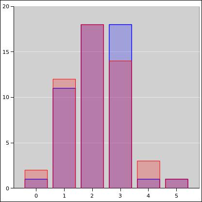
You can also plot a histogram of what the batches are doing. With only 50 batches, the histogram itself is noisy. See figure 3. For the spreadsheet used to produce this figure, see reference 1
Remark: As you might expect, given the gross asymmetry, the probability of heads is not 50% ... but it may turn out to be closer to 50% than you might have guessed.
Remark: It is a feature (not a bug) in this experiment that nobody knows the "right" answer. Nobody knows the probability of heads until they do the experiment. This is a refreshing contrast from the usual end-of-chapter exercises where the goal is to get the "right" answer by hook or by crook.
Remark: Students are always amazed at how noise the data is, and how slowly the running average converges to its asymptote. FWIW I’ve seen data like this a gazillion times, and I’m still glad to have a reminder, every so often, of how slowly it converges. 1/√x is a very slow function.
Remark: This is real data. This is a real experiment that students can do for themselves.
Remark: A very great deal of what we call “modern physics” aka “20th century1 physics” depends on probability. This includes thermodynamics aka statistical mechanics, quantum mechanics, et cetera.
Even if it had nothing to do with physics, it would still be important. Bad guys are continually trying to bamboozle voters, jurors, et cetera using various all-too-common statistical fallacies. This is far more relevant to the average citizen than (say) anything on the Force Concept Inventory.
Detail: Using five tacks per batch is about right. With more than that, they become hard to count. A batch-size of 1 gives more information, but it is a waste of time, it makes the data even noisier, and it causes confusion. (There are more than a few students who have only a shaky grasp of the concept of zero, and they get confused if the first toss gives them zero heads.)
Remark: This experiment does not teach you everything you need to know. It is only a small first step. In particular, it doesn’t say anything about on conditional probability. See reference 3.
Fine point, for relatively advanced students: The yellow shaded region in figure 2 is a model of the uncertainty. It is a rather crude model (based on Gaussian statistics) because I was too lazy to do the proper binomial statistics. The model serves to make an important point: The uncertainty comes from the model. There is an uncertainty band associated with the model. The data points are correctly shown with no error bars whatsoever. This is discussed in reference 4.
The general procedure is the same as in section 1.1. We just interpret the data differently, as explained in section 2.2.
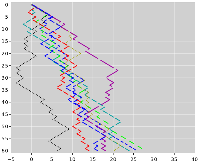
Figure 4 shows another way of using the tack-toss data. Imagine a random walk, where every time the tack comes up tails, the walker takes a step to the right, and every time it comes up heads, he takes a step to the left. (Every step has unit length.) Since for our tacks, tails is slightly more likely, the walker will exhibit a steady trend to the right, on average. However, because the outcome of any particular toss is random, there will be a lot of noise on the data.
Figure 4 shows the outcome of 8 separate experiments. Each experiment is shown with a different color. The vertical axis shows the number of tosses. The horizontal axis shows the position after that many tosses. The probability of heads is 35%. Theory tells us that after 60 tosses, the distribution is centered at 18. You can see that the actual outcomes are more-or-less centered around 18, but there is a lot of scatter.
In more detail: Let’s talk about the distribution, rather than any particular outcome. The center of the distribution is trending to the right at a rate of 0.3 steps per toss. This is the average behavior. It is linear in the number of tosses. Meanwhile, the width of the distribution is growing in proportion to the square root of the number of tosses. For large X, we know that √X is very much smaller than X. So in the long run, if the number of tosses is large, eventually the trend will outrun the fluctuations. However, in the short run, the fluctuations can be bigger than the trend. In the figure, you can see that one of the traces spends considerable time in negative territory.
These ideas have many applications in the real world:
This is wildly different from the gambler in a casino, because the gambler seeks risk per se as a form of entertainment, whereas the farmer does not. The farmer has to make a tricky tradeoff, seeking to maximize the average gain while minimizing the downside risk.
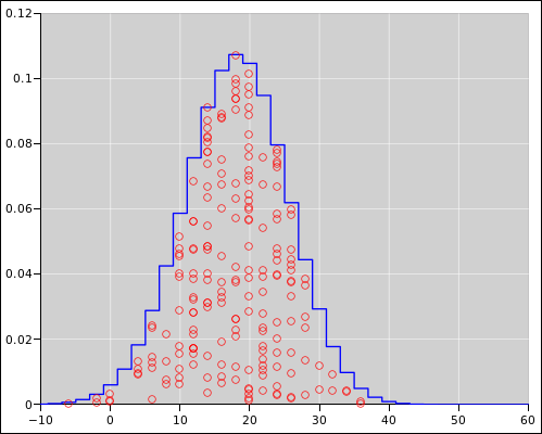
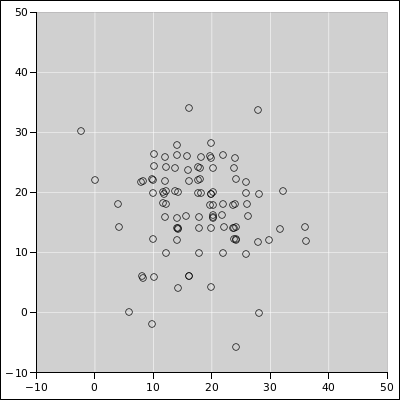
Here are some additional ways of looking at the data. Suppose we repeat the tack-tossing experiment 200 times, with 60 tosses per experiment, and examine only the final position of the walker. Theory says that the results should be distributed according to a binomial distribution. This is shown in figure 5. The blue curve represents the ideal binomial distribution. There are 200 data points, shown in red, indicating the outcome of the experiments, formatted as a diaspogram. As explained in reference 3, the horizontal axis indicates the outcome of the experiment. The data is spread out in the vertical direction to make it easier to see what’s going on. The amount of spread is proportional to the theoretical probability, so there should be a uniform random distribution of points under the curve.
Meanwhile, figure 5 is a plain old scatter plot. Each black point represents the outcome of two experiments: The horizontal position represents one experiment, and the vertical position represents another. All the outcomes are of course integers (indeed even integers), but in figure 5 I offset some of the points slightly to make it easier to detect when multiple points are sitting on top of each other. When you see such points, imagine them all rounded to the nearest even integer.
In both diagrams, you can see that the distribution is centered around 18 units. For the spreadsheet used to prepare these figures, see the binomial-distribution page in reference 5.
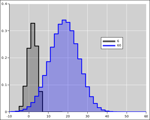
The black curve in figure 7 shows the distribution of lengths after a 6-step walk. The probability of heads is 35%, as before. The distribution is centered around 1.8 units, so it peaks at 2 units. Notice that even though the walker is moving to the right on average, there is a significant fraction of the probability to the left of the origin.
Meanwhile, the blue curve in figure 7 shows the distribution of lengths after a 60-step walk. This is the same as the blue curve in figure 5. The distribution is centered around 18 units. There is only a tiny percentage of the probability to the left of the origin.
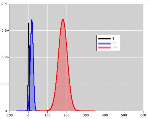
Figure 8 is a zoomed-out version of figure 7. The black curve and the blue curve are the same as before. The red curve shows the distribution of lengths after a 600-step walk. The distribution is centered around 180. There is an utterly negligible, infinitesimal amount of probability to the left of the origin.
Note that the absolute width of the distribution grows in proportion to the square root of the length of the walk, whereas the center of the distribution moves steadily in direct proportion to the length. As a consequence, if the walk is long enough, the trend will always swamp the fluctuations. To say the same thing another way, the relative width (as a fraction of the mean) gets smaller as the walk becomes longer. It may seem odd that the relative width is getting smaller even as the absolute width is getter larger, but that’s the way it is.
The random walk is related to the running average (as discussed in section 1) as follows:
The idea of “trend plus fluctuations” has immensely important practical ramifications. A vast amount of real-world data behaves this way, to a good approximation.
People make decisions based on less-than-perfect data all the time, in the science lab, in corporate management, in government, and in personal daily life.
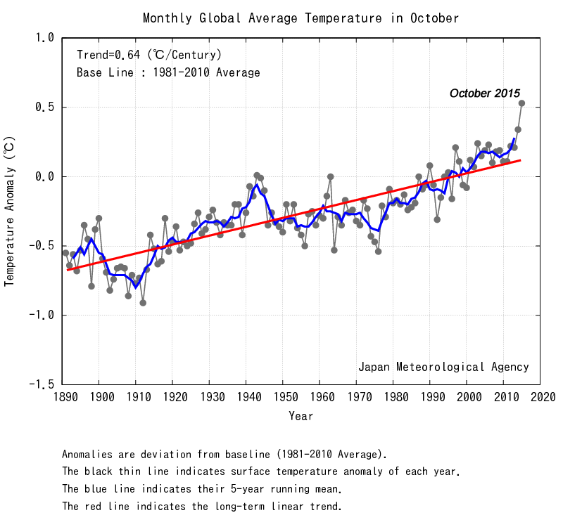
We can apply this idea to an example: Suppose there is a long-term warming trend, with random fluctuations. You should expect to see intervals of a few years with less-than-average warming, along with intervals of greater-than-average warming. Do not let yourself be fooled by this. The trend is still there. If you look at a longer run, the trends become clearer, and it becomes easier to separate the trends from the fluctuations.
As usual, experts have their own terminology.