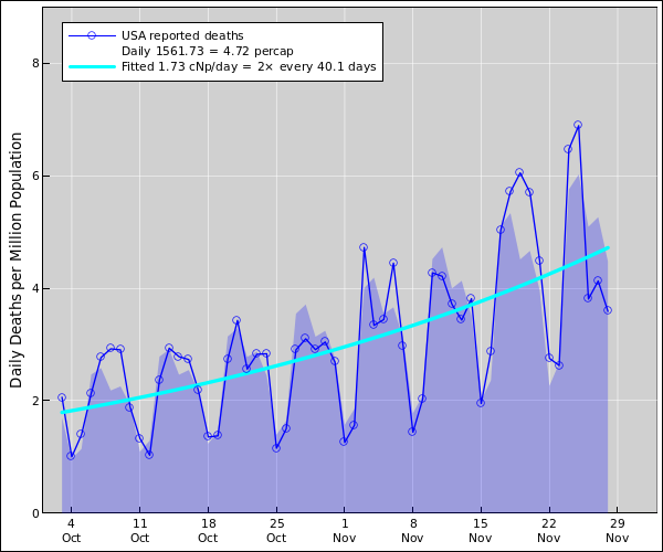
Figure 1: US Coronavirus Daily Deaths
This diagram shows four main quantities of interest:
Note: The just-mentioned items can be normalized in absolute terms (deaths) or in per-capita terms (deaths per million population). The logarithmic derivative is the same no matter what normalization you use.
The acceleration is the rate-of-change of the height of the curve (i.e. the daily death rate). In other words, it is the rate-of-change of the rate-of-change of the area under the curve (i.e. the cumulative death toll). This is calculated by fitting an exponential, so the acceleration reflects not absolute change but rather the relative change, which is very nearly the percentage change. In mathematical terms, the acceleration is the logarithmic derivative of the death rate. It is measured in cNp per day. (One cNp is very nearly one percent. See section 4 for an explanation.)
A negative acceleration is synonymous with a deceleration.
Curve-fitting is a powerful technique for averaging out the meaningless day-to-day variations. The fitted exponential is easier to interpret than the raw data, as discussed in section 3.2.
The main purpose in looking at graphs like this is to help decide what’s good policy and what’s bad policy. When doing so, keep in mind that (a) there are other sources of information (notably observations of countries that have been successful in suppressing the virus), and (b) this data is imperfect, as we now discuss.
The data is seriously delayed, and arrives in batches. Specifically:
Imperfect data is better than no data. Everybody (including scientists and everybody else) makes decisions based on imperfect data all day every day. We should not over-react or under-react to the presence of noise in the data.
A certain amount of the noise is Poisson noise, which is inescapable because we are (thank heavens) working with smallish numbers.
Fitting an exponential to the data is a very powerful way of averaging out the short-term noise. As long as public-health policy doesn’t change, and other “facts on the ground” don’t change, we expect the daily death rate to follow a more-or-less exponential trend. As a corollary, we expect the acceleration (i.e. the logarithmic derivative of the death rate) to be constant. Similarly, we expect the cumulative death toll to be an exponential offset by some constant.
An infection doesn’t become a “case” until it is diagnosed.
I look forward to the day when the the case load is small enough and the testing is vigorous enough so that nearly all infections are detected, but we’re not there yet. We’re not even on a path to get there any time soon.
You could kinda maybe sorta get away with extrapolating the nationwide trend back in early March, when there was more-or-less one big outbreak. But not any more. Now we have hundreds of smaller outbreaks. The only way to make sense of the situation is to model each outbreak separately, and then add the results.
Let’s be clear: In general, it is difficult to extrapolate the nationwide or even statewide trends.
When you have a sum of exponentials, you might have a contribution that starts out small but increasing. It will be negligible until suddenly it isn’t. In contrast, there is virtually never a fair godmother that comes along and makes things better unexpectedly.
To repeat: There is usually only one way that things will work out better than a simple extrapolation would indicate (better outside the uncertainty band). That’s if there is a beneficial change in behavior, a change in treatment options, or the like.
One centineper (abbreviated cNp) corresponds to 1% when the changes are small. When the changes are large, centinepers behave much better. It’s the difference between compound interest and simple interest. A more detailed discussion with examples and graphs is available.