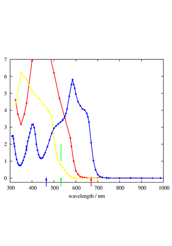
Figure 1: Transmission Spectra
Copyright © 2005 jsd & bc
Figure 1 shows the transmission spectra for some McCormick (aka Schilling) food coloring dyes. The red curve is for their red dye, the yellow curve is for their yellow dye, and the blue curve is for their blue dye.
For reference, the green arrow indicates the wavelength of a green DPSS laser (532 nm), and the red arrow indicates the wavelength of a typical red diode laser (670 nm). The blue arrow indicates a typical wavelength in the center of what is conventionally called the blue part of the spectrum (465 nm). This corresponds rather closely to the “blue” phosphor on a typical CRT display; look at figure 4 if you want to see what it looks like. The range from 445 nm down to 350 nm or slightly below is called the violet part of the spectrum. See reference 1 for more on this.
You can see that the red dye transmits wavelengths near the red end of the spectrum, and nothing else. Meanwhile, the yellow dye (in reasonably dilute concentrations) transmits a wider range of wavelengths, down to and including the green part of the spectrum.
It is odd the the blue dye would be transparent in the infrared, but this is not relevant in practice, since the human eye is very insensitive beyond 700 nm. The blueness of the blue dye is due to the two regions of fair-to-good transmission in the blue and violet parts of the spectrum.
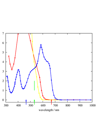
Figure 2 presents the same data in a different format, expressing it as an absorption cross section. Thinking in terms of cross sections is often helpful, as will be discussed in section 3.
The absorption cross section is related to the transmission coefficient (at any given wavelength) by a simple exponential:
| (1) |
where T is the transmission coefficient, I0 is the intensity of the light entering the cell, I is the intensity exiting the cell, M is the amount of dye present, V is the volume (which is affected by how much the dye has been diluted), L is the length of the path traversed by the light, and σ is the cross section per unit material. You have a choice: you can consider M to be the number of moles present, in which case σ is the cross section per mole ... or you can consider M to be the number of molecules present, in which case σ is the cross section per molecule. For definiteness, I will call it the molar cross section, but you can redefine it if you like.
We can solve for the molar cross section:
| σ = − |
| ln(T) (2) |
and this σ is what is plotted in figure 2. The units in the figure are arbitrary, because we have no idea how many dye molecules the manufacturer puts in a unit volume of the product. So our σ is the cross section per drop, times some geometry factors.
Just by looking, you can easily observe some remarkable properties of the yellow dye in this type of food coloring: In thin layers it has a nice yellow color, while in somewhat thicker layers it looks orange, and in yet-thicker layers it has a strong red color. We can summarize this by the qualitative equations
| yellow plus yellow makes orange (3) |
| orange plus orange makes red (4) |
These observations are wildly inconsistent with the “color theory” that you learned in third grade. There is no way to explain them in terms of the “color wheel” or anything like that. However, facts are facts. These observations are entirely real; no tricks or optical illusions are involved.
Also: the color shift is just physics; no chemical reactions occur when the dye is diluted. You can easily confirm this for yourself as follows: put some of the so-called yellow dye in a glass dish, and dilute it moderately with water. Tilt the dish so as to form a wedge-shaped sample, tapering to zero thickness. If you look through a very thin layer, it looks yellow. If you look through thicker and thicker layers, it looks orange and then red.
The facts are easily explained in terms of the cross section data in figure 2. If we fudge the yellow curve upward, multiplying it by a factor of five, it tells us what happens if the yellow dye has a fivefold greater concentration. This is shown in figure 3.
You can see that the fudged yellow curve is not too much different from the red curve. Such a sample looks red to the eye. Comparing this to figure 2, you can see there is much higher absorption in the green region of the spectrum.
All this tells us that mixing inks can be very nonlinear.
It is important to remember that mixing colored lights is very different from mixing colored dyes or inks.
| Mixing colored lights is properly called additive color mixing. | Mixing colored dyes is commonly called subtractive color mixing, but properly it should be called multiplicative color mixing instead, for the following reason: Suppose you know a certain amount of ink attenuates a certain wavelength by a factor of X. If you have twice as much ink, the attenuation will be X2, not 2X. This idea is expressed quantitatively by equation 1. |
| The theory of mixing colored lights is a linear theory. It works pretty well for many purposes (although not all). | If you want to describe mixing colored inks, you really need a nonlinear theory right from the get-go. The color shifts expressed by equation 3 and equation 4 are literally the first thing you see when you take a drop of so-called yellow dye out of the bottle. |
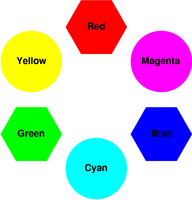
| The conventional primary colors for additive color mixing are red, green, and blue. This is the system used by essentially every television and computer display in the world. | The conventional primary colors for multiplicative color mixing are cyan, magenta, and yellow. This is the system used by most inkjet printers in the world ... although you can buy printers that use additional primaries, to improve their coverage of the color-space. |
| You can cover about half the area of the CIE chromaticity diagram using these three primaries. The remaining area is called out of gamut. The out-of-gamut colors are perfectly ordinary colors; they just can’t be constructed by mixing the given primaries. An actual spectrum produced by a diffraction grating contains many colors that cannot be produced on a TV or computer monitor, no matter how hard you try. | You can cover less than half of the CIE chromaticity diagram using cyan, magenta, and yellow. An actual spectrum produced by a diffraction grating contains many colors that cannot be produced on your ink-jet printer, no matter how hard you try. |
At this point non-experts often try to argue that since there are only three kinds of color receptors (cones) in the human eye, we “must” be able to produce any color sensation whatsoever using only three primaries. That’s a cute argument, but it’s just wrong. The reason the argument breaks down is that the three receptors are not orthogonal. There is considerable overlap. It is impossible to choose a wavelength that excites the “green” cones without also exciting the “red” cones and/or “blue” cones. For details on this, see the graph in reference 1. (For mixing colored dyes, i.e. multiplicative color theory, the situation is even more complex, 1because the dyes aren’t orthogonal either.)
In third grade you might have been told that for mixing colored dyes, the primaries were red, blue, and yellow. That statement is almost justifiable, if you want to consider cyan to be a shade of blue and magenta to be a shade of red (which is really stretching it). In any case we can say that the name cyan is to be preferred, because it is much more specific (just as “poodle” is much more specific than “dog”). Also it is safe to say that the blue used as an additive primary in the RGB system is a very deep blue (some call it cobalt blue), very unlike cyan. Similarly the RGB primary red is very unlike magenta.
The dissimilarity between the two system is easily seen in figure 4. The additive primaries (RGB) are shown as hexagons, while the multiplicative (CMY) are shown as disks.
To repeat: The conventional names for the primary colors for mixing colored inks or dyes are cyan, magenta, and yellow. This is the terminology that the experts use, and I recommend that everybody else use it also. It can’t hurt, and it often helps.
It is amusing that cyan, magenta, and yellow are the secondary colors in the RGB (additive) system, while red, green, and blue are in some sense the secondary colors in the CMY (multiplicative) system.
If (after all these warnings and hints) you still think red food coloring, yellow food coloring, and blue food coloring are usable as primary colors, tell me one thing: How are you going to make magenta? Suppose you are asked to put magenta frosting on a cake; how are you going to do it? There isn’t a magenta primary in the RYB set, and if the spectra are to be believed, there is no possible way of making magenta. By definition, magenta is supposed to transmit the blue and the red, while absorbing in the middle part of the spectrum.
You can demonstrate the idea of secondary colors very simply. (This doesn’t have much to do with food coloring directly, but it is fun and informative.) Get three colored LED flashlights: red, green, and blue. (They were on sale for $1.00 apiece at the drugstore, the last time I looked.) Aim all three of them at the same spot, from slightly different angles. (The easiest way is to recruit a helper to hold two of the lights.) The three colors will mix, additively, to form a fair approximation of white. Now comes the fun part: interpose something that casts a shadow. A spoon works well. You will see three main shadows, each with a different color, namely cyan, magenta, and yellow. That’s because each shadow-area is illuminated by two sources, while the spoon blocks the third.
All the data in this document is the handiwork of Bernard Cleyet.
Copyright © 2005 jsd & bc