|
|
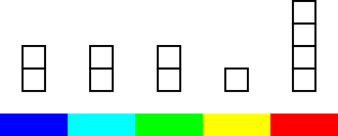
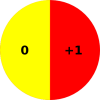
Figure 1 represents a probability distribution.
|
We will give a formal definition of probability in section 3, but first let’s give some informal examples.
|
|
Figure 1 represents a probability distribution.
|
|
|
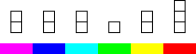
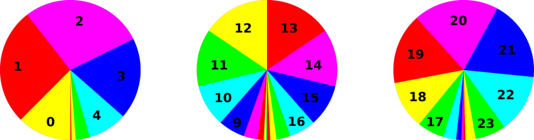
Figure 2 represents another probability
distribution.
|
If you consider the disk in figure 2 as a dart board, and throw darts at it randomly, then intuitively you would think that any dart that hits the disk would have a 25% chance of hitting a red sector.
However, we will define our fundamental notion of probability in a way that does not depend on random darts or any other kind of randomness. There will be some discussion of random sampling in section 9, but we do not depend on this for our definition of probability. Instead, we start by focusing attention on the areas in these figures. In each case, the disk as a whole represents 100% of the area, and the various colors represent subsets of the area.
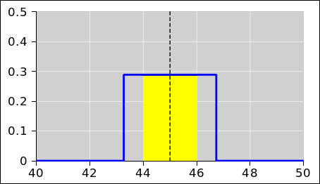
The disks in section 1.1 are not the only way of representing probabilities. Another representation uses histograms. It’s the same idea, just a different way of picturing it.
|
|
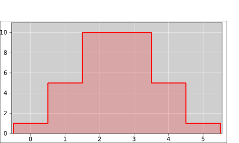
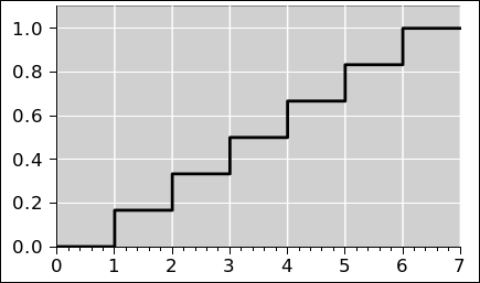
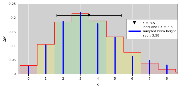
Figure 3 shows the histogram representation of the same probability we saw in figure 1. You can see that there are 10 blocks total, and the red color is assigned 3 of the 10 blocks, i.e. 30% of the total probability. |
|
|
Figure 4 shows the histogram representation of the same probability we saw in figure 2. In this case there are 12 blocks total, and the red color is assigned 3 of the 12 blocks, i.e. 25% of the total probability. |
A probability distribution is not a number. A number is not a probability distribution. In grade school you learned how to do arithmetic with numbers. Later you learned how to do arithmetic with vectors ... such as adding them tip-to-tail, which is conceptually rather different from adding mere numbers. Now it is time to learn to do arithmetic with probability distributions. In fact a distribution is more like a vector than a number.1 You can visualize a vector as either a little arrow or as the inverse spacing between contour lines on a topographic map. You can visualize a probability distribution as a pie chart or as a histogram.
As a related point: There is no such thing as a random number. If you have a number drawn from a random distribution, the randomness is in the distribution, not in the number.
|
You can talk about drawing a number from a random distribution, but that doesn’t mean the number is random.
|
Also note that it is perfectly possible to have a distribution over non-numerical symbols rather than numbers, as discussed in section 3.4.
Note that there are lots of different probabilities in the world. For example, the probability P[foo] in figure 3 is different from the probability P[bar] in figure 4 ... and there are innumerable other probabilities as well.
There are different kinds of probabilities, and different probabilities within each kind.
Note that since we tossed this coin an odd number of times, it is impossible for the observed frequency to be equal to the ideal theoretical probability (namely 50:50). On the other hand, theoretically, we hope that if we tossed the coin a huge number of times, the observed frequency would converge to the ideal.
Note that the foregoing list contains examples of comparing one probability distribution to another. We shall encounter this idea again and again. Sometimes one distribution is in some sense “close” to another ... and sometimes not. Sometimes one distribution converges to another ... and sometimes not. Convergence is discussed in section 13.
There are some nice, simple, hands-on experiments you can do that will give you a feel for the basic concept of probability. See e.g. reference 1.
A nice easy-to-understand yet sophisticated presentation of the foundations of probability can be found in reference 2.
We define a measure as follows:
We define a probability measure to be a measure with the additional property that:
Beware: The word “measure” is commonly used in two ways that are different in principle, and just similar enough to be confusing.
- Speaking of “the” measure or “a” measure by itself refers to the function described above. We can write this as µ or µ(...). This is a function, i.e. a set of ordered pairs.
- Speaking of the measure of a set refers to µ(s), i.e. the number we get by applying the function µ to a particular set s.
A familiar example of a probability measure consists of a finite set of discrete elements, where we assign one unit of measure to each element of the set. The discrete, uniformly-sized blocks in figure 3 are an example of this type of measure; to find the measure, all you need to do is count blocks. An election using the “one person one vote” rule can be considered a probability measure of this type.
A familiar example of a different type of probability measure consists of intervals – and sets of intervals – on a finite subset of the real line, where the measure of an interval is just the length of the interval. This is called the Lebesgue measure. The sectors in a pie chart such as figure 1 are an example of this type of measure. (The circumference is isomorphic to the interval [0,2π] on the real line. However, if you don’t know what that means, don’t worry about it.)
Note that if we consider intervals on the entire real line – not some finite subset of the real line – then we have a measure that is not a probability measure. It fails because the measure is not bounded above.
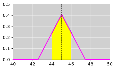
As an example of the additivity property, look again at
figure 1 and observe the following relationships:
|
|
||||||||||||||||||||||||||||||
This gives us a mathematical representation of the intuitive idea that if you throw darts at a dart board, the probability of hitting a red region or a blue region is given by the sum of the probabilities for each region separately ... assuming the various cases are disjoint, i.e. mutually exclusive.
Note: Given that the probability measure is bounded, it is sometimes convenient to normalize things to make the bound equal to 1. However, this is not required by the axioms as presented in section 3.1, and it is not always convenient. Sometimes it is advantageous to use un-normalized probabilities.
Some authorities (e.g. reference 3) go so far as to define probability using the aformentioned intuitive idea. That is, they define:
| (1) |
where we take the limit of a very large number of randomly and independently thrown darts. Note that the fraction on the RHS is a frequency, and this dubious definition is called the frequentist definition of probability. We take a different approach. We say that the areas on the disk suffice to define what we mean by probability. Our fundamental definition of probability does not depend on any notion of randomness. If you want, you can think of equation 1 as a Monte Carlo method for measuring the areas, but if we already know the areas we don’t need to bother with a Monte Carlo measurement.
This tells us that the frequentist approach is a proper subset of the set-theory approach. Set theory can incorporate and explain any frequentist result, and can do more besides.
In particular, the frequentist approach has a mandatory, built-in large-N limit ... whereas the set-theory approach has no such restriction.
In what follows, we will not make use of the frequentist definition, except in a few unimportant tangential remarks.
We have defined probability quite abstractly. It is possible to have a distribution over numbers, but it is also possible to have a distribution over abstract non-numerical symbols. Some of the interesting possibilities include the following cases:
For that matter, we could make things even more abstract by forgetting about the names and the colors. As long as we know the measure of each set, we can apply the probability axioms. We don’t need to label the sets using colors or anything else.
|
| |
| Figure 5: Point Drawn From a Distribution over Names | Figure 6: Point Drawn From a Discrete Distribution over Numbers | |
Note that in case 2 and case 3, each set has two numbers associated it, namely the measure and the numerical label. In general, these two numbers are not related in any simple way. They are two quite different concepts.
Note that case 1 (e.g. figure 5) and case 2 (e.g. figure 6) are not really as different as they might appear, because if the sets are labeled in any way, we can assign numbers to them later. An example of this is discussed in section 3.5.
Suppose C is a collection of mutually-disjoint sets. Suppose that each set s in C has a probability measure µ(s) in accordance with the axioms given in section 3.1. Suppose that at least one of the sets has nonzero measure. Further suppose that we have some other function x such that x(s) is a number (or number-like algebraic quantity), defined for each set s in our collection C. For example, in figure 5, x could be the life-span of each scientist. This gives us a distribution over x, which we call X. The simplest way of taking the average of X is defined as:
| (2) |
where the sums run over all sets s in C. This is the first moment of the distribution X. If the xi were obtained by sampling, this is called the sample mean.
Various less-general corollaries are possible:
In the special case where the collection C consists of N sets all with equal measure, we can simplify equation 2 to just
| (3) |
This is called an unweighted mean (although it might be more logical to call it an equally-weighted mean).
| (4) |
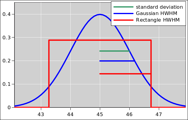
There are, alas, multiple inconsistent definitions for “the” standard deviation. In the large-N limit they all converge to the same value, but when N is not very large we need to be careful. The plain-vanilla version is:
| (5) |
My square-bracket notation is nonstandard, but it is helpful since the standard notation suffers from ugliness and inconsistency. The subscript v in [X]v2 stands for “vanilla”.
When only one variable is involved, we can define the standard deviation, namely the square root of the variance:
| (6) |
The subscript v stands for vanilla. The statistics literature calls this by the misleading name “sample standard deviation”; don’t ask me to explain why.
Let’s consider the case of a single observation, i.e. N=1. The sample standard deviation as given by equation 6 is automatically zero, because every observation is equal to the sample mean. This is a perfectly well behaved number, but it is not a very good estimator of the width of the underlying distribution.
As a first attempt to find a better estimator, we can consider the following sample-based estimate:
| (7) |
where the subscript “sbep” indicates that this is a sample-based-estimate of the population’s standard deviation. Some authorities call this the bias corrected sample standard deviation, which is yet another misleading name. It differs by a factor of √N/(N−1.5) from the plain-vanilla standard deviation [X]v. For the case of a single observation, equation 7 is useless, which is OK, because there is just no way to estimate the width of the population distribution from a single sample.
For all N≥2, equation 7 is an unbiased estimator of the width of the distribution. (We continue to assume the distribution is Gaussian.) See section 9 for more about the business of using a sample to estimate properties of the underlying distribution.
Meanwhile, we have yet a third way to define the standard deviation, namely:
| (8) |
where ⟨P⟩ is the mean of the underlying population from which the sample X was drawn ... not to be confused with ⟨X⟩ which is the mean of the sample). Equation 8 is useful in cases where you have reliable knowledge of the population mean ⟨P⟩, so that you don’t need to estimate it using ⟨X⟩. In such cases [x]p is an unbiased estimator of the width of the distribution, with no need for fudge-factors in the denominator.
Remember, to construct an unbiased estimator of the width: If you need to estimate the mean, you need N−1.5 in the denominator (equation 7) whereas if you already have a non-estimated value for the mean, you need N in the denominator (equation 8).
Beware that many software packages, including typical office spreadsheet apps, define a “stdev” function that is similar to equation 7 but with N−1 in the denominator rather than N−1.5. I have no idea where this comes from.Also beware that spreadsheets commonly represent the plain-vanilla standard deviation (equation 6) as “stdevp” where the “p” allegedly stands for population. This does not seem very logical, given that it is calculated based on the sample alone, without using any direct information about the population, unlike equation 8.
We can write the weighted average of the distribution X as:
| (9) |
where the normalization denominator is:
| (10) |
In some cases it is arranged that the weights are already normalized, so that Z=1 ... but sometimes not. In particular, if all the weight factors are equal to 1, then Z is just N, the number of terms in the sum.
We can write the vanilla variance as:
|
This is convenient, because it means that in a computational loop, all you need to keep track of is:
That means you can compute everything in one loop. This stands in contrast to the direct application of the definition in equation 11a, which would require you to compute the mean (loop #1) before you could begin to calculate the variance (loop #2).
Here’s another benefit of equation 11e: If the data is dribbling in over time, you can easily calculate the mean and standard deviation of everything you’ve seen so far, and then easily incorporate new data as it comes in.
Bottom line: It is standard good practice to organize the calculation along the lines of equation 11e.
Also: Here’s a mnemonic to help you remember where to put the factors of wi and 1/Z: Every time you do a sum it will have a factor of wi on the inside, and a factor of 1/Z on the outside. The logic of this is particularly clear if you imagine that the weights wi have units (kilograms or amperes or whatever). In particular: in equation 11a and in equation 11e, the factor of wi does not get squared. This is analogous to computing the moment of inertia (∫r2 dm), which is a weighted sum over r2, weighted by the element of mass dm. The dm does not get squared.
We continue with the notations and assumptions set forth in the first paragraph of section 3.5.
However, let’s suppose that rather than knowing two things about each set, namely µ(s) and f(s), we only know one thing, namely the measure µ(s). We don’t need to know anything else about the sets, just the measure. Also, for simplicity, in this section we assume that the probability is normalized, i.e. ∑µ(s) = 1.
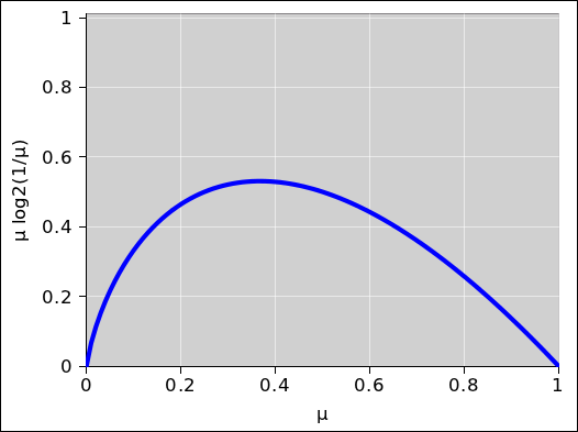
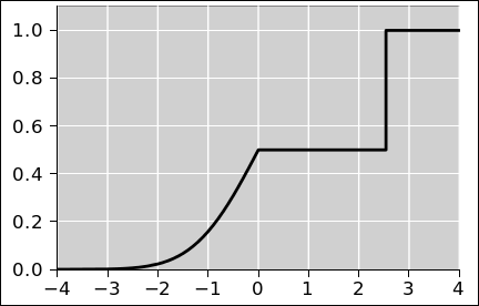
We define the surprisal of a set to be
| (12) |
and we define the entropy to be the average surprisal:
| (13) |
where the sum runs over all sets s in C, restricted to sets with nonzero measure. (Remember that the sets in C are mutually disjoint.)
It must be emphasized that the entropy is a property of the collection C as a whole, not a property of any particular set s. You can talk about the surprisal of s, but not the entropy.
Technical note: In equation 12, the surprisal remains undefined for sets with zero measure. Loosely speaking, you can think of such sets as having infinite surprisal. Meanwhile, in equation 13, such sets contribute nothing to the entropy. In effect, we are defining 0 log(0) to be zero, which is completely natural, as you can see by extrapolating the curve in figure 7 to µ=0. You can also show mathematically that the limit of µ log(µ) is zero, using l’Hôpital’s rule or otherwise. The spreadsheet to calculate this figure is cited in reference 4.
Suppose we have a coin with some probability distribution P[coin]. Similarly, suppose we have a die with some probability distribution P[die].
Now we toss the coin and roll the die in such a way that we believe, based on the physics of the situation, that they do not affect each other. In statistics terminology, we say that the coin-toss and the die-roll are independent events. We can compute the probability of the two events happening jointly, provided they are independent, simply by multiplying the probabilities for each event happening separately:
| (14) |
| If you want to be formal and mathematical about it, you can take equation 14 to be the definition of what we mean by statistical independence. Any events that satisfy this equation are said to be independent. | This mathematical definition formalizes the following physical intution: Events are expected to be “independent” if the process that produces one event cannot significantly influence the process the produces the other. |
We can extend the notion of independence to chains of events, with arbitrarily many events in the chain. The probability for the chain as a whole is simply the product of the probabilities for the individual events. For example, if we have five independent fair coins, then are 25 possible outcomes, all equally likely. If we choose to normalize the probabilities so that they add up to unity, we have:
| (15) |
More generally, let’s suppose each of the coins is off-balance in the same way, so that for each coin P[1 coin](H) = a and P[1 coin](T) = b. We continue to assume that each toss is statistically independent of the others. Then the various possible chains of events have the following probabilities:
| (16) |
Note that equation 15 can be seen as a corollary of equation 16, in the special case where a=b=1/2.
Note that an “orderly” outcome such as (H,H,H,T,T) has exactly the same probability as a “disorderly” outcome such as (H,T,H,H,T). This must be so, in accordance with the product rule (equation 14), given that the coins are identical and independent. Multiplication is commutative.
Note that when we have a chain of events, the outcomes can be considered vectors. For example, in equation 16, an outcome such as (H,T,H,H,T) can be considered a vector in an abstract five-dimensional space.
In accordance with the axioms of measure theory (section 3.1), we assign probability to sets of such vectors.
For some purposes, it is interesting to combine the vectors into sets according to the number of heads, without regard to order; that is, without regard to which coin is which. The function that counts the number of heads in a vector is a perfectly well-defined function. If we relabel heads as 1 and tails as 0, this function is called the Hamming weight of the vector.
After we have grouped the vectors into sets, it is interesting to see how many vectors there are in each set:
| (17) |
You may recognize the numbers on the RHS of equation 17 as coming from the fifth row of Pascal’s triangle, as shown in equation 18. These numbers are also known as the binomial coefficients, because they show up when you expand some power of a binomial, such as (A+B)N.
| (18) |
There are various ways of understanding why binomial coefficients are to be expected in connection with a combination of coin-tosses. You could treat it as a random walk (as in section 6.2) and proceed by induction on the length of the walk. There is also a consise explanation in terms of shift-operators, as in equation 50.
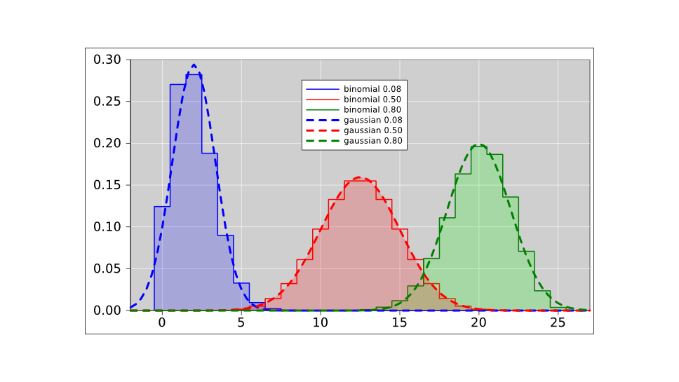
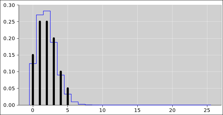
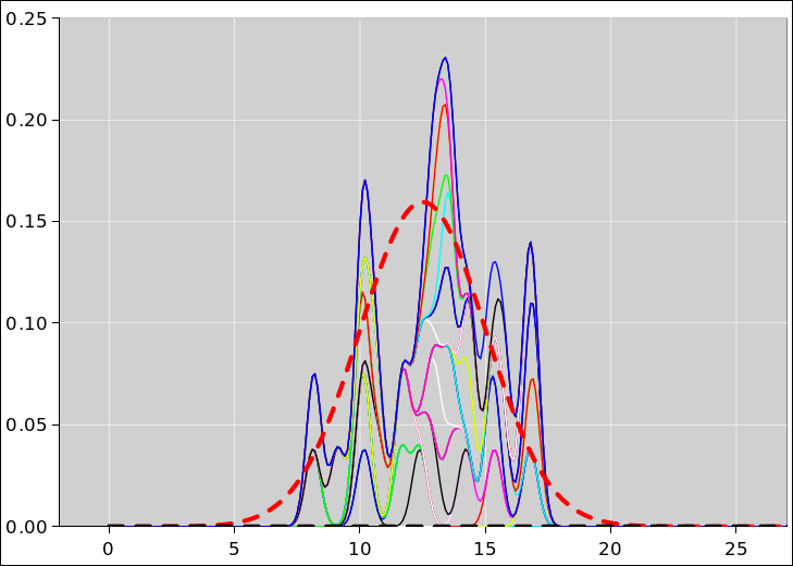
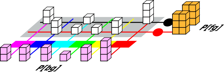
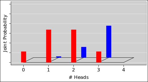
The pie chart for the probability of getting N heads by tossing five fair coins is shown in figure 8. The corresponding histogram is shown in figure 9. This figure, and several similar figures, were prepared using the spreadsheet cited in reference 5.
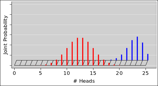
We can do the same thing with sets of 25 coins (rather than only 5 coins). The situation is similar, except that that there are almost 34 million possible vectors (rather than only 32 possible vectors). When we group the vectors into sets based on the number of heads, there are 26 possible sets (0 through 25 inclusive). The pie chart representing the multiplicity (i.e. the cardinality of each set) is shown in figure 10 and the corresponding histogram is shown in figure 11.
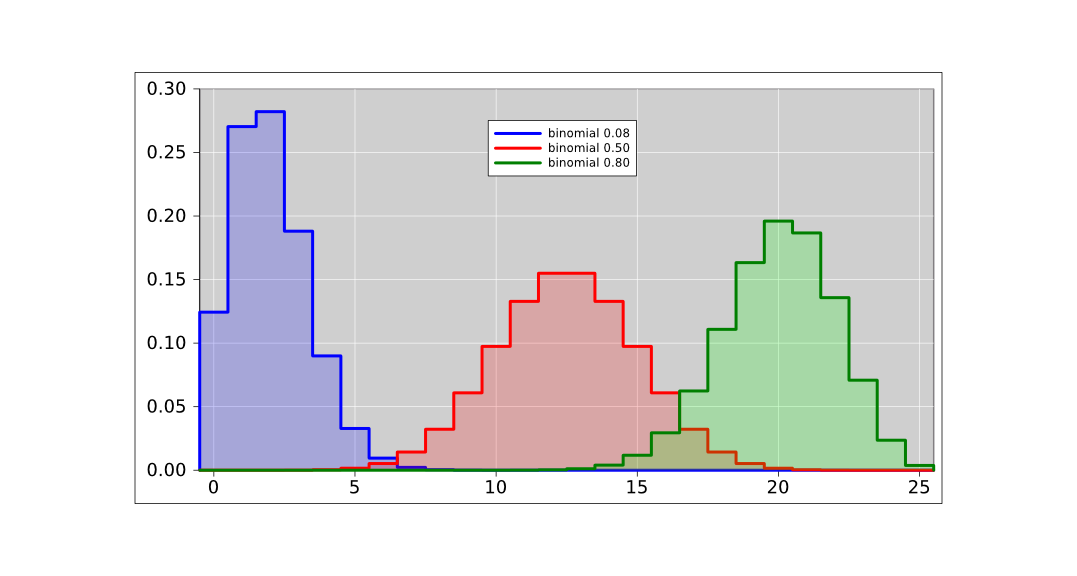
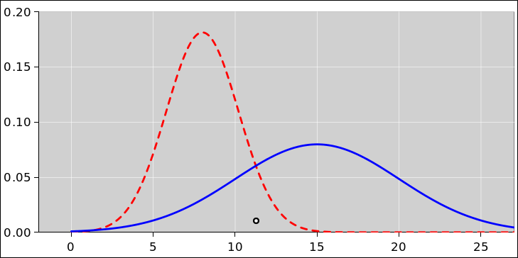
Figure 12 shows what happens if the coins are not symmetrical. The figure is normalized so that for each curve, the total probability (i.e. the area under the curve) is unity. Except for the normalization, the red curve in figure 12 is the same as the red curve in figure 11.
If we look at the average of the curve (not just the peak), we get a more precise answer. The weighted average of N (weighted by the probability) is exactly equal to the per-coin probability. This weighted average is called the mean of the distribution. While we are at it, we might as well calculate the standard deviation of the distribution.
| blue | red | green | ||||
| coins per vector | 25 | 25 | 25 | |||
| per-coin probability | 0.08 | 0.50 | 0.80 | |||
| mean # of heads | 2 | 12.5 | 20 | |||
| stdev | 1.356 | 2.5 | 2 |
The fact that the standard deviation for 25 fair coins comes out to be 2.5 is not an accident. For fair coins, the general formula for the standard deviation is half the square root of the number of coins. You can understand this in terms of a “random walk” as discussed in section 6.2.
Figure 13 shows the pie charts corresponding to the three curves in figure 12.
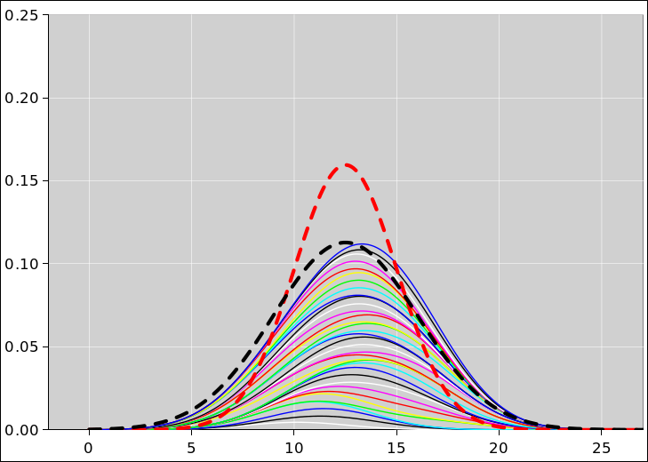
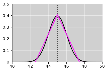
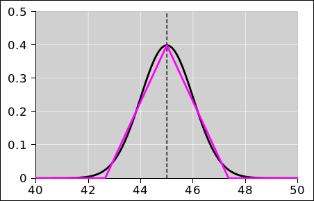
Figure 14 compares these three binomial distributions to the corresponding Gaussian distributions, where “corresponding” refers to having the same mean and standard deviation.
We see that for the fair coin, the binomial distribution is well approximated by the Gaussian distribution. However, as the coin becomes more and more lopsided, the Gaussian approximation becomes less accurate. Indeed, for the blue curve in figure 14, the Gaussian thinks there is about a 2.5% chance of getting −1 heads. The true probability for such an outcome is of course zero.
The ideas discussed in this section have many applications.
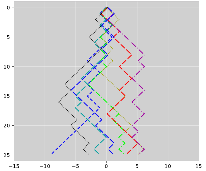
A random walk, in its simplest form, works like this. Imagine a number line, and a marker such as a chess piece that starts at zero. We toss a fair coin. If it comes up heads, we move the marker one unit in the +x direction. If it comes up tails, we move the marker one unit in the −x direction. The probability distribution over the per-step displacement Δx is shown in figure 15.
Table 2 shows the position data x(L) for eight random walks of this kind.
| walk | #1 | #2 | #3 | #4 | #5 | #6 | #7 | #8 | |
| length | |||||||||
| 0 | 0 | 0 | 0 | 0 | 0 | 0 | 0 | 0 | |
| 1 | −1 | −1 | −1 | 1 | 0 | 1 | 0 | 1 | |
| 2 | 0 | 0 | 0 | 2 | 0 | 0 | −1 | 0 | |
| 3 | 0 | −1 | 1 | 1 | 1 | 1 | 0 | 0 | |
| 4 | 0 | 0 | 0 | 0 | 2 | 2 | −1 | 0 | |
| 5 | 0 | −1 | −1 | 0 | 1 | 3 | −2 | 1 | |
| 6 | 0 | −2 | 0 | 0 | 2 | 4 | −1 | 0 | |
| 7 | −1 | −1 | −1 | 1 | 3 | 5 | 0 | 0 | |
| 8 | −2 | 0 | 0 | 0 | 4 | 6 | −1 | 0 | |
| 9 | −3 | −1 | −1 | 1 | 3 | 5 | −2 | 0 | |
| 10 | −2 | −2 | 0 | 0 | 2 | 6 | −3 | −1 | |
| 11 | −1 | −3 | −1 | 0 | 3 | 5 | −4 | −2 | |
| 12 | −2 | −4 | −2 | 0 | 4 | 4 | −5 | −3 | |
| 13 | −3 | −3 | −3 | 1 | 3 | 5 | −6 | −4 | |
| 14 | −2 | −4 | −2 | 2 | 2 | 6 | −5 | −5 | |
| 15 | −3 | −5 | −1 | 3 | 3 | 5 | −6 | −4 | |
| 16 | −2 | −4 | 0 | 2 | 2 | 4 | −7 | −3 | |
| 17 | −1 | −5 | 1 | 1 | 1 | 5 | −6 | −2 | |
| 18 | −2 | −4 | 2 | 2 | 0 | 6 | −5 | −1 | |
| 19 | −3 | −3 | 1 | 3 | 1 | 5 | −4 | 0 | |
| 20 | −4 | −2 | 2 | 4 | 2 | 4 | −5 | −1 | |
| 21 | −5 | −1 | 3 | 3 | 3 | 5 | −4 | 0 | |
| 22 | −6 | 0 | 2 | 4 | 4 | 4 | −3 | 0 | |
| 23 | −7 | −1 | 3 | 5 | 5 | 5 | −2 | 1 | |
| 24 | −8 | −2 | 2 | 6 | 4 | 6 | −3 | 0 | |
| 25 | −9 | −1 | 3 | 5 | 3 | 5 | −2 | 1 |
Figure 16 is a plot of the same eight random walks.
We now focus attention on the x-values on the bottom row of table 2. When we need to be specific, we will call these the x(N)-values, where in this case N=25. It turns out to be remarkably easy to calculate certain statistical properties of the distribution from which these x-values are drawn.
The mean of the x(N) values would be nonzero, if we just averaged over the eight random walks in table 2. On the other hand, it should be obvious by symmetry that the mean of the x(N)-values is zero, if we average over the infinitely-large ensemble of random walks derived from the probability defined by figure 15. Indeed, when averaged over the large ensemble, the mean of the x(L)-values is zero, for any L, where L is the length, i.e. the number of steps in the walk.
We denote the average over the large ensemble as ⟨⋯⟩. It must be emphasized that each column in in table 2 is one element of the ensemble. The ensemble average is an average over these columns, and many more columns besides. It is emphatically not an average over rows.
In accordance with the definition of mean, equation 2, we can calculate the mean of any function. So let’s calculate the mean of x2. We can calculate this by induction on L. In the rest of this section, all averages will be averages over the entire ensemble of random walks.
Obviously after zero steps, x is necessarily zero, x2 is necessarily zero, and therefore ⟨x2(0)⟩ is zero.
Now consider the Lth step in any given random walk, i.e. the step that takes us from x(L−1) to x(L). Denote this step by Δx. There is a 50% chance that Δx is +1 and a 50% chance that Δx is −1. The calculation goes like this:
| (19) |
In the last step, we have used the fact that ⟨Δx⟩=0 (since it is a fair coin) and also the fact that ⟨(Δx)2⟩=1 (since you get 1 if you square 1 or square −1, and those are the only two possibilities).
By induction, we obtain the famous results:
| (20) |
where RMS is pronounced “root mean square”. It means the root of the mean of the square, i.e. root(mean(square())). In accordance with the usual rules of mathematics, this expression gets evaluated from the inside out – not left to right – so you take the square first, then take the mean, and then take the root.
After a random walk of L steps, where each step is −1 or +1, the possible outcomes are distributed according to a binomial distribution, with the following properties:
| (21) |
A more general expression can be found in equation 26.
Consider the probability distribution shown in figure 17. It is similar to figure 15, but less symmetric.
We can construct a biased random walk using this probability. That is, we toss a fair coin. If it comes up heads, we move the marker one step in the +x direction. If it comes up tails, we do nothing; we leave the marker where it is.
We can analyze this using the same methods as before, if we think if it in the following terms: There is a 50% chance of Δx = ½ + ½ and a 50% chance of Δx = ½ − ½. Therefore x will undergo a steady non-random drift at the rate of half a unit per step, and then undergo a random walk relative to this mean. The step-size of the random walk will be only half a unit, half as much as what we saw in section 6.1.
Rather than calculating the mean of x2(L), we choose to ask how far x(L) is away from the mean, and calculate the square of that. This quantity is conventionally called the variance, and is denoted by σ2.
| (22) |
You can easily prove that the last line is equivalent to the previous line. It’s one or two lines of algebra. Note that the square root of the variance is denoted by σ and is called the standard deviation.
After a random walk of L steps, where each step is 0 or +1, the possible outcomes are distributed according to a binomial distribution, with the following properties:
| (23) |
A more general expression can be found in equation 26.
In words, we say that if you take a random walk of this kind, after L steps, the possible outcomes are distributed according to a binomial distribution, with the following properties:
An example of such a distribution (for L=N=25) is the red curve in figure 12.
Now let’s consider a random walk where if the coin comes up tails we displace the marker by some amount a while if it comes up heads we displace the marker by some amount b. We maintain the less-than-general assumption that the there are only two possible outcomes, and that they are equally likely; however we are now taking a more general, algebraic approach to the displacement associated with the two outcomes. The previous sections can be considered special cases, as follows:
| section 6.1 | : | a = −1 | b = +1 | |
| section 6.2 | : | a = 0 | b = +1 | |
| this section | : | a = whatever | b = whatever |
We will be interested in the quantities
| (24) |
which can be considered a change of variables. The inverse mapping is:
| (25) |
So you can see that every step moves a non-random amount p, plus a random amount ±q.
We can calculate the mean and standard deviation, by replaying the calculation in section 6.2. After a random walk of L steps, the possible outcomes are distributed according to a binomial distribution, with the following properties:
| (26) |
This is a generalization of equation 21 and equation 23. You can see that the non-random part of the step contributes to the mean, while the random part of the step contributes to the standard deviation.
When the length L is large, the distribution of x-values converges to a Gaussian with mean and standard deviation given by equation 26.
Keep in mind that this is not any particular Gaussian, but rather a whole succession of different Gaussians, one for each length L. In particular, note the following contrast:
| For any particular fixed Gaussian, as you draw more and more samples from the distribution, it becomes more and more likely that you will see an outlier, far from the center. However, distant outliers are very unlikely, more-than-exponentially unlikely. | For a random walk, and you increase L, it becomes more and more likely that you will see an outlier. These outliers are more likely than you might think, because the width of the distribution is increasing as a function of L. |
The question is, how many steps does it take on average for a random walker to get to a certain location X units from the origin? This is a surprisingly tricky problem. It turns out that the walker will always get to location X, but it might take a very very long time ... so long that the average time is infinite.
The key idea is that the total probability of eventually visiting the site is:
| (27) |
but
| (28) |
where φn is the probability of first visiting the site after n steps. One sum converges while the other does not.
These expressions are derived and explained in reference 6.
The statistics of a random walk can be used to obtain some understanding of sampling error, i.e. the sample-to-sample fluctuations that occur in situations such as public-opinion polling.
This is discussed in reference 7.
Suppose it is a few days or a few weeks before a US presidential election. State-by-state opinion polling information is available. How can we estimate the probability that a given candidate will win the electoral vote? This turns out to be rather straightforward, if we approach it the right way.
We now come to the only halfway-clever step in the whole process: Rather than directly calculating the thing we really want (namely the probability of winning), we first calculate something more detailed, namely the probability of getting exactly X electoral votes. Given the latter, we can easily calculate the former.
So, we will need a histogram representing the distribution over all possible outcomes. There are 538 electoral votes, so there are 539 possible outcomes, namely X=0 through X=538 inclusive.
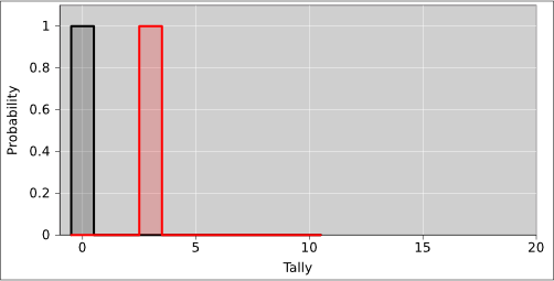
As emphasized in section 2.1 and elsewhere, a probability distribution is not a number. However, we can use a distribution to encode a representation of a number (among other things). For example, the black distribution in figure 18 represents a 100% probability that the tally is exactly X=0 votes. Separately, we can have another distribution, such as the red distribution in figure 18, that represents a 100% probability that the tally is exactly X=3 votes.
Note that adding votes to the tally shifts the entire distribution in the +X direction. In figure 18, each distribution is a zero-entropy distribution. That means we are just using the X-axis as a glorified number line. However, things are about to get more interesting.
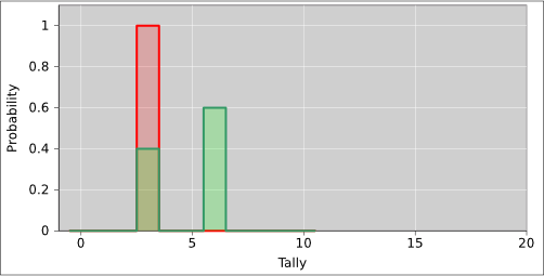
In figure 19, the red distribution is the same as before. The green curve represents a 40% probability of getting three votes and a 60% probability of getting six votes. Now we have a distribution with nonzero entropy. The green curve can easily arise as follows: We consider only two states. The first state, with three electoral votes, is certain to go for this candidate, as shown by the red curve. The second state has another three electoral votes, and has a 60:40 chance of going for this candidate. The second state by itself is not represented in the figure. The green curve represents the sum of these two states. The process of getting from the red curve to the green curve can be understood as follows: There is a 40% chance that the tally stays where it was (at X=3) and a 60% chance that it gets shifted three votes to the right (to X=6).
Because there is only a 40% chance that the tally stays where it was, the green curve at X=3 is only 40% as tall as the red curve at that point. Note that in all these curves, the area under the curve is the same, in accordance with the idea that probability is conserved.
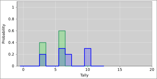
We now consider a third state. It has 4 electoral votes, and has a 50:50 chance of going for this candidate. So, in figure 20, as we go from the green curve to the blue curve, there is a 50% chance that the tally stays where it was, plus a 50% chance that it gets shifted four votes to the right.
As we consider the rest of the states, the pattern continues. We can process the states in any order, since addition is commutative. In particular, when the electoral college meets, they can add up the votes in any order. This tells us that when we shift our probability distribution in the +X direction, one shift commutes with another.
We can express the procedure mathematically as follows: The histogram is the central object of interest. We consider the histogram to be a vector with 539 components.
As we add each state to the accounting, if there is a probability a of winning V electoral votes, the update rule is:
| (29) |
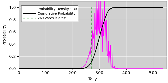
The results of such a calculation are shown in figure 21. For details on how this was accomplished, see section 8.2.
The magenta curve is the histogram we have been talking about. It represents the probability density distribution. This curve is scaled up by a factor of 30 to make it more visible. Meanwhile the black curve represents the cumulative probability distribution. As such, it is the running total of the area under the magenta curve (i.e. the indefinite integral).
The probability of winning the election is given by the amount of area associated with 270 or more electoral votes. You can see that this candidate has about a 90% chance of winning.
At this point, we have a number for the probability of winning the election, which is nice, but we can do even better. We can do a series of what-if analyses.
For starters, we note that the so-called “margin of error” quoted in most polls is only the shot noise, i.e. the sampling error introduced by having only a finite-sized sample. It does not include any allowance for possible systematic error.
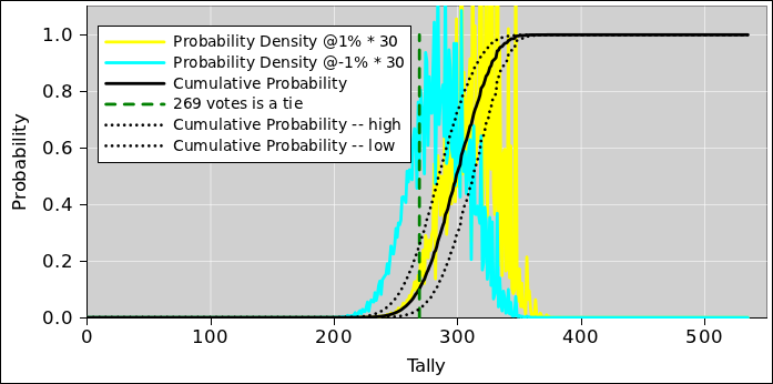
Figure 22 shows the effect of a possible small systematic error, one way or the other. One nice thing about having our own spreadsheet model is that we can shift the data a tiny amount one way or the other and see what happens.
The figure shows the effect of a 1% shift in the opinion polling data, one way or the other. You can see that even quite small systematic errors can have a dramatic effect on the outcome. A 1% change in the polling margin produces vastly more than a 1% change in the probability of winning the electoral vote. That’s because the winner-take-all rule acts as a noise amplifier. If you carry the state,2 even by the smallest margin, you get all of that state’s votes.
The solid black curve in figure 22 is the same as in figure 21 and represents the unshifted result, while the dotted lines represent the shifted results. This way of measuring the system’s sensitivity to systematic error can be considered an example of the Crank Three Timestm method, as set forth in reference 8.
Note that the black curve is highly nonlinear in the regime of interest. This has some interesting consequences. It means that symmetrical inputs will not produce symmetrical outputs. Specifically: suppose that the systematic error could go in either direction, to an equal extent with equal probability. That is a symmetrical input, but it will not produce equal effects at the output. If the candidate you expect to win overperforms the polls, he still wins, and nobody notices. On the other hand, if the candidate you expect to win underperforms the polls, even by a rather small amount, it gives the other candidate a much larger chance of winning. If the unexpected candidate wins, everybody will run around wondering how the polls could possibly have been off by so much. The answer is that the polls are almost always off by that much, but it doesn’t matter except in tight races ... and even then, it might or might affect the final result, depending on whether the error was in the positive direction or the negative direction.
There are of course innumerable other what-if analyses you could do. For example, if some oracle told you that this candidate would definitely win Florida, you could fudge the polling data for that one state, and see what effect that would have on the possible outcomes. The spreadsheet provides a couple of convenient ways of applying such fudges, and for turning them on and off.
Note that when the opinion polls exhibit systematic error, it does not imply that the pollsters are incompetent or biased. There are multiple perfectly reasonable explanations for the systematic error, including:
If one state shifted one way and another state shifted the other way, the overall effect would mostly wash out, but in fact it is common to see systematic, correlated shifts. Opinion can respond at the last minute to campaign activities as well as to external events e.g. hurricanes, sudden financial crises, et cetera.
Also note corrupt election officials can make it difficult or impossible for people they don’t like to cast votes. They only bother to do this in battleground states, so if you don’t see it happening in your state, that doesn’t mean it isn’t happening or that it isn’t significant to the overall outcome.
It is straightforward to calculate the electoral college histogram using a spreadsheet or other computer language. The two main steps are:
Note that if you organized this calculation in the wrong way, there would be an enormous number of possibilities to consider: Winning or losing in one state gives two possibilities. Winning or losing in two states gives four possibilities. Winning or losing in N states gives 2N possibilities. Alas, 251 is about 2.3×10¹⁵, so it is quite infeasible to consider all of them separately.
Fortunately we don’t have to consider all 251 possibilities. That’s because we don’t much care which states are won, just so long as we know the final electoral vote tally (or the distribution over tallies). A calculation involving 539 rows and 51 columns is easily feasible on an ordinary personal computer.
As a related point: It cracks me up when some so-called pundit on TV says that he “cannot imagine” a path to victory that does not run through Ohio, or a path to victory that does not run through Florida, or whatever. Well, whether or not that guy cannot imagine it, such paths do exist. Millions upon millions of such paths exist. None of them is particularly likely on a path-by-path basis, but they add up.
We now introduce the notion of randomness.
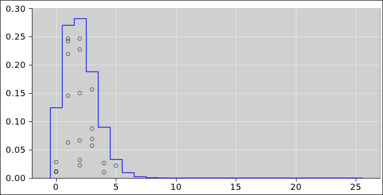
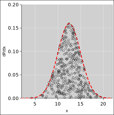
Let’s look at figure 23, which is the same as figure 1 with one slight addition. The small circle represents a data point randomly drawn from the distribution. Similarly the collection of ten small circles in figure 24 represents a set of ten data points drawn from the distribution.
As an example of random sampling, imagine throwing darts randomly at a dart board.
Before the data point is drawn, there is an element of randomness and uncertainty. However, after the point is drawn, the uncertainty has been removed. For example, the point in figure 23 is red. This is a definite, known point, and it is definitely red. You can write this result into your lab notebook. The result is not going to change.
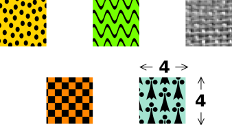
The field of statistics uses a lot of seemingly-ordinary words in ways that conflict with the ordinary meaning. Consider the swatches of fabric shown in figure 25.
| In ordinary conversation, among scientists and/or non-scientists, we would say this is a set consisting of five samples. | In statistics jargon, we would say this is one sample, consisting of five swatches. |
| In ordinary terminology, as used by scientists and non-scientists alike, the sample-size here is 4×4. Each of the samples has size 4×4. | In statistics jargon, the sample-size here is 5. The sample consists of 5 swatches. |
Scenario: In the chemistry lab, if somebody asks you to prepare a sample of molybdenum and measure the density, he is almost certaintly talking about a single swatch. If later he tells you to use a larger sample, he is almost certainly talking about a more massive swatch (not a larger number of swatches).
In this document, whenever we use the word sample in its technical statistical sense, we will write it in small-caps font, to indicate that it is a codeword. When speaking out loud, you can pronounce it “statisample”. Mostly, however, we just avoid the word, and substitute other terms:
| sample (non-statistical) | → | swatch |
| or data point | ||
| sample (statistical) | → | data set |
| sample-size (statistical) | → | number of data points |
| or cardinality of the data set |
A related word is population. In figure 24, the colored disk is the population and the collection of small black circles is a sample drawn from that population.
Things get even more confusing because according to some authorities, in statistics, a sample can be any arbitrary subset of a population, not just a randomly-selected subset. If you want a random sample you have to explicitly ask for a “random sample”. (All the samples considered in this document will be random samples.
To understand what error bars mean – and what they don’t mean – let’s apply some sampling to a well-behaved distribution over numbers.
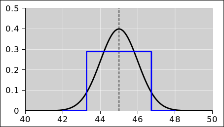
| Let’s throw darts at the leftmost pie-chart in figure 13. In the pie chart, the presence of a point in a color-coded sector is meaningful, but the (r,θ) position of the point within the sector is not meaningful. The points are randomly spread out within the sector just to make them easier to see. | Equivalently we could throw darts at the corresponding histogram, as shown in figure 26. In the histogram, the x-position of the points is meaningful but the y-position is not. The points are randomly spread out in the y-direction just to make them easier to see. |
As mentioned in section 9.1, bear in mind that before the point is drawn, there is an element of randomness and uncertainty ... whereas after the point is drawn, we know absolutely what it is. For example, if the drawn point is a 25-coin vector with zero heads, the number of heads is zero. It is not zero plus-or-minus something; it is just zero.
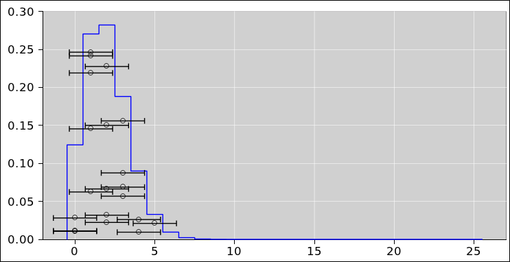
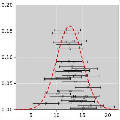
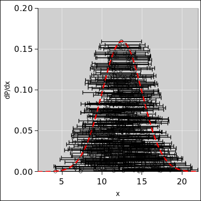
In particular, it is a common and highly pernicious misconception to think of the points themselves as having error bars, as suggested in figure 27.
Uncertainty is not a property of any given data point, but rather a property of the distribution from which the points were drawn. The distribution in figure 26 has a perfectly well-defined standard deviation, namely 1.356 ... but if we draw a point from this distribution and observe the value 0, it would be quite wrong to write it as 0±1.356. This is what the error bars in figure 27 seem to suggest, but it is quite wrong in principle and problematic in practice.
An expression of the form 0±1.356 means there must be some sort of probability distribution centered at zero with a half-width on the order of 1.356 units. In this case it is super-obvious that there is no distribution centered around zero. For one thing, it is physically impossible to have a vector with less than zero heads.
Let’s be clear: If you know the distribution, it tells you a lot about what points might be drawn from the distribution. The converse is much less informative. One or two points drawn from the distribution usually do not tell you very much about the distribution. See section 13.1 for more discussion of what can go wrong.
Given a huge ensemble of data points drawn from the distribution, we could accurately calculate the standard deviation of the ensemble. This would remain a property of the ensemble as a whole, not a property of any particular point in the ensemble. For more discussion of this point, see section 13.2 and especially section 13.3.
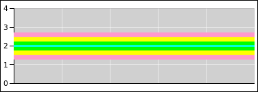
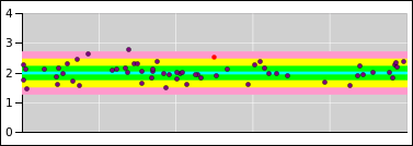
Sometimes the error bars are primarily in the x-direction and sometimes they are primarily in the y-direction. The fundamental ideas are the same in either case. You just need to rotate your point of view by 90 degrees. In particular, we now leave behind figure 26 where the data was distributed in the x-direction. We turn our attention to figure 28 where the data is distributed in the y-direction.
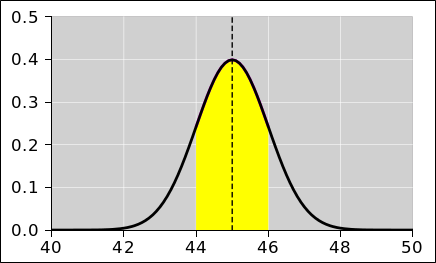
In figure 28 we are taking a bird’s-eye view, looking down on the top of a Gaussian distribution. There is a distribution over y-values, centered at y=2. Green represents ±1σ from the centerline, yellow represents ±2σ, and magenta represents ±3σ. The distribution exists as an abstraction, as a thing unto itself, just as the pie chart in figure 23 exists as a thing unto itself. The distribution exists whether or not we draw any points from it.
Meanwhile in figure 29, the small circles represent data points drawn from the specified distribution. The distribution is independent of x, and the x-coordinate has no meaning. The points are spread out in the x-direction just to make them easier to see. The idea here is that randomness is a property of the distribution, not of any particular point drawn from the distribution.
According to the frequentist definition of probability, if we had an infinite number of points, we could use the points to define what we mean by probability ... but we have neither the need nor the desire to do that. We already know the distribution. Figure 28 serves quite nicely to to define the distribution of interest. The spreadsheet used to prepare this figure is cited in reference 10.
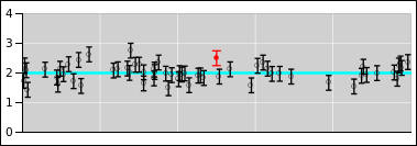
By way of contrast, it is an all-too-common practice – but not a good practice – to focus attention on the midline of the distribution, and then pretend that all the uncertainty is attached to the data points, as suggested by the error bars in figure 30.
In particular, consider the red point in these figures, and consider the contrasting interpretations suggested by figure 29 and figure 30.
| Figure 29 does a good job of representing what’s really going on. It tells us that the red point is drawn from the specified distribution. The distribution is centered at y=2 (even though the red dot is sitting at y=2.5). | Figure 30 incorrectly suggests that the red point represents a probability distribution unto itself, centered at y=2.5 and extending symmetrically above and below there. |
| Specifically, the red point sits approximately 2σ from the center of the relevant distribution as depicted in figure 29. If we were to go up another σ from there, we would be 3σ from the center of the distribution. | Figure 30 wrongly suggests that the top end of the red error bar is only 1σ from the center of “the” distribution i.e. the alleged red distribution ... when in fact it is 3σ from the center of the relevant distribution. This is a big deal, given that 3σ deviations are quite rare. |
Band plots (as in figure 29) are extremely useful. The technique is not nearly as well known as it should be. As a related point, it is extremely unfortunate that the commonly-available plotting tools do not support this technique in any reasonable way.
Tangential remark: This can be seen as reason #437 why sig figs are a bad idea. In this case, sig figs force you to attribute error bars to every data point you write down, even though that’s conceptually wrong.
Please do not confuse a distribution with a point drawn from that distribution.
|
It should be obvious from figure 61 and/or from basic frequentist notions that if you have a lot of points, the spread of the set of points describes and/or defines the width of the distribution from which the set was drawn. Widening the set of points by adding “error bars” to the points is a terrible idea, as we can see in figure 62.
It is less obvious but no less true that when you have only one or two points, they don’t have error bars. We need different figures to make this point, such as figure 28 and figure 29. The width of the distribution is the same, no matter how many points are drawn from it. You can draw any number of points, from zero on up, and the distribution remains the same.
Sometimes people say there “must” be some uncertainty “associated” with a point. Well, that depends on what you mean by “associated”.
Another counterargument starts from the observation that the uncertainty you get from thermodynamics and/or from the calibration certificate is only one contribution to the overall uncertainty. It is at best a lower bound on the actual uncertainty.
Some of the mistaken notions of width “associated” with individual points can be blamed on “significant figures” ideas, which wrongly imply that it is not possible to write down a number without “implying” some amount of uncertainty “associated” with the number. Very commonly, the purpose of taking data is to obtain an estimate of properties of the distribution from which the data is coming. However, that estimate is made after you have taken many, many data points. A large set of data points can give you a good estimate, but a single point cannot. (A numerical example of this is shown in lurid detail in section 13.1.) In any case, the idea that you have to know the width of the distribution before writing down the first data point is just absurd.
For more information about the many absurdities of “significant digits”, see reference 8.
There are standard techniques for using a computer to produce samples drawn from any probability distribution you choose. See reference 11.
There is a facetious proverb that says
In this section we discuss a method for looking at statistical data that might otherwise have been difficult to visualize.
Sometimes you have two variables (such as height and width), in which case you can make a two-dimensional scatter plot in the obvious way.
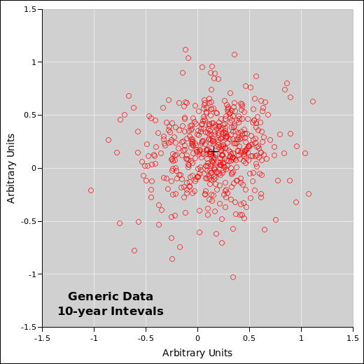
However, let’s suppose there is really only one variable. You still might find it advantageous to plot the data in two dimensions. An example of this is shown in figure 34. The horizontal axis shows the net change over a 10-year period. The vertical axis shows the exact same data, except lagged one year. In other words, there is one point for which the horizontal position represents the change from January 1980 to January 1990. The vertical position of that same point represents the change from January 1981 to January 1991. This representation would be ideal for discovering any year-to-year correlations, but this data set doesn’t appear to have much of this. Therefore all this “lag” procedure does is give us a way of spreading the data out in two dimensions, which is worth something all by itself, insofar as the 2D representation in figure 32 is easier to interpret than a 1D representation as in e.g. figure 38.
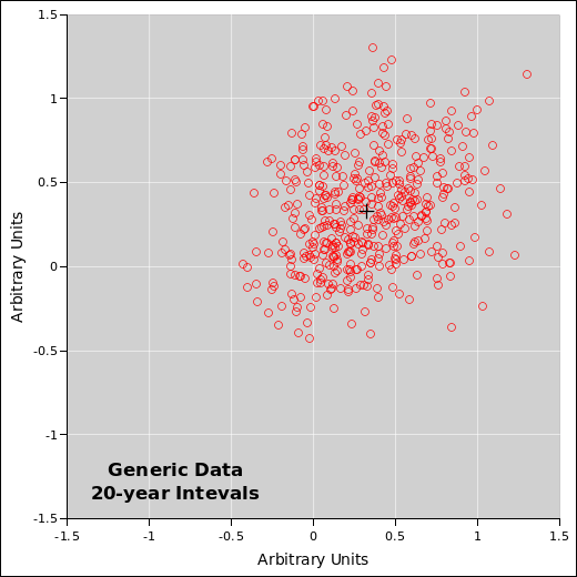
Note: In this section, we are treating the data as “generic” data. The meaning doesn’t matter much. It could be tack-tossing data for all you know. Perhaps somebody tossed a few tacks every month for 50 years. We are being intentionally vague about it, in order to make the point that some statistical techniques and visualization techniques work for a very wide class of data.Despite that, the data has a not-very-well-hidden meaning, as discussed in section 10.2.
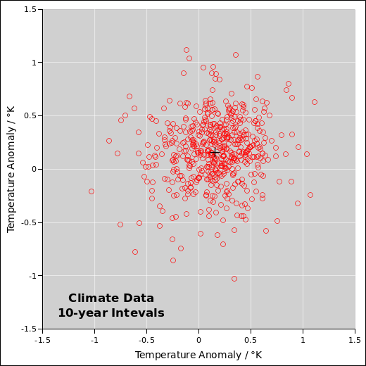
The data in figure 32 is rather noisy. The fluctuations are large compared to the trend, even when we integrate the trend over a 10-year period. As indicated by the black cross, the trend is about 0.15 units in ten years, or about 0.015 units per year, but you would be hard pressed to discern this by eye, without doing the calculation. Note that even though there is an increasing trend, a large number of data points are below zero, indicating that there was no increase, or a negative increase, over this-or-that ten year interval.
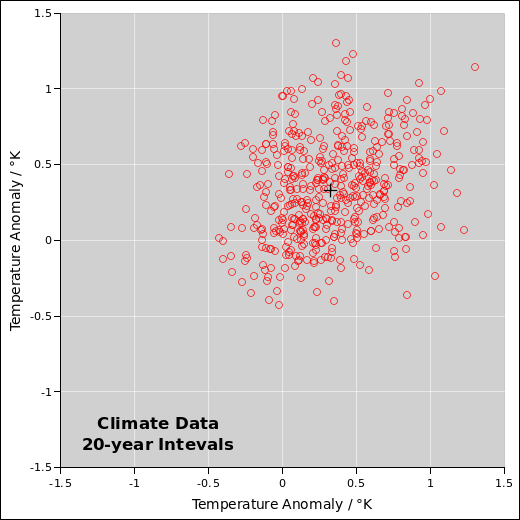
Meanwhile, figure 33 shows the exact same physical process, but integrated over 20-year intervals. The signal-to-noise ratio is better in this diagram. The signal is twice as large, and the noise is smaller. The overall trend is clear. The average 20-year increase is well above zero. Still, even so, there are more than a few 20-year intervals where the data moves the “wrong” way, i.e. where the fluctuations overwhelm the trend.
The overall lesson here is that when you see data like this, you should recognize it for what it is: noisy data. The signal-to-noise ratio is small. The signal is small, but not zero. The noise is large, but not infinite. Extracting the signal from the noise takes some skill, but not very much.
As a corollary, don’t try to make policy decisions based on one single ill-chosen ten-year sample of noisy data. If you are going to look at ten-year intervals, look at all the ten-year intervals, as in figure 32.
Conversely, somebody who is sufficiently foolish or sufficiently dishonest can always select a ten-year interval that is wildly atypical of the overall data set. If somebody tries this, tell him to look at all the ten-year intervals ... or better yet, look at the longer-term trends and stop fussing over the fluctuations.
Another lesson is that visualization is important. Among other things, it helps to look at the data in more than one way. Apply some creativity. If you have a conventional time series such as figure 36 and you’re not sure whether the recent fluctuations are consistent with prior historical fluctuations, try looking at different representation, such as figure 34 or figure 35.
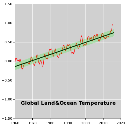
Despite what you saw in section 10.1, no competent statistician would willingly analyze “generic” data. The first thing you should do is find out everything you can about the data. In this case, it turns out the data is 100% real. It is global temperature data, published by reference 12. It is replotted with proper labels in figure 34 and figure 35 See also reference 13 for some ocean data. Based on this data and a whole lot of other data, we know that temperatures are increasing at an alarming rate. (We also know why they are increasing, but that is a separate issue.)
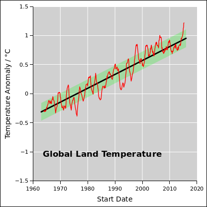
Figure 36 shows a more conventional presentation of the same data, namely the temperature anomaly versus time. The ordinate is a one-year moving average. For example, it might be the average from one April to the next. The corresponding ordinate is the start of the interval. The “anomaly” is defined to be the observed temperature, relative to a baseline defined by the 1961–90 average.
Note that there was a tremendously strong El Niño during the winter of 1997–98, which is clearly visible in the data. This tells us we ought to be looking at the energy, not just the temperature. There was not a sudden increase in the earth’s energy, just in the surface temperature, because a bunch of energy got moved out of the deep ocean into the atmosphere. Energy explains the temperature, and then temperature explains what happens to plants, animals, glaciers, et cetera.
Important note: See the discussion of reversion to the mean in section 10.3.
The fact that the 20-year interval data is less noisy than the 10-year interval data suggests that the process is not a random walk. It’s not quite like tack-tossing. As noisy as this data is, the moderately-long-term data is not as noisy as it could be. One hypothesis that partially explains this is a smallish number of oscillators at different frequencies, gradually drifing in and out of phase. El Niño is an oscillation, and there are others. Another partial explanation is that there are some negative feedback processes. That means that a fluctuation due to (say) a huge volcanic eruption affects things for only a finite amount of time; this stands in contrast to a random walk, where a run of unusual luck shifts the distribution permanently.
One very scary thing about climate physics is that there are some positive feedback loops (not just negative). If we don’t clean up our act, one of these days there’s going to be a large fluctuation that doesn’t die out.
Real data has fluctuations. It’s the nature of the beast. If you’ve only got two or three data points, a large amount of noise can be fatal ... but if you’ve got hundreds or thousands of data points, you can tolerate quite a bit of noise, and still reach valid conclusions, if you analyze things carefully enough.
Typical data will always be less extreme than the extreme data. That should be obvious. It’s true almost by definition. This concept is so important that it has a name: Reversion to the mean, or equivalently regression to the mean.
Consider the so-called Sports Illustrated Jinx: If somebody gets his picture on the cover of Sports Illustrated, his performance usually goes down. This is readily understood in terms of reversion to the mean. The achievment that earned him the cover story was probably exceptional even for him so we expect typical data to be less extreme. By the time the magazine hits the newsstands, his hot streak is probably already over.
Here’s another example: If you toss a fair coin and it comes up heads 9 times in a row, that’s unusual, but not impossible. The best way to explain it is to say that it doesn’t require a special explanation; it’s just a routine fluctuation; there’s nothing special about it. It does not tell you anything whatsoever about what happens next. The next 9 tosses will not be all tails to «compensate». The next 9 tosses will not be all heads to «continue the streak». Far and away the most likely thing is the the next 9 tosses will be more-or-less ordinary.
Sometimes reversion to the mean does not occur, but only in situations where something happens to change the data. For example, suppose a student gets exceptionally good grades by a lucky accident, and that leads to a scholarship, which leads to better grades in the long run, because he can spend more time studying and less time working to earn a living. Similarly, if a political candidate gets some good poll numbers, not based on actual popularity but only on statistical fluctuations in the polling process, that can cause additional campaign contributions and additional media coverage, leading to a genuine long-term increase in popularity.
Still, the fact remains that if the data is random, with no feedback processes, a fluctuation tells you nothing about what happens next. It takes some skill to look at the data and figure out what’s a fluctuation and what’s a trend. Some skill, but not much.
Here’s a notorious example: In early 2003, climate deniers said there had been no warming in the last 5 years. In early 2008 they said there had been no warming in the last 10 years. In early 2013 they said there had been no warming in the last 15 years, actually a slight cooling. They called it a “hiatus” in the warming trend, or even the end of the warming trend. This is pure chicanery. It was obviousl wrong all along. For one thing, the fact that they kept shifting the size of the comparison window was a clue that they were up to no good. When you compare to an extraordinarily warm El Niño season (i.e. 1997–98), there will be a dramatic – but meaningless – reversion to the mean. Making policy decisions on the basis of such a comparison is beyond outrageous.
The green band in Figure 36 is the one-σ error band. You can see that at no time since 1998 has the temperature anomaly been more than 1σ below the long-term trend line. It was obvious all along that there was no hiatus; all of the data was consistent with the long-established warming trend and consistent with the fact that the data is noisy.
Policy decisions should be based on apples-to-apples comparisons. If you compare typical data to the long-term trend, there is no hiatus, and there never was. Meanwhile, if you want to make an oranges-to-oranges comparison, compare the 1997-98 El Nĩno to the 2015-16 El Nĩno. Again you can see that the warming trend continues unabated. The point of this section is that you should be able to look at noisy data and understand the difference between a fluctuation and a trend. Exceptions do not signal a change in the trend. Reversion to the mean does not signal a change in the trend.
The 2015-16 El Nĩno makes it obvious to everybody that there never was a hiatus, but the point is that this should have been obvious all along; it should have been obvious even without that.
Plotting the data and the error band makes it easy to see what’s expected and what’s not.
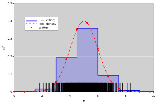
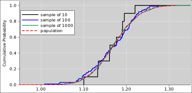
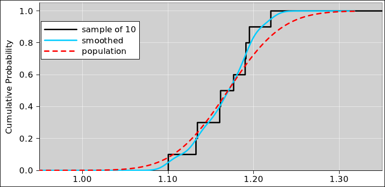
If you have one-dimensional data and don’t spread it it out into two dimensions, you will soon run into problems, because too many data points fall on top of each other. For example, consider figure 38. The black vertical slashes represent a scatter plot of a sample consisting of 1000 data points. This is a one-dimensional distribution, distributed over x. The blue histogram is another representation of this same set of data points.
In addition, the dotted red line in the figure shows the population from which the data points were drawn. The population is an ideal Gaussian. It must be emphasized that in the real world, one rarely knows the true population; it is shown here only for reference. In particular, the scatter plots, histograms, and diaspograms in this section are constructed without reference to the population distribution.
In figure 38, both representations of the data are imperfect.
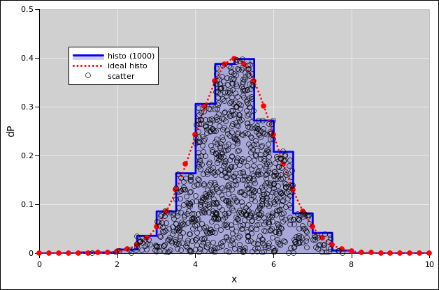
To get a better view of the data in figure 38, we can spread the data out in the y-direction, as in figure 39. The black circles in this figure are in one-to-one correspondence with the black slashes in the previous figure. In particular, the abscissas are exactly the same.
In figure 39, the y values are random, with a certain amount of spread. The question arises, how much spread should there be? The best idea is to spread the points by a a random amount proportional to the local probability density. If we do that, then the resulting scatter plot will have a uniform two-dimensional density.
In any case, this results in spreading out the data point so that they fill the area under the curve, under the (exact or estimated) probability density function. I call this a diaspogram, based on the Greek word for spreading.
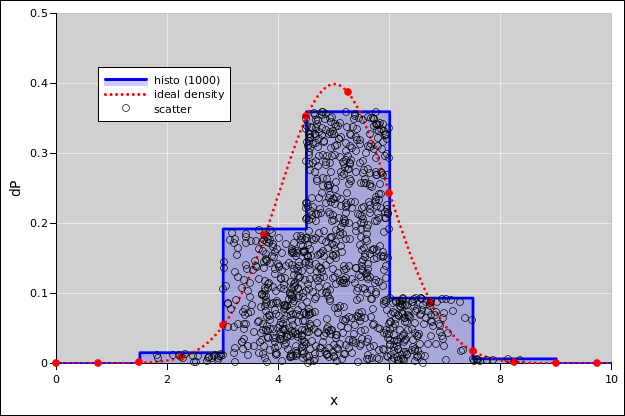
The diaspogram gives us quite a bit more information than either the histogram by itself or the unspread data by itself. In particular, if there is something seriously wrong with the histogram, this gives a chance to notice the problem. For example, in figure 40, you can see that the points are too dense in the region from x=6 to x=6.5, and too sparse in the region from x=7 to x=7.5. This tells us that the histogram bin-size is too coarse. The histogram is not doing a good job of tracking the local probability density. This problem was equally present in figure 38, but it was much less easy to notice.
The diaspogram idea applies most directly to one-dimensional distributions. It also applies to data that lies on or near a one-dimensional subspace in two or more dimensions. The idea can be extended to higher-dimensional data, but the need is less and the methods are more complicated, beyond the scope of the present discussion.
The spreadsheet that produces these figures is given in reference 14.
Consider the contrast:
When using adaptive bin-widths, there are many ways of choosing the widths. One nice way of doing it is to arrange for each bin to have an equal share of the probability, so the taller bins are narrower. This provides for more resolution along the x-axis in places where we can afford it, i.e. in regions where there is enough data.
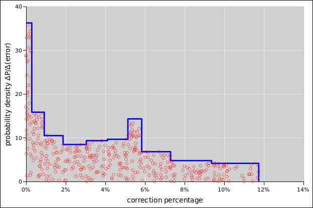
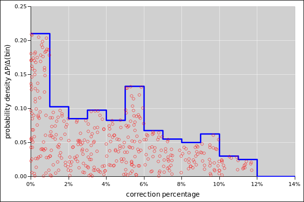
For the data in figure 41, uniform bin-widths would to a dramatically worse job of representing the data, as you can see in figure 43. The diaspogram shows far too much data scrunched up against the left edge of the first bin (near error=0) and also against the left edge of the last bin (near error=12%).
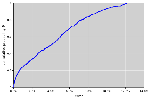
A deeper analysis of the situation (which we are not going to do here) would tell us that for this data, the probability density near error=0 is very high, indeed singular. A vertical rise in the cumulative probability (figure 42) corresponds to infinite probability density.
The spreadsheed used to analyze this data and create the plots in given in reference 15.
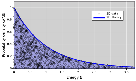
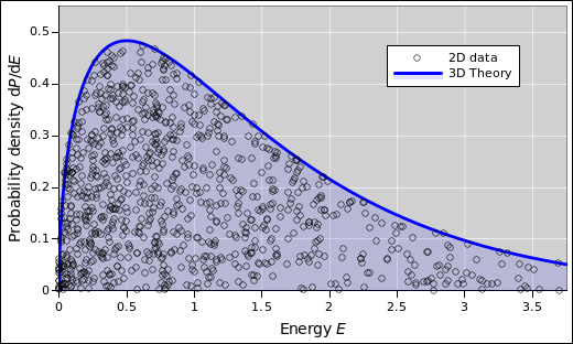
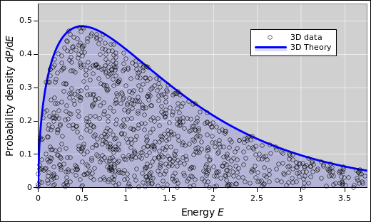
The diasopgram idea is not restricted to histograms. Suppose you have some particles that are free to move in two dimensions. Due to thermal agitation, there will be some distribution over energy for each particle. If you check the data against the correct theory, it should look like figure 45. In contrast, suppose you naïvely look up the usual Maxwell-Boltzmann formula. If you check the data against this formula, it looks like figure 45. This is not good. The density of dots is far too high at the left, and far too low at the right. The formula assumes three dimensions, which is not correct in this case.
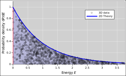
The reverse problem arises if you plot the 3D data against the 2D theory, as in figure 45.
Consider figure 48. For one thing, note that the figure actually gives two representations of the same distribution.
We expect that as we increase the number of points in the scatter plot, it becomes a better and better representation of the ideal distribution, but this is not necessary. The ideal Gaussian distribution exists as a thing unto itself, and is not defined in terms of the scatter plot.
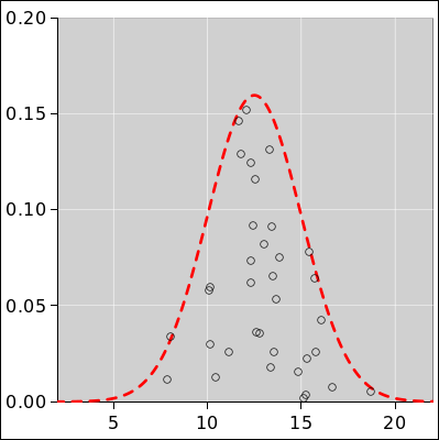
This is considered a one-dimensional distribution, because the probability is known as a function of x alone. That is to say, when we draw a point from the distribution, we care only about where it lies along the x-axis, the horizontal axis. In the figure, the points are spread out vertically, but primarily this is just to make them easier to see; you could redistribute them vertically without changing the meaning.
Secondarily, we have used a clever trick: At each point along the x axis, the points are spread vertically by an amount proportional to the probability density in the vicinity of x. That means that the scatter plot has a uniform density per unit area in the plane.
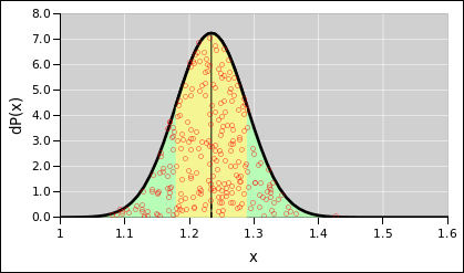
The yellow-shaded region extends one standard deviation to each side of the midline. Recall that in this example, the nominal value is 1.234 and the standard deviation is 0.055. You can see that “most” of the probability is within ± one standard deviation of the nominal value, but there will always be outliers.
The ordinate is dP(x), which you should think of as the probability density. For any x, there is zero probability of finding a point exactly at x, but the probability density tells you how much probability there is near x.
Last but not least, it must be emphasized that the data points have zero size. In the scatter plot, the points correspond to the centers of the red circles. The size of the circle means nothing. The circles are drawn big enough to be visible, and small enough to avoid overcrowding. There is a width to the distribution of points, but no width to any individual point. For details on this, see section 13.
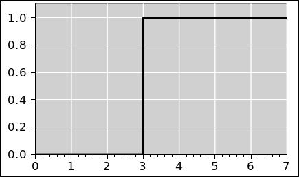
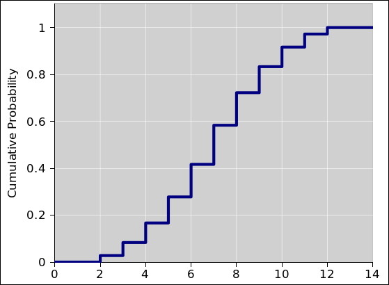
Figure 50 presents exactly the same information as figure 49, but presents it in a different format. Figure 50 presents the cumulative probability. By that we mean the following: Let’s call the curve in figure 50 P(). Then at any point x (except where there is a discontinuity), the value P(x) is the probability that a given roll of the dice will come out to be less than x. More generally (even when there are discontinuities), the limit of P(x) as we approach x from below is the probability that the outcome will be less than x, and the limit as we approach x from above is the probability that the outcome will be less than or equal to x.
|
| |
| Figure 49: Probability Density for a Pair of Dice | Figure 50: Cumulative Probability for a Pair of Dice | |
So for example, we see that there is zero probability that the outcome will be less than 2, and 100% probability that the outcome will be less than or equal to 12.
We use the following terminology. For a one-dimensional variable x, we have:
| (30) |
where the operator d... represents the exterior derivative. The “lt” stands for “less-than” and is needed because we can also define
| (31) |
where the “le” stands for “less-than-or-equal-to”. In one case the horizontal tread of the stairstep function includes the point at the low-x and and not the high-x end, while the other case is just the opposite. For some purposes it is convenient to duck the issue and leave the cumulative probability distribution function undefined at the location of each vertical riser. The probability density distribution is the same in any case. Note that mathematically speaking a so-called “delta function” is not really a function. Mathematicians call it a delta-distribution, although that terminology is very unfortunate, because it conflicts with the word for probability distribution.
The terminology and notation in equation 30 is fairly widely used, but beware that people often take shortcuts. This is a way for experts to save time, and for non-experts to get confused. It is common to write P(x) which might refer to either P[lt] or P[le].
It is even more common to get sloppy about the distinction between P(x) and p(x). For example, p(x) is all-too-often called “the” probability even though it doesn’t even have dimensions of probability. It really should be called the probability density, or equivalently probability per unit length. In particular, a Gaussian is not a graph of “the” probability, but rather the probability density.
For some reason, the probability density distribution (as in figure 49) is more intuitive, i.e. easier for most humans to interpret. In contrast, the cumulative representation (as in figure 50) is more suitable for formal mathematical analysis.
It is easy to convert from one representation to the other, by differentiating or integrating.
Here are some examples of discrete distributions:
There is an important distinction between an individual outcome and a distribution over outcomes. The distribution assigns a certain amount of probability to each possible outcome.
There are many different distributions in the world. For starters, we must distinguish the “before” and “after” situations:
| Before the toss, for an ideal die, the initial distribution assigns 1/6th of the probability to each of the six possible outcomes, as shown in figure 51. | After the die has been tossed, suppose we observe three spots. The set of remaining possibilities is a singleton, i.e. a set with only this one element. The final distribution assigns 100% of the probability to this one outcome, as shown in figure 52. |
In a discrete distribution, the outcomes do not need to be integers. It is perfectly possible to have a distribution over rational numbers, over real numbers, or even over abstract symbols. As a familiar and important example, there are 2.54 centimeters per inch. Even though 2.54 is a rational number, and even though there are infinitely many rational numbers, is no uncertainty about having 2.54 centimeters per inch. There is a 100% probability that there will be 254 centimeters in 100 inches, by definition. The cumulative probability for this distribution is shown in figure 53.
Now suppose we have a continuous distribution (as opposed to a discrete distribution). This allows us to handle situations where there are infinitely many possible outcomes. This includes outcomes that are represented by rational numbers or real numbers, such as length or voltage.
We can contrast the discrete distributions we have just seen with various continuous distributions:
Some people who have been exposed to sig figs think that every time you write a rational number in decimal form, such as 2.54, there must be some “implied” uncertainty. This is just not true. The width of the riser in figure 53 is zero. There is some width in figure 54 and in figure 55, but not in figure 53.
When sane people write 2.54, they are writing down a rational number. It is 254/100, and that’s all there is to it. As such, it is exact. This number can be used in various ways, as part of more complex expressions. For example:
Let’s be clear: You are allowed to write down a number without saying – or implying – anything about any sets or distributions from which the number might have come.
For some purposes, it is conceptually important to distinguish 2.54 (which is a plain old number) from [2.54±0.005] (which is an interval). It is OK to talk about them using the same language, treating them both as distributions, as in figure 53 and figure 54 ... but we can clearly see that they are different distributions.
Furthermore, even though they are different, there are some situations where we can get away with blurring the distinction:
Tangential remark: There is a tendency to associate continuous distributions with infinite sets and vice versa, but this is not strictly necessary, as we have seen in figure 53. It is also possible to have a hybrid distribution (aka mixed distribution), i.e. partly continuous and partly discrete. In figure 56, for example, half of the probability is spread over the negative real numbers, while the other half of the probability is assigned to a single positive number, namely 2.54. The probability for all other positive numbers is zero. The distribution for negative numbers is half a Gaussian; if it were a whole Gaussian it would have a mean of zero and a standard deviation of unity. You can see that about 16% of the total probability lies to the left of -1, which is what you would expect for such a distribution.
| In this section, we start by considering the convergence of the sample mean to the population mean, and the convergence of the sample variance to the population variance. (Note that the mean is the first moment of the distribution, and the variance is the second moment ... which explains the title of this section.) | We defer until section 13.2 and section 13.3 any discussion of point-by-point convergence of one distribution to another. Beware that is quite possible for two distributions to have the same mean and same variance, yet be quite different distributions, as we see for example in the blue curves in figure 14. |
In table 2, we have a set of random walks. In accordance with the statistics jargon mentioned in section 9.2, we can call this a sample of random walks. In this case, the sample-size is 8.
In section 6.1 we used the axioms of probability to calculate the mean and variance of the distribution from which these walks were drawn, i.e. the population. These calculations concerned the population only, and did not depend on the tabulated sample in any way.
As a rather awkward alternative, you could take the frequentist approach. That is, you could imagine vastly increasing the sample-size, i.e. adding vastly more columns to table 2. Let N denote the number of columns. On each row of the table, you can evaluate the mean and variance of the sample. In the limit of large N, we expect these values to converge to the mean and variance of the original population.
There are a lot of ways of drawing a sample of size N. To make sense of this, we need to imagine a three-dimensional version of table 2
To make progress, let’s get rid of the L-dimension by focusing attention on the case of L=1 i.e. the toss of a single coin. We then “unstack” the third dimension, so that it can be seen in table 3. When the sample-size is N=1, there are only two possible samples. That is to say, the cluster of samples has two elements. More generally, the cluster of samples has 2N elements, as you can see by comparing the various clusters in the table. The clusters are color-coded, and are separated from one another by a blank line, and are distinguished by their N-value.
The columns of the table have the following meanings:
| rms | cluster avg | rms | cluster avg | rms | |||||||||||||
| raw data | N | s_mean | error | s_stdev | s_stdev | error | error | sbep_p_stdev | sbep_p_stdev | error | error | ||||||
| relpop | relpop | relpop | 1.5 | relpop | relpop | ||||||||||||
| 1 | 1 | 1 | 1 | 0 | 0 | −1 | 1 | 0 | 0 | −1 | 1 | ||||||
| −1 | 1 | −1 | 0 | −1 | 0 | −1 | |||||||||||
| −1 | −1 | 2 | −1 | 0.71 | 0 | 0.5 | −1 | 0.71 | 0 | 1 | −1 | 1 | |||||
| −1 | 1 | 2 | 0 | 1 | 0 | 2 | 1 | ||||||||||
| 1 | −1 | 2 | 0 | 1 | 0 | 2 | 1 | ||||||||||
| 1 | 1 | 2 | 1 | 0 | −1 | 0 | −1 | ||||||||||
| −1 | −1 | −1 | 3 | −1 | 0.58 | 0 | 0.71 | −1 | 0.5 | 0 | 1 | −1 | 0.58 | ||||
| −1 | −1 | 1 | 3 | −0.33 | 0.94 | −0.057 | 1.3 | 0.33 | |||||||||
| −1 | 1 | −1 | 3 | −0.33 | 0.94 | −0.057 | 1.3 | 0.33 | |||||||||
| −1 | 1 | 1 | 3 | 0.33 | 0.94 | −0.057 | 1.3 | 0.33 | |||||||||
| 1 | −1 | −1 | 3 | −0.33 | 0.94 | −0.057 | 1.3 | 0.33 | |||||||||
| 1 | −1 | 1 | 3 | 0.33 | 0.94 | −0.057 | 1.3 | 0.33 | |||||||||
| 1 | 1 | −1 | 3 | 0.33 | 0.94 | −0.057 | 1.3 | 0.33 | |||||||||
| 1 | 1 | 1 | 3 | 1 | 0 | −1 | 0 | −1 | |||||||||
| −1 | −1 | −1 | −1 | 4 | −1 | 0.5 | 0 | 0.81 | −1 | 0.37 | 0 | 1 | −1 | 0.39 | |||
| −1 | −1 | −1 | 1 | 4 | −0.5 | 0.87 | −0.13 | 1.1 | 0.095 | ||||||||
| −1 | −1 | 1 | −1 | 4 | −0.5 | 0.87 | −0.13 | 1.1 | 0.095 | ||||||||
| −1 | −1 | 1 | 1 | 4 | 0 | 1 | 0 | 1.3 | 0.26 | ||||||||
| −1 | 1 | −1 | −1 | 4 | −0.5 | 0.87 | −0.13 | 1.1 | 0.095 | ||||||||
| −1 | 1 | −1 | 1 | 4 | 0 | 1 | 0 | 1.3 | 0.26 | ||||||||
| −1 | 1 | 1 | −1 | 4 | 0 | 1 | 0 | 1.3 | 0.26 | ||||||||
| −1 | 1 | 1 | 1 | 4 | 0.5 | 0.87 | −0.13 | 1.1 | 0.095 | ||||||||
| 1 | −1 | −1 | −1 | 4 | −0.5 | 0.87 | −0.13 | 1.1 | 0.095 | ||||||||
| 1 | −1 | −1 | 1 | 4 | 0 | 1 | 0 | 1.3 | 0.26 | ||||||||
| 1 | −1 | 1 | −1 | 4 | 0 | 1 | 0 | 1.3 | 0.26 | ||||||||
| 1 | −1 | 1 | 1 | 4 | 0.5 | 0.87 | −0.13 | 1.1 | 0.095 | ||||||||
| 1 | 1 | −1 | −1 | 4 | 0 | 1 | 0 | 1.3 | 0.26 | ||||||||
| 1 | 1 | −1 | 1 | 4 | 0.5 | 0.87 | −0.13 | 1.1 | 0.095 | ||||||||
| 1 | 1 | 1 | −1 | 4 | 0.5 | 0.87 | −0.13 | 1.1 | 0.095 | ||||||||
| 1 | 1 | 1 | 1 | 4 | 1 | 0 | −1 | 0 | −1 | ||||||||
Note that we are playing with Bernoulli trials and binomial distributions here. For large numbers of coins, the binomial distribution is well approximated by a Gaussian, but not for small numbers of coins. For Gaussian data, finding an unbiased estimator is quite tricky; see reference 16.
| Beware that in a typical office-software spreadsheet, the stdev(⋯) function includes a fudge factor, namely √N/(N−1) (not √N/(N−1.5)). That means it does not calculate the standard deviation of the sample. Rather it attempts to estimate the standard deviation of the population from which the sample was drawn, but it doesn’t do a very good job of that, either. The fudge factor that it uses is probably never exactly what you want, for reasons discussed in reference 16. | In contrast, the stdevp(⋯) function calculates the sample standard deviation, with no fudge factor. If this is not what you want, at least it can be used as a sane starting point for calculating something else. |
It must be emphasized that when you are doing actual experiments, you never get to see the whole cluster of samples; all you get is one sample out of the cluster. The sample mean and sample variance are generally rather noisy, and you do not have the luxury of averaging over the whole cluster.
Please refer to figure 57, which is a clone of figure 26. It shows two distributions: A source distribution (aka population) which is an ideal binomial distribution, shown by the blue line, and an empirical histogram, describing a randomly-drawn sample, shown by the number of points in each column.
Figure 58 is another way of showing the same two distributions. Once again, the ideal binomial is shown by a blue line. In this figure, the frequency histogram of the sampled data is shown by the black bars. Recall that the frequency is a perfectly good probability distribution, just a different distribution from the population distribution from which the sample was drawn.
In figure 58, the frequency histogram (black bars) can be considered a Monte Carlo estimate of the source distribution (blue outline). You can see that the height of each black bar is quantized as a multiple of 1/20th, as a consequence of the fact that we have drawn 20 data points total. If we increase the number of points ad infinitum, the estimate will get better and better. In other words, the sample distribution will converge to the population distribution. This is what you would expect in accordance with the frequentist school of thought, and it works as advertised.
More specifically, this approach works as advertised if the source is a distribution over a collection of discrete sets, as in figure 58. In contrast, for something like a Gaussian, which is a distribution over a continuous set of x-values, the notion of convergence is rather trickier, as discussed in section 13.3 and section 13.4.
Again, it pays to realize that there are two distributions here. Under some conditions one distribution converges to the other, but not under others.
It must be emphasized that the leftmost black bar in figure 58 is located at x=0. It is not 0 plus-or-minus something; it is just plain 0. Similarly the next black bar is located at x=1. It is not 1 plus-or-minus something; it is just plain 1.
To repeat: If we do things properly, drawing a large-enough sample with no error bars on the data points, the frequency histogram (as shown by the black bars) will converge to the the theoretical histogram (as shown by the blue outline).
In this section we tell a cautionary tale about error bars. This continues the discussion from section 9.3.
We are considering a distribution over a one-dimensional variable x. As discussed in section 11, we can make the data easier to understand by spreading it out in the y-direction, as in figure 59. The data here has the same x-values as in the previous figure. The x-values are meaningful whereas the y-values are not.
It is common practice – but not recommended – to imagine that each point comes with its own error bars. This unwise idea is depicted in figure 60. Except for the error bars, this figure is the same as figure 59.
Figure 61 is the same as figure 59 except that it shows more points.
This gives a rather graphic meaning to the idea of “Monte Carlo integration”, because the following two interpretations are equivalent. Either way, counting the dots gives us a way to measure the area under the curve:
Adding error bars to the points is still a terrible idea, as shown in figure 62.
Since the idea of assigning “width” to the points is such a prevalent and pernicious misconception, we now turn to yet another way of depicting what’s going on. In what follows, we represent each data point not by a circle with error bars, but instead by a Gaussian distribution of its own. This is just another way of representing the the idea of width. This is shown in figure 63.
The dashed red curve is the source distribution, just as in the other figures in this section. Below it are N=35 curves representing the running sum of N little Gaussians, each representing a data point drawn from the source distribution. The Gaussians are stacked on top of each other, totem-pole style, so that the ith curve is the sum of the first i Gaussians. Each little Gaussian has a standard deviation equal to the alleged error bar, namely the error bars shown in figure 60. The area of each little Gaussian is 1/N. In other words, each of them represents 1/Nth of the total probability measure. In the figure, each curve is a sum of Gaussians, so to find the area of the Gaussian itself, look at the area between one curve and the one below it.
Last but not least, the dashed black curve is a reference, just like the dashed red curve except √2 shorter and √2 wider.
In accordance with basic frequentist ideas, you might have hoped that in the limit of large N, the sum of little Gaussians would converge to the source distribution, i.e. the dashed red curve. Alas this does not happen. The sum of the little Gaussians converges to the black dashed curve, which is the wrong answer. It is √2 too fat and √2 too short.
Let’s be clear: If you think there is an uncertainty “associated” with each point drawn from the source distribution, the sum you get by combining all these “uncertain” points will never converge to the right answer. Increasing N will not help.
We can make further progress if we accept the idea that each point drawn from the source distribution is a little delta function with zero width, i.e. no error bars – or very narrow error bars. In this way, some parts of the frequentist approach can be made to work, if we do things just right. A step in this direction is shown in figure 64. This figure is very similar to figure 63, except that the N little Gaussians are much narrower. The reconstruction is somewhat noisy, but at least it is not so badly systematically wrong. Furthermore, we can get rid of the noise by increasing N.
We should not get carried away in the direction of making the little Gaussians narrower. Theory tells us that the data points have zero width, and as such should be represented by little delta functions. However, a finite sum of delta functions will never be equal to a nice smooth Gaussian. For that matter, a sum of too-narrow little Gaussians will be a bad approximation to the original big Gaussian, as we can see in figure 65.
The reconstructed distribution in figure 65 has the right mean and the right standard deviation (to a good approximation) ... but the higher moments are not right. Overall it is not the right distribution.
For additional discussion of reconstruction and convergence, see section 13.5.
In this section we consider the convergence of cumulative probability distributions. We shall see that this is much more robust than the convergence of the probability distributions considered in section 13.3.
By way of background, recall that in figure 65, it is not easy to reconstruct a probability density distribution. We can use a series of reconstructions that converges in the limit of large N, if we do things properly, but for any finite N there is a tradeoff to be made: Whatever width we give to the little Gaussians causes the reconstruction to be systematically too wide. On the other hand, whatever height we give to the little Gaussians makes the reconstruction noisy. We can’t eliminate their height and width while still giving them finite area.
An intelligent way out of this dilemma is to ask for convergence of the cumulative probability distributions. rather than the probability density distributions. An example of such convergence is shown in figure 66. The dashed red curve is the original source distribution, i.e. the population. The black curve represents a sample of 10 data points drawn from the population. The blue curve represents 100 points. The green curve, which is half-hidden behind the red curve, represents 1000 points.
Each data point is treated as a zero-width delta function of probability density, corresponding to a zero-width vertical step in the cumulative probability. This gives us a well-behaved notion of a limiting process that results in pointwise convergence. At no point in the process do we need to pretend that the points have any “error bars” ... so there is no risk of making the distribution systematically too wide.
On the other hand, it is still possible to make a tradeoff if you want: The reconstruction “looks better” and more closely approximates the source distribution if we round off the corners a little bit, as you can see in figure 67. A little bit of smoothing makes the convergence better, but too much would make it worse.
Comparing the approaches in this section against section 13.3:
| Cumulative Probability Distribution | Probability Density Distribution |
| The CPD converges automatically, with strictly zero added width at every step along the way. | The PDD converges if you provide some added width that goes asymptotically to zero. |
| This is an important issue of principle, because it means the convergence can be studied objectively, without any choices, without any artistry, without any adjustable parameters. Also in practice is its convenient to be able to plot the cumulative probability distribution without having to choose a bin-size or anything like that. | For finite N, it requires some artistry, some judgment, to decide how much added width to use. For example, in a histogram, one must choose a bin-size. |
| The cumulative probability distribution might converge better if you provide some added width that goes asymptotically to zero. This is optional, and does not raise any issues of principle. |
Before we can do a decent job of reconstructing the source distribution based on N points drawn from the source distribution, there is a technical detail that needs to be dealt with one way or another:
There are several limits involved, which must satisfy the following requirements:
In the pattern recognition business, the general idea of reconstructing a distribution by adding up slightly blurry sub-distributions is called the Parzen Windows approach.
Returning to figure 63, it is easy to understand why this approach cannot possibly get the right answer:
Figure 68 shows a probability distribution where the various areas carry two labels, namely the background (sector) color and the foreground (spot) color.
We can measure how much area is associated with the foreground label, or the background label, or both, or neither. As an example of the “neither” case, the entropy does not depend on the labels at all, as discussed in section 3.8. In this section we will be primarly concerned with the “both” case, where both labels are used jointly.
In this example, the combination of red background and black foreground occupies 3/12ths of the disk (in two regions, diametrically across from each other).
Figure 69 shows the same thing, using the histogram representation rather than the pie chart representation. The combination of red background and black foreground is assigned 3 out of 12 units of measure, as you can see in the upper-right corner of the histogram. The combination of red background and red foreground is assigned zero measure, as you can see in the lower-right corner of the histogram.
We can express these ideas in mathematical terms:
| (32) |
The two lines in equation 32 are equivalent. Both refer to having a red background and a black foreground. In an expression such as P[⋯](⋯), the first part P[⋯] tells us the name and structure of the function, and the second part (⋯) tells us what variables are being passed to the function.
If you leave off the square brackets, you are left with something like P(black, red), which is ambiguous. Sometimes it is possible figure out from context what it is supposed to mean, but sometimes not. Abbreviate the notation at your peril. Beware that the conventional notation that you find in standard statistics books is quite confusing for a number of reasons, including highly ambiguous abbreviations.
In accordance with the axioms of probability measure (section 3.1), we can form the union of disjoint sets, and add the probabilities. For example, we can collect all the sets with a given background color (by summing over foreground colors). This is shown along the right margin of figure 70. Similarly, we can collect all the sets with a given foreground color (by summing over all background colors). This is shown along the bottom margin in the figure.
The relevant equations are (in all generality):
| (33) |
Some numerical values are (in the example shown in the diagrams):
| (34) |
In equation 34, it should be obvious that omitting the square brackets would leave you with the expression P(red), which would be hopelessly ambiguous.
Given the joint probability and marginal probability, we can define the conditional probability as follows (in all generality):
| (35) |
The expression P[bg | fg] is pronounced “the probability of background given foreground”. The idea is that the foreground color is considered “given”.
Note that even though the joint probability can be written with the variables in any order, the same is not true for the conditional probability, when using the “|” notation. It matters a great deal which variables are on which side of the “given” bar (“|”).
| (36) |
There is, however, a way to get around this limitation:
This is useful if you want to write P[bg, fg] as an array, and want to respect the convention that the first index is the row-number and the second index is the column number. For example:
| (37) |
where we have highlighted the RHS of the last equation to emphasize that the order of the variables has been reversed, which is mathematically correct, but tends to be confusing, especially if you are writing the elements of P in rows and columns.
Here are some numerical examples, based on the example shown in the diagrams:
| (38) |
Note that neither the joint probability nor the marginal probabilty needs to be normalized, and indeed in our example they add up to 12, not 1. However, by construction, the conditional probability has its own peculiar type of normalization. It is a function of two variables, but it is normalized with respect to only one of them, namely the non-given variable, i.e. the one to the left of the “|” bar.
| (39) |
Note that an old-fashioned non-probabilistic function can be encoded as a conditional probability, in the sense that “given” a value for x, we know y with 100% probability:
| (40) |
The normalization is such that if we integrate the RHS with respect to y, we get 1 (for any x).
We can see how this works by comparing figure 71 with figure 72, both of which are conditional probabilities derived from the joint probability in figure 69. The row specifies the foreground color, and the column specifies the background color.
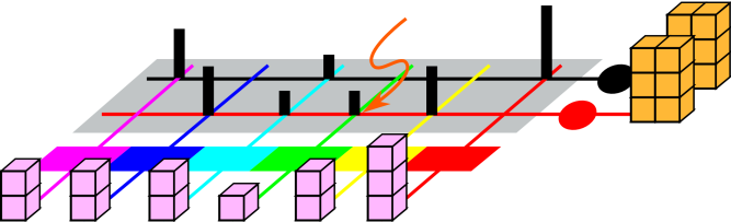
|
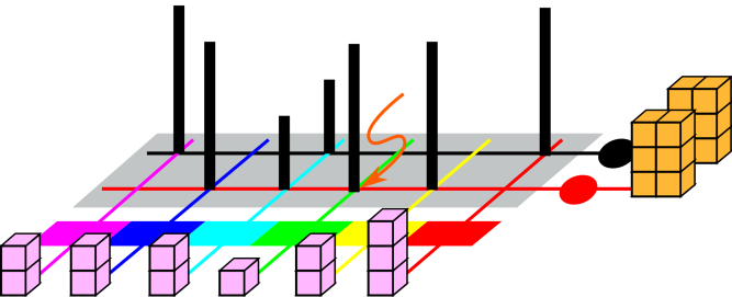
| |
| Figure 71: Conditional Probability, Given Row | Figure 72: Conditional Probability, Given Column | |
| P[@fg, bg] | P[fg, @bg] |
As a specific example, let’s start with the joint probability in figure 69, and derive from that some conditional probabilities. By way of example, we focus attention on the area that has a green background and a red foreground.
| Row-Wise | Column-Wise |
| The red-over-green area has measure 1. That is one out of 6 in its row, i.e. the red-foreground row, so the conditional probability is represented by a black bar with 1/6th of a unit of height in figure 71. The orange arrow points to this black bar. | The red-over-green area still has measure 1, but that is 1 out of 1 in its column, i.e. the green-background column, so the conditional probability is represented by a black bar with full unit height in figure 72. The orange arrow points to this black bar. |
Suppose you want to write a “horizontal” marginal in terms of a “vertical” marginal (or vice versa). As an immediate corollary of equation 35, we can write:
| (41) |
This is called the Bayes inversion formula. It has been known since 1763.
So far, for simplicity, we have restricted attention to situations with only two labels, namely foreground and background. The ideas of joint probability, marginal probability, and conditional probability can be straightforwardly generalized to larger numbers of labels.
Suppose we have an urn containing three coins. Two of them are fair coins, with probability p=0.5 of coming up heads. We mark these coins with red (for regular). The remaining coin is severely biased, with probability p=0.9 of coming up heads. We mark this one with blue (for bent or biased).
We are going to conduct an experiment consisting of many batches. Each batch proceeds as follows: Our assistant reaches into the urn and pulls out a coin at random, without regard to color and without regard to whether it appears bent or not. He then tosses the coin N times and tells us how many heads were observed. Based on that number, we try to infer whether the coin in question was bent or not. We then iterate, experimenting with various values of N. We measure a great many batches for each N, so we get good statistics.
The simplest case is when N=0. That is, we draw a coin and don’t toss it at all. We are 100% confident that zero heads will be observed (and zero tails as well). We know a priori that there is a two-thirds chance that the chosen coin was regular (red), and a one-third chance that it was bent (blue). This is shown in figure 73.
We now proceed to the case of N=1. If we perform three million batches of this kind, we expect the results to be approximately as follows: one million of them will involve a regular coin that comes up heads, one million will involve a regular coin that comes up tails, and 900,000 of them will involve a bent coin that comes up heads. Only 100,000 of them will involve a bent coin that comes up tails. This is shown in figure 74.
Similar results for higher values of N are shown in the other figures. The spreadsheet used to produce these figures is cited in reference 17.
This is all fine as far as it goes, but it does not directly tell us how to decide whether the chosen coin is regular or bent.
In the case where N=0, we might as well guess that the coin is regular. In every batch, have a two-thirds chance of guessing correctly. In this case, we are relying entirely on the a priori probability and not using experimental data at all.
Let’s now skip to the N=4 case. This allows us to make an inference based on more information. The smart way to do it is to look at the conditional probability, P[c|d], which is shorthand for the conditional probability of some coin-color, given some data. This is shown in figure 78. For the case of N=4 and zero observed heads, there is very nearly a 100% chance that the coin is regular. It is exponentially unlikely that the bent coin would come up tails in four out of four tosses.
The situation is more challenging if three heads are observed. There is about a 63% chance that the coin is fair. However, there is still about a 37% chance that the coin is bent, and just randomly happened to come up tails on one of the four tosses. In each batch of this kind, if we want to maximize the chance of guessing correctly, we should guess that the coin is fair, but we cannot be certain.
This procedure is called maximum a posteriori inference. It makes use of the priori probability and also makes use of the data. Remember, the prior probability is the fact that even before we do any tossing, we have a two-thirds chance of drawing a fair coin from the urn, and a one-third chance of drawing a bent coin. Also, the prior probability is equal to the marginal probability distribution over colors, i.e. P[c] ... as it must be, since tossing doesn’t change the color.
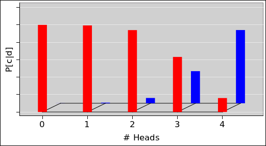
|
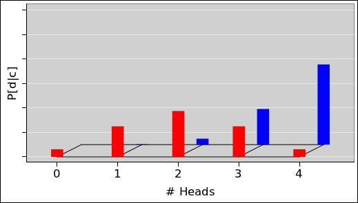
| |
| Figure 78: Conditional Probability: P[c|d] | Figure 79: Conditional Probability: P[d|c] | |
| (normalized column-by-column) | (normalized row-by-row) |
If the goal is to make the best guess as to whether the coin is bent or not, the decision procedure is simple: If x heads are observed, find the corresponding x-value in figure 78. If the red curve is higher, guess red. If the blue curve is higher, guess blue.
To say the same thing another way, in the figure there is some x-value where the two curves cross. This is called the decision boundary. For example, the decision boundary is a little to the right of x=3 in figure 78. You can equally well locate the decision boundary by finding where the joint probability curves cross, as in figure 77. It’s provably equivalent. The decision rule again is simple: If the observed number of heads is on the blue side of the the decision boundary, guess blue. If it is on the red side, guess red.
Ordinarily, it’s not good to spend time discussing misconceptions, but allowances must be made for misconceptions that are particularly pernicious and particularly prevalent. So, let’s turn our attention to the conditional probability P[d|c] as shown in figure 79. This distribution is appropriate for some purposes, but not all. In particular, let’s ask the following somewhat-artificial question: Given a particular coin, red or blue, what is the chance that tossing it four times will produce three heads?
As you can see from figure 79, tossing a known-bent coin is a slightly more efficient way of generating three heads than tossing a known-fair coin. (We continue to assume N=4 tosses.) The technical term for this is likelihood. The likelihood P[d|c](3H, blue) is 29%, whereas the likelihood P[d|c](3H, red) is only 25%. In all generality:
| (42) |
In the present example, model is synonymous with color.
As a tangential remark about terminology: Maximum a posteriori is often abbreviated MAP. You might think MAP could equally well be used an abbreviation for maximum a priori, but it’s not. The term maximum likelihood is used for that.
Returning to the main line of thought: Remember that the assigned task was to infer whether the coin was bent or not. In each batch, we have some data obtained by tossing the coin, and we wish to choose a model that explains the data. We can explain it as coming from a regular coin or a bent coin. Our decision needs to be based on the probability of the model given the data, not the data given the model. In other words, we want MAP, not maximum likelihood. Likelihood is the probability of the data given the model, which is backwards. Beware! Our decision should not be based on likelihood, because that would utterly fail to make use of the information we have on the prior probability of the models, aka the marginal distribution over models. See section 15.2 for a proof of this assertion.
For most data-analysis tasks, maximum a posteriori inference is the right strategy, and maximum likelihood is not. Figure 78 correctly tells us that our best guess is “red”, whereas figure 79 wrongly suggests that we should guess ‘blue”.
Let’s do another example, where the problem with maximum likelihood is more starkly apparent. Suppose there is some rare disease that is carried by one person out of a million. Carriers are asymptomatic at first, but before long develop sudden, very serious problems. Now suppose a test for this disease has been developed, and the test is 99% reliable. Specifically, the test has a 1% chance of indicating that the disease is present when it is not. If you take the test and it comes back positive, that emphatically does not mean that you have a 99% chance of carrying the disease. That’s because when we take the prior probability into account, your chance of having the disease only went up from 1 chance in a million to 100 chances in a million. Even though the test is in some sense 99% accurate, it is still overwhelmingly likely that you do not carry the disease.
This is important, because maximum-likelihood methods are very widely used ... and very wildly abused. For example, practically all “least squares” regression and curve-fitting routines are maximum likelihood methods, and people are all-too-often taught to use them in situations where they are not appropriate.
In some cases you can get away with using maximum likelihood methods, especially if the prior probability is reasonably flat and/or you have huge amounts of data ... but in other cases maximum likelihood can lead to seriously wrong inferences.
When there is lots of data, i.e. large N, the prior probability doesn’t matter very much. That’s because in a plot of the joint probability, the red curve becomes strongly peaked around N/2 heads, while the blue curve becomes strongly peaked around 9N/10 heads, as you can see in figure 81.
Suppose we were to change the prior probability of (say) the blue curve, scaling it up relative to the red curve. In other words, we change the marginal probability P[c](blue), making it larger relative to the marginal probability P[c](red). This would cause a modest shift in the decision boundary, but it would have rather little practical effect, because there is relatively little probability that either type of coin will generate data in the vicinity of the decision boundary, as you can see in figure 80. The decision boundary is somewhere near x=18.5.
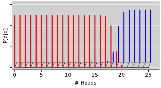
|
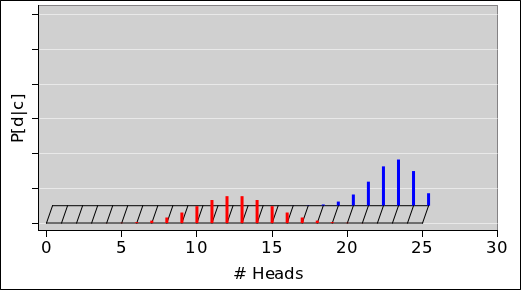
| |
| Figure 81: Conditional Probability: P[c|d] | Figure 82: Conditional Probability: P[d|c] | |
| (normalized column-by-column) | (normalized row-by-row) |
The probability of making a correct inference is given by the posterior probability, as shown in figure 81.
Meanwhile, figure 82 shows the likelihood. As usual, the likelihood is not useful for inferring whether the coin is bent or not.
Exercise: Consider the case N=0, i.e. the joint probability shown in figure 73. Calculate the likelihood and show that it is completely uninformative. Calculate the posterior probability and show that it works fine as the basis for making a reasonable guess about the coin.
As a direct corollary of the definition of conditional probability, equation 35, we have two ways of writing the joint probability in terms of conditional and marginal probabilities:
| (43) |
Let’s investigate the consequences of using an incorrect estimate of the marginal distribution over coin-color. That is, suppose the urn contained one bent coin and three regular coins, but we didn’t know that. We write
| (44) |
where the marginal Q on the RHS is similar to P but not quite correct, and as a consequence the joint Q on the LHS is not quite correct. Let’s calculate the likelihood in terms of Q. Plugging into the definition, we find
| (45) |
This is a mathematical proof of something we asserted in section 15.1, namely that the likelihood utterly fails to make use of the information we have on the prior probability of the models. You can use the right prior or a wildly wrong prior, and you get the same likelihood either way. This is not good.
Let’s take another look at figure 18, which is reproduced here as figure 83 for convenience.
As mentioned in section 2, in section 8.1, and elsewhere, sometimes it helps to think of the probability distribution as a vector in some vector space. We now elaborate this, and introduce the idea of basis vectors for this vector space.
In figure 83, we write:
| (46) |
In general, we write the zero-width distribution that encodes exactly X votes with 100% probability as |X⟩. Such a thing is called a ket.3 These can be used as a convenient basis set.
Figure 84 is a clone of figure 20. In this figure, we write:
| (47) |
The scalar in front of the ket is called a prefactor.
We now introduce the raising operator S† and the lowering operator S:
| (48) |
As another way of saying the same thing, the S† operator shifts the whole distribution one place to the right, while the S operator shifts the whole distribution one place to the left.
These operators commute4 with each other, commute with scalar multiplication, and distribute over addition:
| (49) |
As a simple example, consider the biased random walk from section 6.2. After L steps we have:
| (50) |
The RHS takes the form of a binomial. It is therefore no surprise that we encountered binomial coefficients in section 5.
For the electoral college, the effect of the ith state can be written as follows: If the state has Vi electoral votes, and the probability of losing the state is ai, and the probability of carrying the state is bi, then the state contributes a factor of
| (51) |
So the final distribution can be written as
| (52) |
This means the electoral college calculation is like a generalized random walk, where the step-size is different at every step, and where the coin is lopsided in a different way at each step.
The ket |0⟩ appears on the RHS of equation 52 to represent the starting point of the random walk.
Figure 85, figure 86, and figure 87 show Gaussian, triangular, and rectangular distributions. In each case, the area within ±1 standard deviation of the middle is shaded.
The Gaussian family can also be expressed as an equation. When the mean is zero and the standard deviation is unity, we have:
| probability density ∝ exp(−x2 / 2) (53) |
Don’t forget the factor of 2 in the denominator; it is needed to make the standard deviation come out right. You can easily prove that the standard deviation is in fact unity, by plugging equation 53 directly into equation 8 and turning the crank. Hint: integration by parts.
In more detail: If µ is the mean and σ is the standard deviation, the Gaussian normal distribution is:
| dP(x | µ, σ) = |
|
| exp |
| dx (54) |
The corresponding cumulative probability distribution is given by equation 55 and plotted in figure 92.
| P(x | µ, σ) = ½ + ½ erf( |
| ) (55) |
Here’s a mnemonic that may help you remember the denominators: If you square the argument to the erf in equation 55, and multiply by −1, you get the argument to the exponential in equation 54.
Returning attention to the probability density distribution, in equation 54, the height of the curve has been normalized so that the area under the curve is unity; that is, the total probability is 100%. You can verify this by doing the integral. Hint: If the integral is I, start by calculating I2, which you can treat as a two-dimensional Gaussian. It is easy to integrate in polar coordinates. Then take the square root.
As depicted by the red and blue horizontal bars in figure 88, the HWHM of any Gaussian is about 18% longer than the standard deviation. The results for Gaussian, triangular, and rectangular distributions are summarized in the following table:
| Gaussian | triangular | rectangular | ||||
| area under the curve: | 1 | 1 | 1 | |||
| standard deviation: | σ | σ | σ | |||
| peak height: | 0.3989 / σ | 0.4082 / σ | 0.2887 / σ | |||
| half width at half max: | 1.1774 σ | 1.2247 σ | 1.7321 σ | |||
| √2 ln 2 σ | √3/2 σ | √3 σ | ||||
| area within ±1 σ: | 68.27% | 64.98% | 57.74% | |||
| area within ±1 HWHM: | 76.1% | 75% | 100% | |||
| height × FWHM: | 0.9394 | 1.0 | 1.0 |
| Interval | Probability | |
| ± 0 σ | 0.00 % | |
| ± 1 σ | 68.27 % | |
| ± 2 σ | 95.45 % | |
| ± 2.576 σ | 99.00 % | |
| ± 3 σ | 99.73 % |
In figure 88, the blue curve is a Gaussian distribution. The standard deviation is 1.0, and is depicted by a horizontal green bar. The standard deviation of the rectangle is also 1.0, and is depicted by the same green bar.
Meanwhile, the HWHM of the Gaussian is depicted by a blue bar, while the HWHM of the rectangle is depicted by a red bar.
The numbers in table 4 and the figures in this section were produced using the spreadsheet cited in reference 18. Recall that the standard deviation is defined by equation 8. Applying this to a Gaussian, the HWHM is √2 ln 2 σ as you can verify by plugging into equation 53 or equation 54.
| A useful rule of thumb states that a Gaussian distribution and a triangular distribution look very similar. Figure 89 shows how things look when the two curves are well matched in the sense that they have the the same mean (namely 45, the same standard deviation (namely 1), and the same area under the curve (namely 1). | Another way of fitting a triangle to a Gaussian is shown in figure 90. It approximates the Gaussian by a triangle with the same height and same FWHM. This triangle has 94% as much area as the Gaussian, as you can see in the bottom row of table 4. This gives us a convenient and accurate way of estimating the area under a Gaussian curve: multiply the height by the FWHM and then multiply by 1.06. |
We can also compare a Gaussian to a rectangular distribution, as in figure 91. We find that that the rectangular approximation is not nearly so good as the triangular approximation.
Figure 92 shows the Gaussian cumulative probability distribution, for the case where the mean is 45 and the standard deviation is unity.
For a triangular distribution, the cumulative distribution is so similar to the Gaussian that the difference is almost imperceptible on this scale; see figure 93. The difference between the two curves is everywhere less than 1.65% of the total probability. On the other hand, in the wings the Gaussian is nonzero while the triangular distribution is zero. Therefore, if you think the triangular distribution is correct, in the wings the Gaussian is wrong by an infinite percentage of the local probability.
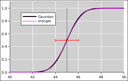
|
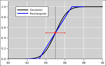
| |
| Figure 93: Gaussian and Triangle Cumulative Probability | Figure 94: Gaussian and Rectangular Cumulative Probability | |
Suppose we have a series of events, independent and identically distributed (“IID”), that occur at some averate rate r. We count the number of events (k) that occur in some time period τ. This number k is randomly distributed according to a Poisson distribution. This is a one-paramter family of distributions. The relevant parameter is the dimensionless rate λ := rτ.
Here is a general expression for the Poisson distribution:
| (56) |
It is a fairly straightforward exercise to derive equation 56. It’s just the joint probability of seeing k events in the chosen interval. The Poisson distribution can also be understood as the limiting case of a Bernoulli process where there is a small probability of seeing an event in each small sub-interval of time. Recall that a Bernoulli process is just a coin toss. In this case you want a coin that is heavily biased in favor of one outcome over the other, i.e. mostly non-events with only rare events. Rolling dice and counting snake-eyes as the only event is a super-simple way of approximating a Poisson process. Looking at a batch of 126 rolls gives rτ = λ = 3.5, to a good approximation.
It is an easy and amusing exercise to verify that the Poisson probability in equation 56 is normalized so that
| (57) |
as it should.
Some examples are shown in figure 95 and figure 96. In each figure, the diamond symbols mark the rate parameter λ. In both figures, the heavy red lines show the ideal theoretical data for λ=3.5 while the heavy black lines show the ideal theoretical data for λ=9.5. In figure 96, the additional light blue dashed lines show the date for a random sample of 250 Poisson-distributed points.
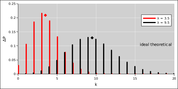
|
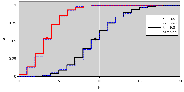
| |
| Figure 95: Poisson Discrete Probability Distribution | Figure 96: Poisson Cumulative Probability Distribution | |
| The probability density distribution consists of a collection of delta functions. It is zero for all non-integer k-values. (Some authorities claim it is «undefined» for non-integer k-values, but I disagree. It is perfectly well defined, just zero.) | By the same token, the graph of the cumulative probability distribution is horizontal for all non-integer k-values and vertical for all integer k-values. |
The distribution is quite lopsided, so the mean, mode, and median are all different. This stands in contrast to the symmetrical distributions considered in section 17.1, where for each distribution the mean, mode, and median were all the same.
- Mean: The mean of the distribution is equal to the rate parameter λ.
- Mode: The peak of the distribution (aka mode) occurs at floor(λ), i.e. the largest integer less than or equal to λ. When λ is an integer, there is a double peak, with equally-high values at k=λ and k=λ−1.
- Median: You can see from the diamond on the red curve in figure 96 that more than half of the probability lies to the left of λ, when λ=3.5. For λ=3.0001, about 65% of the probability would sit to the left of λ. On the other hand, for λ=3.9999, only about 43% of the probability would sit to the left of λ.
- Standard Deviation: For any λ, the Poisson distribution has a standard deviation equal to √λ.
- Gaussian Approximation
For large λ, the Poisson distribution can be well approximated by a nice symmetrical Gaussian centered at λ with standard deviation √λ. For not-very-large λ, the Poisson distribution is not symmetrical. It does not resemble a Gaussian. It is not centered at λ. The upper error bar is not equal to the lower error bar, and neither of them is equal to √λ.
Suppose we have a physical system that we can model as a Poisson process. The rate λ is a parameter of the model. We can observe the value of k. We have to use the observed k values to infer a suitable value of λ.
This is easier than you might think, because for any Poisson process, averaging the count k gives us the rate λ.
| (58) |
This average is the ensemble average, averaged over an ensemble of observations. In other words, it is the weighted average of k, weighted according to the probability of observing that k-value.
Let’s try to make sense of this. We restrict attention to λ=3.5.
| There are only a few k-values to the left of λ in figure 95, and they are all relatively close to λ. Obviously k cannot be less than zero. | Meanwhile, there are in principle an infinite number of k-values to the right of λ, and some of them are very very far to the right. Yet still, ⟨k⟩=λ. |
This contrast is not a paradox, because the low-k values are have more probability than the high-k values. Here are some pairs for comparison. Each pair is centered on the rate, λ=3.5.
So, even though the k-values to the left of λ are relatively few in number and lacking in leverage, when we take the weighted average, the total leftward torque is equal to the rightward torque, as it should be, so that the average comes out equal to λ.
To say the same thing in different words: Consider the sampled data shown by the blue circles in figure 97. You can obtain a decent (but somewhat noisy) estimate for λ by averaging over all the data, giving equal weight to each of the data points; for the sample shown in the figure, the average is 3.58. If you take more and more data, this estimate provably converges to the exact answer (λ=3.5 in this case).
Beware that a lot of people are absolutely convinced that when taking the average over Poisson-distributed data, each data point should be weighted in inverse proportion to k. This is just insane.
| Before observing k: For any particular λ, the predicted k will be uncertain by an amount √λ. | After observing k: The observed k is the observed k, with no uncertainty whatsoever. The observed data point has no error bars whatsoever. |
| The uncertainty depends on λ: If different parts of the model use different values for λ – e.g. if λ is a function of time – then different parts of the curve-fit should be weighted according to 1/λ. This is an approximation that makes sense in the large-λ limit, where the Gaussian approxmation applies. | The uncertainty doesn’t depend on k: For any particular λ, it would be insane to attribute an error bar of length √k to each observation. That would require weighting each observation according to 1/k. It would be guaranteed to give the wrong result. This should be ultra-obvious given that k=0 is an entirely plausible observation, and such an observation should not be given infinite weight. |
| The Good: It is not necessary to assume that λ is large. It is easy to find good techniques that use the Poisson distribution directly, without approximating it by a Gaussian. See reference 19. The idea that raw data points (such as observed k-values) have no uncertainty and no error bars is emphasized in reference 8. | The Bad: Alas it is also easy to find nonsense techniques. The idea of error bars proportional to √k is featured in reference 20 (Bevington). |
| If you take data (such as is shown in figure 97) and run it through any of Bevington’s programs, if the program doesn’t throw a floating-point exception and crash, then the estimated λ will be zero. That’s not a very good approximation, given that the right answer is λ=3.5 for this data. Even if you find a data set that stays away from k=0, the notion that the raw data points have error bars leads to a systematic underestimate of λ. |
As a separate matter, note that approximately 60% of the probability falls in the green-shaded region in figure 97, and approximately 90% of the probability falls in the combination of green- and yellow-shaded regions.
Figure 98 shows a more conventional histogram of the same data. The blue bars are proportional to the probability (i.e. frequency) with which each k value appears in the sampled data. Due to sampling noise, the top of the bar may be higher or lower than the ideal theoretical distribution. This makes it easy to see the effect of sampling noise. (This stands in contrast to figure 97, where for each k the column of scattered data points is normalized to the height of the theoretical distribution, and to perceive the sampling noise you have to look at the density of points.)
Also in figure 98 we show the standard deviation of the ideal distribution. The variance is equal to λ so the standard deviation is √λ. Once again we emphasize that the mean and standard deviation are properties of the distribution as a whole, not of any particular data point. It would be madness to attach “error bars” to the individual points.
Furthermore, although the standard deviation is perfectly well defined, it may not be as informative as you would like. The whole idea of error bars that indicate “plus or minus one sigma” makes more sense for a symmetrical distribution than for an asymmetrical distribution (such as the one we are considering here). For a Poisson distribution with λ<4, the two-sigma error bar extends below zero, which is obviously absurd, since we cannot observe a negative count. What’s worse, for λ<1, the one-sigma error bar extends below zero. Instead of thinking in terms of error bars, it is often better to think in terms of bands, as shown by the shaded color coding in the figure. That is, ask what range of abscissas do we need to include to capture some given percentage of the total probability.
If you do the experiment and observe k=0, that does not mean that you can infer that λ=0. It could be that λ is greater than 4, and you just got unlucky.
In such a situation, you need to take more data. Keep in mind that λ is rate times time, and you are probably more interested in the rate than in λ itself. If you take ten times as much data and k is still zero, your estimate of λ is still as loose as it ever was, but the important idea is that your upper bound on the rate is now ten times tighter.
More generally, you need to consider all possible λ values that are consistent with the observed k. This requires having some a priori estimate of what λ values are plausible, but the estimate does not need to be precise. The prior (i.e. the a priori estimate) gets combined with the data to produce an a posteriori probability. A big-enough collection of data will wash away imperfections in the prior.
The definition of probability in terms of measure theory has been around since the 1930s (reference 21). Today, a typical mathematician cannot imagine any other way of doing things.
In contrast, outside the mathematics community, the idea is not nearly as well known as it should be.
Both volumes are strongly recommended.
The chapters on probability are in Volume II.
Probability is covered in chapter 6 of volume I.
Note: Most chapters in Feynman’s books are sophisticated and full of
useful insights. However, the chapter on probability is an exception,
in my opinion. I consider the frequentist definition to be less
useful and less sophisticated than the set-theoretic approach
presented in reference 2. Also I strongly disapprove of
trying to associate error bars with an individual point drawn from a
distribution. The error bars belong to the distribution, not to any
individual point.
The notion of error bars proportional to √k is discussed on page 195. The notion is baked into many of the Fortran programs; look for “mode = -1” on pages 194, 212, 220, 228, and 237.
xxx⋏yyy
xxx∧yyy
xxx∧yyy