Figure 1: 2N+1 versus 2N+1
Loosely speaking, given a formula and some input variables with error bars, we wish to calculate the output variable and its error bars. To say the same thing more carefully: We know the distribution over input values, and we wish to calculate the distribution over output values.
• This documentation links to several live examples using the Uncertainty Calculator. For these to work, your browser must allow a popup window. • In any case, you are always free to start a standalone (non-popup) copy of the Uncertainty Calculator
• This is the fancy version. There is also a much simple, basic version, with no graphics and no Monte Carlo.
Fill in nominal values and error bars for the input variables you plan to use: x, y, and z. Also enter a mathematical formula that maps the input variables to the desired output. Then press <Enter> in any of the input boxes, or click the Go button.
Let’s start with something ultra-simple, namely the example. In this case there are no variables. The formula is just the number 13. The calculated result is 13 with no uncertainty.
Here’s another example, almost as simple, namely the example. The formula is simply “x”, which means the output is the same as the x-input. The x-input is drawn from a distribution that is rectangular, is centered at 10, and has a half-width at half-maximum (HWHM) of 3. The calculated result is the same.
The general rule is this: When we write A±B, we are describing a distribution, where A specifies the nominal value of the distribution, while B specifies the error bars.
This is the Crank Three Times method. There is nothing tricky or complicated about it. The same result could be obtained using a pocket calculator. (The Uncertainty Calculator has additional features, but we don’t need them for present purposes.)
You can specify the error bar as a plain old number, or in terms of percentage, or in terms of ppm (parts per million), as demonstrated in the example. The two input distributions have exactly the same uncertainty, although it is specified in dissimilar ways.
You can also change the names of the variables, as shown in the example. The slickest way to change the name of the result variable is to write an assignment statement in last step in the formula, as demonstrated in the aforementioned example. The advantage is that the new name does not take effect until after the formula has been evaluated. In contrast, input variables must be renamed by hand.
Suppose there are N input variables, drawn from independent random distributions. In 2N+1 mode, also known as axis mode, the calculator checks all 2N faces of the hypercube, specifically the centers of the faces, allowing only one variable to fluctuate at a time. The +1 comes from the point at the center of the hypercube. If you have a huge number of fluctuating variables, this mode leads to an underestimate of the RMS error, since in reality two or more variables can fluctuate at the same time.
In contrast, in 2N+1 mode, also known as corner mode, then the calculator checks all 2N corners of the hypercube, looking for the worst-case combination of 1-bar-length fluctuations. Once again, the +1 comes from the point at the center of the hypercube. If you have a huge number of variables, this mode leads to a calculated error bar on the distribution over results that is an overestimate of the RMS error.
The Uncertainty Calculator always carries out both modes of calculation; the button near the top right corner merely selects which of the two results is displayed.
In particular, consider the case where we have two input variables, x and y, each drawn from a rectangular distribution, i.e. uniform over some interval. Then the worst-case error bar (half-width at baseline) is the same as the HWHM (half-width at half maximum). Then the distribution over the sum (x+y) is a trapezoid, with the following properties:
Beware that if you have a huge number of variables, computing the worst-case error bar is usually not what you want, because the worst case will be exponentially unlikely.
If the two input distributions are Gaussian (not rectangular), then axis mode will underestimate the uncertainty on the distribution over x+y, while corner mode will overestimate it. This can be understood in more detail by plotting the Monte Carlo data.
The input distributions x, y, and z are independent. The calculator constructs them to be so. You must structure your calculation accordingly. That is, if some preliminary formulation of the calculation uses distributions that are correlated, you need to reformulate it in terms of distributions that aren’t. The example provides a fine example of this. The most obvious preliminary formulation uses the three abundance percentages directly. However, they highly correlated, because they are constrained to add up to 100%. So we reformulate the calculation in terms of two uncorrelated distributions, x and y, which we use to model the two experimentally-determined ratios. For the next level of detail, see reference 1. The two-distribution approach is less obvious but more natural, i.e. closer to the actual physics.
The inputs can be considered “Step 0” of the calculation. At every step after that, Crank Three Times will automatically take care of correlations that arise in the course of the calculation, as they so often do.
We emphasize that the variable x is just a number, i.e. a zero-sized pointlike point, with no uncertainty and no error bars whatsoever. In our notation, {x} refers to a set of x-values. Similarly, A±B refers to a distribution, which is mostly just a of points. The distribution usually has some width, whereas an individual data point never does. The width essentially defines what is meant by uncertainty. A point is different from a distribution, as surely as a scalar is different from an infinite-dimensional vector.
In particular: Even though the Uncertainty Calculator is sometimes mentioned in the same sentence as “uncertainty propagation software” or “error propagation software”, it does not propagate the uncertainty per se through the calculation. It calculates the uncertainty, but only at the end, and not via step-by-step propagation. The only things that get propagated are zero-sized pointlike points. In a multi-step calculation, the intermediate steps do not have – or need – any way of representing uncertainty. The intermediate steps do not have – or need – error bars or significant figures or anything like that. This is important for multiple reasons:
If the calculated result-distribution has lopsided error bars, the Uncertainty Calculator will show the upper and lower error bars separately. This is a warning. It means there is something fishy with the model you are using. In contrast, other methods such as «sig figs» and/or «propagation of error bars» will give you wrong answers without warning.
Lopsided error bars mean you have reached the limit of what you can safely do using only Crank Three Times. To figure out what’s going on, you need more powerful tools, such as the Monte Carlo features provided by the fancy version of the Uncertainty Calculator.
In all cases our results are shown using enough digits so that the roundoff error is at most 1/20th of an error bar.
This requires one or two digits more than would be permitted by «sig figs». That’s because we want to get the right answer, without excessive roundoff error. «Sig figs» tries to use one numeral to represent two numbers, namely the nominal value and the uncertainty, which is a terrible idea. Use the A±B representation instead. Furthermore, «sig figs» requires excessive rounding, which is incompatible with getting the right answer.
Just because you can calculate the uncertainty, it doesn’t necessarily mean you should. It doesn’t guarantee that the result means anything. In the real world, sometimes the uncertainty of a result is determined by the uncertainty of the inputs you plug into the calculation – but sometimes it isn’t, due to unobserved variables and/or built-in biases in the model.
Let’s start with simple sanity check, namely the example. The input x-distribution is a simple Gaussian. The formula is simply “x”, so the output is the same as the input. In the numerical (non-graphical) section of the calculator, we see the following:
For a Gaussian, those three lines should agree, within the precision of the Monte Carlo estimate.
In the numerical (non-graphical) section of the calculator, the bottom two rows describe the tails of the distribution. That is, they tell us how much of the data falls outside the error bars. The left column uses the error bars calculated by Monte Carlo, while the right column uses the error bars calculated by Crank Three Times.
For a Gaussian we expect 15.87% of the MC data to be outside the 1σ error bars on each side.
There is no point in calculating the outliers pertaining to the percentile-based error bars, since they are 15.87% on each side, guaranteed, by construction, no matter what the distribution looks like.
Let’s start by looking at a cumulative probability plot with at all. The magenta curves are just there for reference, so that when we obtain data we will have something to compare it to.
In the cumulative probability distribution plot, the bottom of the plotting frame corresponds to the zeroth percentile, while the top corresponds to the 100th percentile. The three horizontal white grid lines indicate the 16th percentile, the median (i.e. 50th percentile), and the 84th percentile. For a Gaussian, these percentiles correspond to the mean ±one standard deviation. For other distribution-shapes, these percentiles are not so well motivated.
On the cumulative probability plot, the straight magenta line is the cumulative probability corresponding to a rectangular probability density distribution. Meanwhile the smoothly curving magenta line is the cumulative probability density for a Gaussian distribution. It has the familiar bell-shaped probability density distribution.
The reference curves are constructed so that both of them have the same error bars. For the rectangular distribution the error bar is defined to be the HWHM, while for the Gaussian distribution the error bar is defined to be standard deviation.
For a Gaussian, the standard deviation and the HWHM are very nearly equal. If you plot a with HWHM of 3 and compare it to the reference Gaussian with a standard devation of 3, You can see that the Gaussian hits the 16th percentile at very nearly the same abscissa where the rectangular distribution hits the 0th percentile, which is consistent with what we are saying about the error bars being the nearly same. The abscissa where this happens is the end of the lower error bar, as indicated by the green diagonal slash. To repeat: There is a three-way coincidence: The magenta curve crossing the 16th-percentile line, the blue curve hitting the 0th-percentile baseline, and the green slash.
Some useful information is depicted on the cumulative probability plot:
The small vertical black bars indicate the calculated mean and standard deviation of the Monte Carlo data.
The small diagonal slashes indicate the position of the Crank Three Times nominal value and error bars.
The bars calculated using jack mode (i.e. 2N+1 mode) are green, whereas the bars calculated using cube mode (i.e. 2N+1 mode) are red. If the two modes give the same answer, the green slashes cover up the red slashes. The middle red slash is always covered up, and the other two might or might not be.
For the , the standard deviation (as indicated by the black bars) is noticeably smaller than the HWHM (as indicated by the green slashes, and by where the curve hits the baseline).
Here is the Monte Carlo data for a . The input variable (x) is Gaussian-distributed and the result is the same. The Monte Carlo data is shown in blue. In the cumulative probability plot, the blue data curve covers up the magenta reference curve. However, it is not exactly identical. If you hit the Go button repeatedly, you will see that there is some statistical uncertainty in the Monte Carlo calculation. Not very much, but some.
In the probability density plot, there is some noise in the MC estimate, but it stays close to the magenta reference curve.
We now switch the input distribution to be a . For a rectangular distribution (unlike a Gaussian), the standard deviation and the HWHM differ by quite a lot, as you can see in this example. Only 57.74% of the area is within 1 standard deviation of the median. We can see this in various ways, including in the numerical (non-graphical) section of the Uncertainty Calculator output:
We can obtain the same information graphically, as discussed section 3.4.
Note: By clicking on the shape symbol
![]() or
or
![]() beside one of the input boxes, you can switch between Gaussian and
Rectangular for that input. Then click the Go button to see the
consequences.
beside one of the input boxes, you can switch between Gaussian and
Rectangular for that input. Then click the Go button to see the
consequences.
Here is a simple . You can see that the triangular distribution see that it more-or-less splits the difference between the rectangular distribution and the Gaussian distribution. Among other things, the black tick marks (standard deviation) are closer to the green slashes (HWHM). However, the Gaussian still has more weight in the tails. The triangle has absolutely zero weight outside of ±2 HWHM (as indicated by the outer vertical white lines, and by where the cumulative probability intercepts the 0th and 100th percentiles, and by the red slashes).
Also, this example shows that a can be created by adding two equally-wide rectangular distributions. This trick comes in handy on platforms that provide only a uniform random-number generator (uniform over some interval).
In the example, we have two input variables, x and y, each drawn from a Gaussian distribution. Then the distribution over the sum (x+y) is another Gaussian. The widths add in quadrature. For our example, that means 32 + 42 = 52.
The standard deviation of the output distribution is indicated by the black vertical bars. You can see that C3T underestimates this in jack mode (as shown by the green slashes), and overestimates it in cube mode (as shown by the red slashes).
Here is a simple example, namely a , i.e. one variable divided by another. Such expressions occur very commonly in the real world:
In some cases, the relative uncertainty in the denominator is not small. In such a case, the output distribution will be quite lopsided. When that is combined with some uncertainty in the numerator, the final result is a distorted trapezoid. Monte Carlo is by far the easiest and best way to figure out what’s going on.
If the shape of the distribution is unknown, you must not assume that it is Gaussian. Suppose for instance the input variable x is drawn from a Gaussian distribution, with a mean of 16.6 and a standard deviation of 0.2. Also suppose we are required to round x to the nearest integer. The resulting distribution of roundoff errors is shown in the example. It is rather dramatically non-Gaussian. It is also not centered at zero, as you can see by comparing it to the vertical yellow line (which represents zero).
In fact, the distribution of roundoff errors is virtually never Gaussian, except perhaps in cases where you don’t care whether it is Gaussian or not. In particular, it will never be a Gaussian centered at zero.
In such a case you must be careful, because if you repeat the experiment many times, the roundoff errors will never average out.
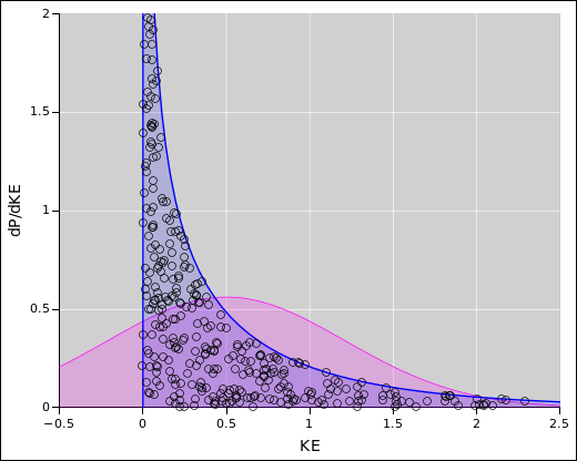
Here’s a situation that comes up fairly often: We have a distribution over velocity and we wish to calculate the corresponding distribution over kinetic energy. In three dimensions, the formula is KE = 0.5 m * Vx*Vx + Vy*Vy + Vz*Vz. That may appear straightforward and innocuous, but it’s more challenging than it appears.
In particular, assume half the particles are moving in theplus;dx direction, while the other half are moving in theminus;dx direction. Specifically, we have a nice symmetrical Gaussian distribution, centered around zero.
The corresponding KE is always positive, so we know it cannot possibly be centered around zero. In particular, you might have hoped that when we apply the transformation formula to the middle of the input distribution, it would map to the middle of the output distribution. However, that does not happen in this case. Not even close.
Tangential remark: The method of «propagation of error bars» (PoEB) gets the wrong answer for this calculation. It alleges that the energy distribution is centered around zero, with zero uncertainty. So in some sense it is infinitely wrong, since the actual uncertainty in energy is infinitely more than PoEB says it is. Also, the true mean, median, and peak are displaced from where PoEB says they are, displaced by an infinite number of PoEB error bars. Also: As always, «sig figs» has all the same problems as PoEB, and more besides.
Let’s apply the Uncertainty Calculator to this task. This is demonstrated in the example.
In two dimensions, the situation is even more peculiar, as demonstrated in the example. The probability density (per unit energy) does not go to zero as the energy goes to zero.
In one dimension, the situation is extremely peculiar, as demonstrated in the example. The probability density goes to infinity as the energy goes to zero. It is what you might call a “weak” infinity, such that the area under the curve is finite.
To understand what’s going on in all these examples, there are two main sources of information: numerical and graphical. Let’s start with the numerical information shown in the top part of the Uncertainty Calculator:
A second method for understanding what’s going on requires looking at the probability plots. For example, the following figure shows the probability density distribution, namely the distribution over energy, for the one-dimensional Maxwell-Boltzmann situation. The blue-shaded area is the data, whereas the magenta-shaded curve is just there for reference, representing a Gaussian with the same mean and standard deviation as the data. You can see that the data does not resemble a Gaussian, not even remotely. The peak (mode) is in one place, the median is in another, and the mean is in yet another. In this plot, about 20% of the data is off-scale.
The magenta-shaded area is a Gaussian with the same mean and standard deviation as the actual data. This demonstrates that knowing the mean and standard deviation doesn’t necessarily tell you what the distribution looks like.
In the example, we see that more than 30% of the MC data falls outside the C3T error bars. The Monte Carlo mean and standard deviation give a better description of the data; only about 12% of the data falls outside the 1σ error bars. All of the outliers are on the high side, whereas none are on the low side.
At zero energy, the cumulative probability distribution has a vertical slope. This corresponds to an infinitely-tall spike in the probability density distribution. The density plot cannot possibly represent this spike accurately. This is one of the reasons why it is often preferable to look at the cumulative distribution. The density may be more familiar, but the cumulative distribution is better behaved.
In any case, you can see at a glance that the Maxwell-Boltzmann energy distribution does not resemble a rectangular distribution or a Gaussian, not even remotely. There is no hope of describing it in terms of A±B or anything like that.
The aforementioned distribution is an example of a discrete probability distribution.
Here is another discrete distribution, namely the example. It illustrates another limitation of the Crank Three Times approach: C3T does strange things if your formula maps the “nominal” point to a region where there is zero probability density. The whole concept of median is badly behaved in such a case. If you look at many samples of die-toss data, each with a large sample-size, each sample has a 50/50 chance of having median=3 or median=4. The mean converges to 3.5, which seems more logical, but for any particular sample the median does not converge and the mode does not converge, no matter how large you make the sample-size.
For two dice, in the example, we can bias the dice so that the nominal value is 3 for one and 4 for the other. This is a kludge, but it gives a nice result for the pair, with the C3T result centered in the right place.
Suppose we want to form the mixture of two distributions. That is to say, we want the ordinate of the probability plot to be a bit of one and a bit of the other. (This is very different from adding the abscissas, as we did in section 4.4. One way of doing it is shown in the example. This example shows a mixture of a continuous distribution with a discrete distribution.
Mixtures of all sorts are quite common in the real world. The example is reminiscent of spectral lines riding on some sort of background or baseline.
It is possible to fool the C3T algorithm if you work hard enough, as demonstrated in the example. It shows that although C3T will “usually” warn you when there is something wrong with the calculation, it is possible to construct exceptions. In this example, the transformation formula is quite nonlinear, but the nonlinear terms are arranged to vanish at the three places where C3T will be looking.
This is another case where the derivative of the transformation function changes significantly in the region of interest. The resulting distribution has a relativel narrow peak plus a long, heavy tail on the low side.
This shows the limitations of C3T, and shows the value of checking C3T against Monte Carlo. There are ways to make C3T better without using MC – perhaps by cranking five times instead of three, or perhaps by explicitly checking the derivatives, or otherwise. However, that is almost never worth the trouble, because MC is easy and very powerful.
Diaspograms can serve as a powerful check on other ways of displaying the data. To show the diaspogram, click on the Diaspo button near the bottom of the page. Ordinarily, this won’t tell you much beyond what the probability density plot is already telling you. However, if there is something wrong with the probability density plot, this is a good way to figure out what’s going on. This is illustrated by example, which you can contrast with the example.
The key to understanding a diaspogram is this: It gives us a way of representing two complimentary ideas:
Let’s call the horizontal axis the r-axis. You can imagine that r stands for result or resistance or whatever. Let P denote total probability. Then the height of the probability density curve is dP/dr. This is consistent with the idea that area under the curve represents a uniform probability per unit area, while dP/dr represents a non-uniform density per unit r. This sheds light on the fundamental nature of the Monte Carlo method: It is sometimes called Monte Carlo integration because it provides a way of measuring areas. In the case of a histogram, it tells us how much area should be assigned to each bin.
On the diaspogram, the r-position of each dot is directly significant; it represents the r-value of that point. In contrast, the height of the dot is almost insignificant; it is chosen at random over the interval from zero up to the height of the alleged probability density distribution curve at that r-value. If the curve is correct, this will result in a uniform random distribution of dots, i.e. uniform probability per unit area. In contrast, if there is something wrong with the curve, this will show up as a non-random density of dots, such as the vertical streaks in the example. This illustrates a problem with the curve, which we can understand as follows: The probability density curve is a histogram, using bins that are much too coarse. The data has structure on a much finer scale, as indicated by the dark vertical streaks. Not coincidentally, areas adjacent to the dark streaks (but within the same histogram bin) show a less-than-normal density. The same data is plotted using a 10x finer histogram in the example. You can see that the data is a mixture of a continuous distribution with a discrete distribution. (Histogramming such data will never be easy.)
Bottom line: If the diaspogram shows dark bands and/or light bands – beyond what would be expected from random fluctuations – it is a sign that the probability density curve is misshapen.
If you want, you can design your own example and send it to somebody. You can do that without writing any javascript. Here’s an example:
The query_string begins with a “?” mark. Items within the query_string are separated by an “&” sign. Arguments within an item are separated by commas. The arguments to setv are:
moniker:alias moniker is internal name; alias is what the user sees nominal value upper bar lower bar shape 0 for rectangular, 1 for Gaussian
You can leave off the “:alias” part, in which case the moniker serves as the alias. Use “tform” as the moniker for the user’s transformation formula; it’s nominal value is the formula. Commas and other punctuation within the formula must be encoded in URL style, as you can see in the example. You may want to use an encoder/decoder.
Other items you can include in the query_string include:
simple Include this as one of the items if you want the simple version of the Uncertainty Calculator to be visible at startup. (You can easily switch version later, if desired.) s Same as “simple”. diaspo=1 Turn on diaspogram dots temporarily. mc_npts=2e6 Set the number of Monte Carlo points. nbins=200 Set the number of histogram bins. go Include this as the last item if you want to carry out the calculation. Otherwise the input fields are filled in but not evaluated. ex=max_boltz_3d Include this as the last item to invoke one of the built-in examples. Read the source to get the exact names of the available examples. Hint: grep example_.*function uncertainty-calculator.js
This is for special purposes. It is not intended to be the primary interface. It is not intended to be user-friendly or even legible. It comes with almost no debugging features (although you might try looking at the javascript console log). If you mistype something, the usual result is that the Uncertainty Calculator ignores the rest of the query_string, with little or no explanation. Use the graphical interface for normal purposes, and for debugging.
| Symbol | Equivalent | Entered as | ||||
| π | pi | Control-Alt-p | ||||
| ∘ | *degree | Control-Alt-0 | (That’s a zero, not letter o or O) | |||
| ÷ | / | Control-Alt-/ | ||||
| · | * | Control-Alt-. | ||||
| × | * | Control-Alt-x | ||||
| ⊕ | Control-Alt-+ | |||||
| ∞ | Infinity | Control-Alt-8 | (Mnemonic: sideways 8) |
On a Mac the Alt key is known as the Option key.
The expression x^y is disallowed. This is a departure from standard javascript, but necessary to avoid confusion. That’s because javascript uses “^” to denote exclusive-or, not exponentiation, contrary to naïve user expectations. Javascript has no infix exponentiation operator.
The formula KE = 0.5 m * v*v is a function that maps velocity to energy. Call it the f function. Velocity is the abscissa when we plot the probability density distribution at the input, and energy is the abscissa when we plot the output distribution. So it’s tricky: energy is the ordinate of the f function, but it’s the abscissa on the output plot. In this section, we are talking about plots where the ordinate is the probability density. Probability is conserved during the transformation. Therefore as we go from input to output, the height of the ordinate must change by a special factor, namely the inverse of the first derivative of f. In higher dimensions, the factor is the inverse of the Jacobian determinant.
This is why we care about nonlinearity. If the first derivative changes significantly from place to place, the output probability density distribution will have a peculiar shape, different from the input distribution. KE as a function of velocity is definitely nonlinear. The first derivative goes from positive to negative. That is to say, it changes by more than 100% over the domain of interest. Any place where the f function goes to zero is guaranteed to make a mess of the output distribution.
In fact, the mapping from velocity to KE is so nonlinear that it is not even invertible. A non-invertible f function is also guaranteed to make a mess of the output distribution.
In all cases, when looking at a probability density distribution, keep in mind that the thing you care about, i.e. the actual probability, is the area under the curve. So the shaded areas in these diagrams convey an important idea.
The Uncertainty Calculator produces probability density plots that are actually histograms. They have to be histograms, rather than direct representations of the data, because if you look closely enough, it is impossible for any collection of data points (Monte Carlo or otherwise) to have a well-behaved probability density. Instead it is a sum of delta-distributions. At any given point, the probability density is either zero or infinity, never anything in between. Adding more points won’t help; the data will never converge to a smooth curve. To make any kind of nice-looking density curve you have to do some binning and/or smoothing ... which requires tricky bias-versus-variance tradeoffs.
By the same token, the cumulative probability distribution at each location is either exactly horizontal or exactly vertical, if you look closely enough. This is demonstrated in the example, which shows what happens if you do Monte Carlo with only a few points. The cumulative probability for a set of points always exhibits this stair-step behavior, if you look closely enough.
Therefore, if you have some newly-visible graphics and/or numerical outputs that you want to calculate, you have to push the Go button, or one of the example buttons.
The inputs on the bottom row (MC npts and nbins) are special, insofar as they have three values: the current value, the saved value, and the canonical value. Simply clicking on the Reset button does a “soft” reset, which sets these inputs to their saved value. Double-clicking on the Reset button does a “hard” reset, which sets these inputs (and their saved values) to the built-in canonical values.
If you enter a new MC_npts or nbins value with a “!” mark at the end, it becomes the new saved value. That means it survives a soft reset, and becomes the standard value used by the examples, until the next hard reset.
Each example button does a soft reset. In contrast, the Go button does not do a reset.
The reason for this three-value scheme is so that the examples can fiddle with these inputs, without affecting the behavior of other examples. Meanwhile, if you know what you are doing, you are free to change the saved value, which does affect the behavior of the examples.
Similarly, the Diaspo button has a rarely-used temporary state that is cleared by a soft reset. This is indicated by a dashed blue border. Again, this is so that examples can fiddle with this setting without affecting the behavior of other examples.