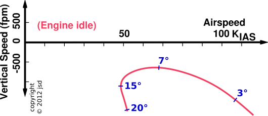
Figure 1: The Power Curve
When plotting something, you don’t necessarily need coordinates. For 2000 of the last 2300 years, Euclidean geometry got along just fine without coordinates. You can combine two vectors geometrically, adding them tip-to-tail, without reference to coordinates.
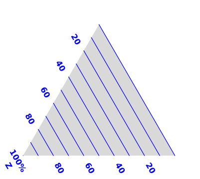
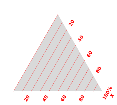
If-and-when you decide to use coordinats, you don’t need axes. The notion of Y “axis” and X “axis” is just too simple. You’re much better off representing the X coordinate in terms of contours of constant X. The X-axis itself is not your friend.
The labeled tick-marks are important, but note that they are oriented crosswise to the axis-line. The orientation of the ticks is far more important than the orientation of the axis-line. The ticks are vestiges of the iso-contours. As long as the contours are labeled, you can do without the axis-line altogether.
As a separate matter, the notion of plotting Y as a function of X is too simple. There are a lot of important situations where we need to plot something that isn’t a function. Furthermore, we don’t always need to plot Y versus X. Instead, you can plot P verus Q, I versus V, or whatever.
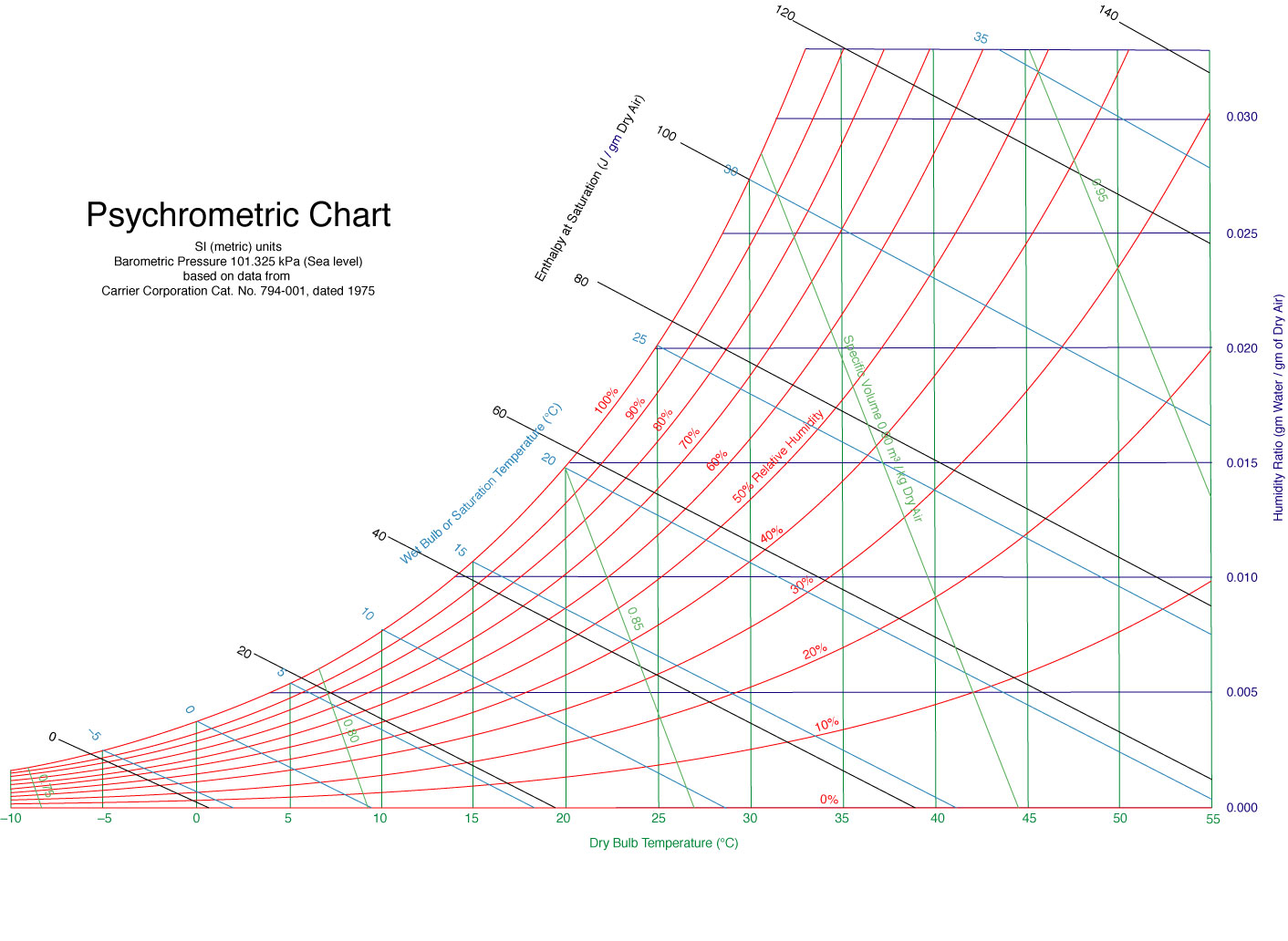
Consider the power curve shown in figure 1. A pilot needs to understand this in order to fly the plane with any reasonable proficiency.
The axes in this power-curve diagram are airspeed and rate of climb. It is interesting to note that the power curve is not a function of either airspeed or rate of climb. If it were a function then (by definition!) there would be only one one ordinate for each abscissa.
We can understand this as follows: Both the airspeed and the rate of climb should be considered functions of the angle of attack. The power curve is parameterized by the angle of attack, as indicated by the blue numbers in figure 1. For details on how this works, and what it means, see reference 1.
True story: Once upon a time, we were living in Tucson, in a house with a swamp cooler (aka evaporative cooler). The principle of such a device is that hot dry outside air is taken in. Water is added. The air is cooled by the latent heat of evaporation, and of course becomes much more humid. The cool air is then distributed inside the house. This technique is usable throughout the desert Southwest, and Tucson is just about the best place for it ... except for a few days per year when the humidity starts to creep up and the swamp coolers don’t work quite so well.
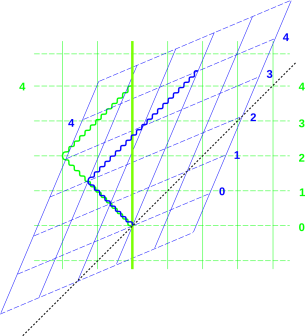
The question arises, how well should a swamp cooler work? The summer when I was 11 going on 12, my father came home with a psychrometric chart, as shown in figure 2. This chart was prepared by Arthur Ogawa; see reference 2.
The chart told him that our cooler was performing as well as physics permitted, so there was no point in wishing for better. If the cooler had underperformed the chart, he would have been motivated to debug the cooler.
I learned one thing from this: The idea of wet bulb temperature. I already knew about temperature and humidity, and I more-or-less understood humidity in terms of dew point. You can get temperature, humidity, and dew point information from lots of official and unofficial sources (radio, TV, newspaper, et cetera) ... but hardly anybody gives out wet-bulb temperature information in a forum where ordinary families can get it ... not even in Tucson in the summer, where oodles of people would be interested in it.
Wet-bulb temperature is basically what you get if you have a thermometer that is soaking wet and you blow on it. You can easily demonstrate that the wet-bulb temperature is always higher than the dew point and lower than the plain old temperature (which in this context can be called the dry-bulb temperature).
Similarly, wet-bulb temperature determines how cool you can be if you are sweating and standing under a fan. Dew point is a wild underestimate; you cannot cool yourself off to the dew point just with water and a fan. At the other extreme, plain old temperature (dry-bulb temperature) is a wild overestimate; you can live comfortably and even exercise in hot and dry conditions, so long as you drink enough.
If you are not set up to measure the wet-bulb temperature, or if for any reason you want to predict the wet-bulb temperature under this-or-that conditions, you can predict it using the psychrometric chart. The contours of constant temperature are vertical lines. Find the one that corresponds to the temperature of interest. Meanwhile, the contours of constant relative humidity sweep from west-southwest to northeast on the chart; find the contour that corresponds to the humidity of interest. Find the intersection of these two contours. That point represents the conditions of interest. Let’s suppose this point represents the ambient atmosphere, at the input to the swamp cooler. The contours of constant wet-bulb temperature run from southeast to northwest in the figure. Find the contour that crosses the point of interest, interpolating if necessary. Evaporative cooling involves moving along a contour of constant wet-bulb temperature. So if you follow this contour up to the northwest until you reach the edge of the diagram, i.e. the 100% relative humidity contour, you have found the (ideal) condition for the output of the swamp cooler.
Equation 1 shows a numerical example:
| (1) |
Take-home messages:
In introductory physics class, when plotting x versus t, it is traditional to plot x vertically and t horizontally. However, in the field of special relativity, it is conventional to plot things the other way: t (mostly) vertically and x (mostly) horizontally. It doesn’t really matter. The plot conveys the same information either way.
An example is shown in figure 3. The first thing to notice is that the grids are more useful than the axes. The grids are easy to read (with or without the axes), whereas the axes would be almost impossible to read correctly without the grids.
In any reference frame that is moving relative to the lab frame, the moving frame’s axes will be not be horizontal or vertical. This is to be expected, in analogy to an ordinary rotation of the axes. What’s more peculiar is that the moving frame’s axes will not appear to be perpendicular to each other when represented on paper (even though they are perpendicular in 4-dimensional space).
In the blue reference frame, the contours of constant time (tb) are not perpendicular to the contours of constant x-position (xb). A diagram with only a “blue time” axis with tick-marks (without the full contours of constant xb) would be more-or-less guaranteed to be misunderstood.
For an explanation of what this figure means, see reference 3. For more about special relativity overall, see reference 4 and the first part of reference 5. Sheets of blank graph paper for spacetime diagrams are available; see reference 6.
A plot of pressure versus volume conveys exactly the same information as a plot of volume versus pressure. Using a standard indicator diagram, given the volume you should be able to find the pressure, and given the pressure you should be able to find the volume ... without needing to re-plot the data.
For more on this, see reference 7.
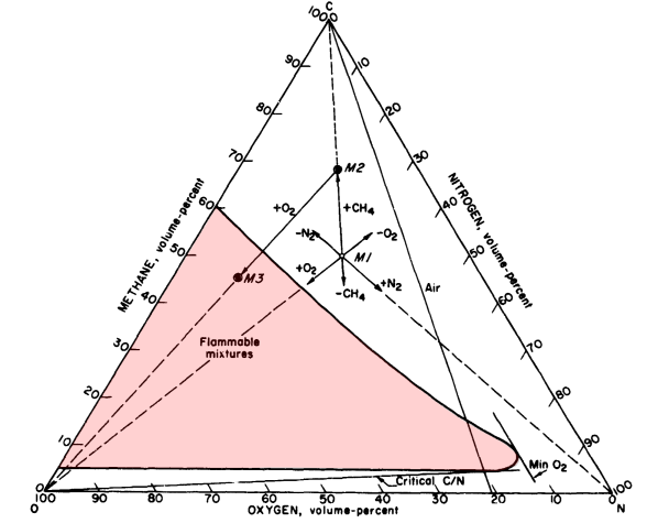
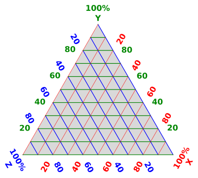
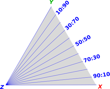
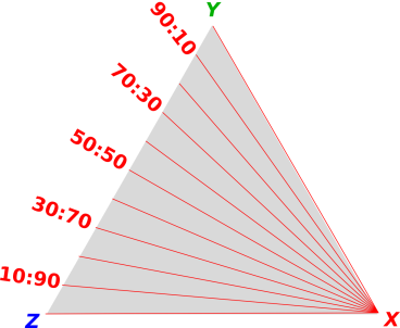
Figure 4 presents a tremendous amount of information. It comes from reference 8, with minor enhancements. Note that there are three coordinates, subject to a constraint. (In this case the three percentages are constrained to add up to 100%.) This sort of thing is called a ternary plot.
It takes some skill and some effort to read a ternary plot. Let’s start by figuring out the corners and the edges, and figuring out the contours of constant X, constant Y, and constant Z. (The notion of polar coordinates on a ternary plot is discussed in section 2.5.2.)
When setting up the labels for each coordinate:
On a typical real-world ternary plot, one of the edges will be “Percentage X” or something like that, as we see in figure 4. However, you should not think of that as the X-axis. Alas, that edge does not have any particularly meaningful association with X. Instead, follow that edge in the direction of increasing numbers until you get to the 100% X corner. That corner has a very meaningful association with X. If the corner is not already labeled, label it yourself.
To plot or read a point on a ternary plot, it helps to use a ruler. A transparent ruler is best, but an opaque ruler will do. To plot or read an X-coordinate, hold the ruler parallel to the 0% X side. Move the ruler parallel to itself so that it represents a contour of constant X. Look along the ruler until you find the appropriately labeled tick.
To plot a point on a ternary graph, choose any two of the three coordinates. Follow along the approriate iso-contour for the first variable until it intersects the appropriate iso-contour for the other variable. That’s where you plot your point.
Having plotted your point using two coordinates, check the work by reading the point to get the third coordinate. Check this numerically, to see that it satisfies the constraint.
Note that in section 2.3 and section 3 we recommend plotting the grid of iso-contours. In the case of ternary plots, the recommendation is not so clear cut. If you plot all of the iso-contours, the plot gets awfully cluttered.
The spreadsheet used to create these diagrams is cited in reference 9.
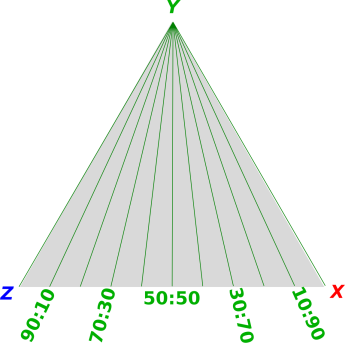
We can also investigate the ternary equivalent of polar coordinates, i.e. straight lines through the origin. That’s tricky, because a ternary plot has three origins.
As a specific example, suppose we start with 100% X and then add a mixture of Y and Z, maintaining a constant ratio of Y to Z, gradually reducing X to uphold the constraint. This is shown in figure 11. Another example is the line labeled “air” in figure 4. It represents the process of adding air to methane (or methane to air). This naturally means that the ratio of oxygen to nitrogen remains constant.
Some of you may be wondering why figure 9 is labeled in terms of Z/X rather than X/Z. Why is it not in alphabetical order? How are we supposed to remember which ones are in which order?
The answer is to start with XYZ and consider all the cyclic permutations, namely XYZ → YZX → ZXY. Then take the first two symbols from each triple. So you see, we are keeping things in order, if you look at the triples rather than the pairs.
Very commonly you find that the physical significance attaches to the triples, not the pairs, so doing things this way gives a simpler and better result. In particular, in the figures in this section, note that the numerators systematically increase clockwise, while the denominators increase systematically counterclockwise. That wouldn’t be true if we didn’t use Z/X in figure 9.
A topographical map can be considered a plot of height (z) as a function of longitude (x) and latitude (y). However, no z axis is shown. Instead, we see the contours of constant z.
Note: When introducing this concept, choose the map carefully, since the contours on some maps are not very clearly drawn.
The common thread in all of the examples we’ve seen is that the iso-contours tell you what’s going on. The contours make sense with or without the axes ... whereas the axes don’t make sense without the contours. Sometimes, such as in a simple XY plot, it’s obvious where the iso-contours must be, but even then, things are more clear when the contours are drawn in. More generally, if the contours are doing anything nontrivial, you really really need to pay attention to the contours.
My not-so-fond memory of the the psychrometric chart mentioned in section 2.2 is that when I was 11, I could not figure out how to use it for myself. My father understood it, but I did not.
With the benefit of a few decades of hindsight, I can identify a big part of the problem: Axes.
When I was 11, I could understand charts in terms of the X-axis and the Y-axis and not otherwise. That’s a problem, because the psychrometric chart doesn’t have a relative humidity axis or a wet-bulb temperature axis. (It does have a dry-bulb temperature axis and an absolute humidity axis, but that doesn’t solve the problem. There are four or five sets of contours, and only two axes.)
Axes are bogus. When working with the X-variable, you always need the contours of constant X ... but you never really need an X-axis. The contours of constant X are hinted at by the tick marks on the X axis, so when you erase the X-axis be sure to keep the tick marks. The axis itself is red herring, i.e. an unhelpful distraction. The idea that there is any such thing as an “X direction” is sometimes true, but sometimes untrue, and never necessary.
This is a never-ending source of confusion. In common parlance we speak of the X axis and the X direction all the time ... even though that is not the smart way to think about things. In particular, in thermodynamic state-space, there is no such thing as “the” direction of increasing pressure.
The psychrometric chart has contours of constant relative humidity, but it does not have (and cannot have) an axis representing "the" direction of increasing relative humidity.
When you teach kids how to plot stuff on a chart, emphasize the contours of constant X and the contours of constant Y. Use graph paper. Do not abstract away the grid too soon. This approach is simultaneously simpler and more sophisticated. It is simultaneously easier, more powerful, and more physical than fussing with axes.
It may help to introduce rhombic graph paper sooner rather than later, perhaps in the context of spacetime diagrams. This serves to emphasize that what matters are the contours of constant X. The contours need not be perpendicular to the "X axis" if any, and the axes (if any) need not be perpendicular to each other.
Also note: The so-called “Y axis” is conventionally drawn as a contour of constant X=0. Therefore, when teaching people to use contours (instead of axes), it is often helpful to use examples where the X-values do not include X=0. Instead you can use something like X ∈ {105, 106, 107, ⋯}. This reduces the temptation for students to think of the X=0 contour as an axis.