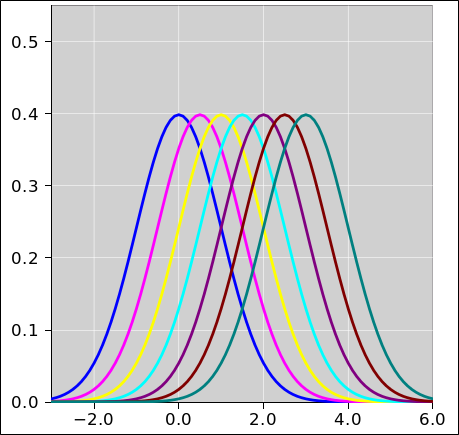
Figure 1: Probability Density Distributions
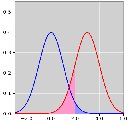
Figure 1 shows seven gaussians. Each is shifted relative to the previous one by half a standard deviation. More specifically, the standard deviation is 1.0, and the centers range from 0 to 3 inclusive, in steps of 0.5.
Figure 2 shows only two of the curves.
Let’s choose a threshold of θ = 2.0, and choose a decision rule that says everything below the threshold is classified as blue, while everything above the threshold is classified as red. The red-shaded area in figure 2 represents the probability of a Type-I error, while the blue-shaded area represents the probability of a Type-II error.
Setting the threshold to θ = 2.0 might or might not be the wise choice. It all depends on the cost model you are using, as discussed in section 2.
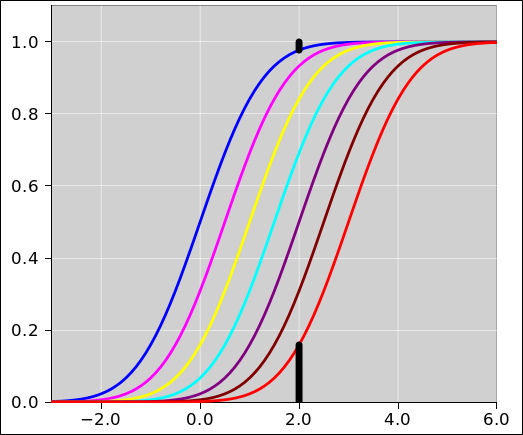
Figure 3 shows the same data as in figure 1. This time we display the cumulative probability distributions (rather than the probability density distributions). The black bar below the red curve represents the probability of a Type-I error. The black bar above the blue curve represents the probability of a Type-II error.
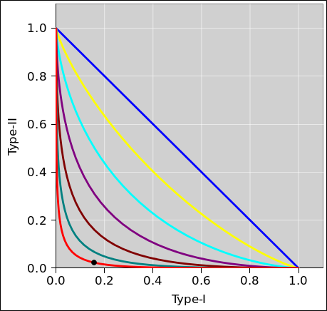
Let us now consider what happens when we change the decision threshold. A powerful way of seeing what happens is the Receiver Operating Characteristic (ROC) as shown in figure 4. See also reference 1. As we vary the decision threshold, we plot the Type-I error rate versus the Type-II error rate. As in all these figures, the red curve corresponds to the case where we have two Gaussians separated by 3 standard deviations. We denote the separation by ΔX, so for the red/blue pair the separation is ΔX = 3.0 (in units where the standard deviation is σ = 1.0). The black dot corresponds to the case where the threshold is θ = 2.0.
The straight diagonal blue line in figure 4 corresponds to a decision based on no information. This is a worst-case scenario. The concept of “worst” will be made more precise in section 2.
As you can see from any of these figures, when two Gaussians are separated by only 3σ, you are going to have a rather substantial error rate, no matter where you set the threshold. If the costs are equal for Type-I and Type-II errors, the optimal threshold is 1.5, in which case the total error rate is 13.4%, made up of 6.7% Type-I errors plus 6.7% Type-II errors.
The spreadsheet used to compute the figures in this section is cited in reference 2. For further information, see reference 3 and (especially!) references therein.
Note that the idea of Receiver Operating Characteristic becomes particularly powerful when applied to distributions that are not simple Gaussians.
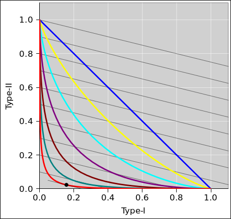
The next step is to draw contours of constant cost to the diagram. In figure 5, the black lines show contours of constant cost, for a scenario where the cost of a Type-II error is 4 times larger than the cost of a Type-I error.
Different black lines correspond to different values for the cost. Cost increases as we go from lower-left to upper-right.
For any particular ROC curve, there will be a point of lowest cost.
The minimum cost associated with the blue curve (separation = 0) is very much higher than the minimum cost associated with the red curve (separation = 3σ).
It is super-important to use a proper cost model when choosing the threshold. Note the contrast:
| A system that checks once per second and has three-sigma reliability will produce a false alarm once every twelve minutes on average. Some people would be annoyed if the fire alarm or the poison-gas alarm went off every twelve minutes. | If your detector is upstream of an advanced digital error-correcting decoder, you don’t need anything like a 3-to-1 signal-to-noise ratio. As a familiar example, GPS signals are in some sense 26 dB below the ambient noise. That’s a 1-to-400 signal-to-noise ratio. |
There are a few good reasons and innumerable bad reasons for leaving out a subset of the data.
As discussed below, it is imperative to construct a model of the data that corrects for such biases. This commonly requires supplementing the survival data with additional types of data.
Note that this results in missing data, where both the abscissa and ordinate are missing. This stands in contrast to the previous item, where the abscissa was known but the ordinate was not.
In this case, it may well be necessary to obtain supplementary data by sampling a subset of the small-scale emitters.
Let’s look at some model data. The model says have a pollution source located at r=0. The pollution spreads out radially. The concentration falls of like 1/r. We take some measurements of the concentration, as a function of r. The measurements are subject to some Gaussian additive noise, with a standard deviation of σ=1.1.
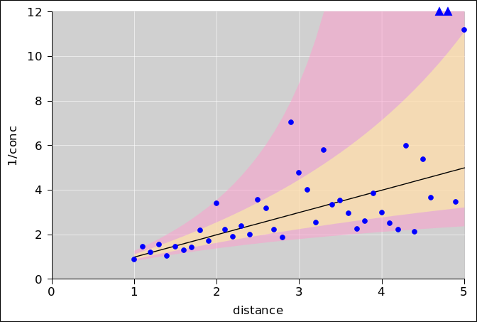
Figure 6 shows a sample of data generated by this model. The ordinate is inverse concentration. In the absence of noise, all the data would fall on the black line. However, the noise causes the data to be scattered above and below the black line. The two data points represented by triangles near the upper-right corner would have fallen off scale, but we coerced them back onto the scale. The plot does not indicate the true ordinate for these points, only a lower bound. (This is a lower bound for the inverse concentration, corresponding to an upper bound for the concentration itself.)
In the figure, the yellow-shaded band corresponds to concentrations that are within ±1σ of the black line. The pink-shaded band corresponds to concentrations that are within ±2σ of the black line. Note that it is very helpful to think in terms of error bands associated with the model (rather than error bars associated with the points). The reasons for this are discussed in reference 4. The spreadsheet used to prepare these figures is cited in reference 5.
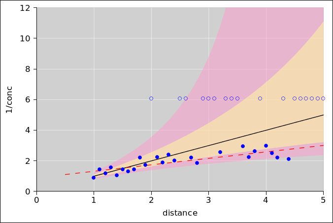
We now discuss the practice of applying a Limit of Detection (LoD). This is a form of censoring the data. This is almost never a good practice. The usual definition of LoD is at least 50 years behind the state of the art. Alas it is still fairly used in certain fields.
The solid disks in figure 7 represent the inverse concentration, for points where the concentration is above the LoD. We have set the LoD equal to three times the standard deviation.
Let’s consider various schemes for dealing with this data:
Consider the point at r=2. As we go from figure 6 to figure 7, the clipping changes a real point with a rather prosaic error (less than 2σ) into a fake point with a humongous error (more than 3σ). Recall that the probability density at a point 2σ out from the mean is more than 12 times greater than it is 3σ out.
Constructive suggestion: The best way to think about all data analysis tasks is in terms of modeling. That is, we want to build a model that explains the data. Presumably the model contains some parameters, and we need to obtain a Maximum A Posteriori estimate for the parameter values.
As applied to the data in figure 6, the model produces the black line and the error bands. The model needs to account for all of the data, including the off-scale data. It is foreseeable that some of the raw data (as it comes off the measuring instrument) could be negative, due to noise. A negative concentration is physically impossible, but that’s irrelevant, because the model is modeling both the true concentration and the noise. Just because such points cannot be plotted in figure 6 doesn’t mean that the model cannot account for them.
Not all analysis is graphical analysis. In high school you learned to plot the data and then analyze the plot, but state-of-the-art analysis doesn’t work that way. Let’s be clear about the contrast: It was reasonable to clip the data for presentation in figure 6. It is not however reasonable to clip or censor the data that goes into the curve-fitting routine.
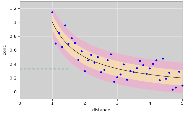
For the purposes of curve fitting, the representation shown in figure 8. We plot the concentration, rather than the reciprocal thereof. This means the data does not fall on a straight line, but for the purpose of curve fitting, there is no reason why it needs to. The curve-fitting routines can fit to non-straight functions just fine.
Note that the format that is the best for viewing the data is often not the best for fitting the data. By fitting the raw data directly, we don’t need to worry about taking the reciprocal of quantities that are near zero, at zero, or below zero. We don’t need to worry about error bands straddline a singularity.
The postion of the alleged 3σ Limit of Detection is shown by the dashed green line – but we don’t care. The data below this level is not particularly less value than the data above.
Also note: Maximum likelihood methods are almost always the wrong thing for data analysis. This includes least-squares curve fitting, which is a maximum likelihood method. You almost certainly want to be using Maximum A Posteriori methods, for reasons discussed in reference 4.
An amusing overview of the approaches used in environmental science and occupational hygiene can be found in reference 6. The author rightly complains about a number of bad practices. Unfortunately, he uncritically accepts a published assertion that «just give me the numbers» did not work well. In response I say that any tool can be abused ... but just because it can be abused doesn’t mean you are obliged to abuse it. By the same token, an unsophisticated user might not know what to do with noise-ridden data ... but not all users are that unsophisticated. A proper model takes into account the fact that the data is noisy. For example, the error bands in figure 6 are quite large in places. Indeed, at r=5, the 2σ error band extends all the way to 1/conc=∞. Trying to “protect” the user by censoring noisy data is a tremendous disservice to the sophisticated user.
Let’s be clear: It is highly unprofessional to censor data just because it is “noisy” or “ugly”. Elementary information-theory considerations demonstrate that it is never a good idea to throw away available information. My motto is, “just give me the data”. Even if the data seems to be physically impossible (such as a negative concentration), give it to me anyway. I am sophisticated enough to understand the difference between the indicated value and the true value, as defined in reference 7. I attach physical significance to the true value only, so the question of unphysical indicated values does not arise.
In many cases, points at or near the noise floor are needed by the fitting routine, in order to establish the baseline.
In the case where data is missing for a good reason, it is imperative that the model account for this. We can understand this based on the following scenario: Suppose that everybody who gets disease X will die in six years. During the first year, the disease is difficult to detect, but after that it is easy to detect. Now suppose an advanced technique makes it possible to detect the disease in the first year, and we respond by applying some expensive treatment Y. If we measure “success” based on the conventional five-year survival rate, one could easily come to the conclusion that “early detection saves lives” – even though the conclusion is completely wrong, because treatment Y is completely ineffective! The main thing we accomplished by early detection is to start the clock earlier, pushing the inevitable outcome over the five-year horizon.
Defending against horizon effects is challenging but quite doable. In this example, it could be accomplished by measuring the progress of the disease during the five-year window, rather than by mindlessly scoring the five-year survival rate only. In all cases you must check that your model is robust against biases due to missing and/or censored data.