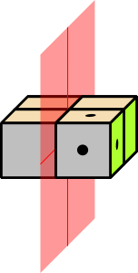
Figure 1: Eight Possibilities; Rule Out Half of Them
Data Analysis |
| This document is a stub. There is much more that could be said about this. |
In order to illustrate some fundamental ideas that are a prerequisite for any understanding of data analysis, let’s analyze the well-known parlor game called “Twenty Questions”.
The rules are simple: One player (the oracle) picks a word, any word in the dictionary, and the other player (the analyst) tries to figure out what word it is. The analyst is allowed to ask 20 yes/no questions.
When children play the game, the analyst usually uses the information from previous questions to design the next question. Even so, the analyst often loses the game.
In contrast, an expert analyst never loses. What’s more, the analyst can write down all 20 questions in advance, which means none of the questions can be designed based on the answers to previous questions. This means we have a parallel algorithm, in the sense that the oracle can answer the questions in any order.
I’ll even tell you a set of questions sufficient to achieve this goal:
- 1) Is the word in the first half of the dictionary?
- 2) Is the word in the first or third quarter?
- 3) Is it in an odd-numbered eighth?
- *) et cetera.
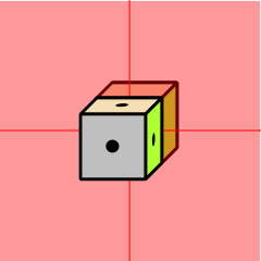
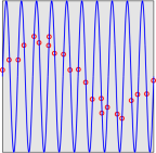
Each question cuts in half the number of possible words. This can be visualized with the help of figure 1 through figure 4. The cube with the dots represents the right answer. Each yes-no question, if it is properly designed, rules out half of the possibilities. So the effectiveness grows exponentially. A set of N questions can reduce the search-space by a factor of 2N.
There are only about 217 words in the largest English dictionaries. So if you use the questions suggested above, after about 17 questions, you know where the word sits on a particular page of the dictionary.
The logic here is the same as in figure 1 through figure 4, except that it doesn’t take place in 3 dimensions, but rather in an abstract 17-dimensional space. Each question reduces the size of the remaining search-space by a factor of 2.
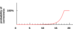
Note that if you ask only 15 questions about a dictionary with 217 entries, you will be able to narrow the search down to a smallish area on the page, but you won’t know which of the words in that area is the right one. You will have to guess, and your guess will be wrong most of the time. The situation is shown in figure 5.
You can see that it is important to choose the questions wisely. By way of counterexample, suppose you use non-incisive questions such as
Then each question rules out only one word. This is a linear search, not an exponential search. It would require, on average, hundreds of millions of questions to find the right word. This is not a winning strategy.
We can formalize and quantify the notion of information. It is complementary to the notion of entropy.
Entropy is a measure of how much we don’t know about the system.
If we are playing 20 questions against an adversary who doesn’t want to help us, we should assume that each word in the dictionary is equally likely to be chosen. This is a minimax assumption. In this case, the entropy is easy to calculate: It is just the logarithm of the number of words. If we choose base-2 logarithms, then the entropy will be denominated in bits. So the entropy of a large English dictionary is about 17 bits.
As we play the game, the answer to each yes/no question gives us one bit of information. We use this to shrink the size of the search space by a factor of 2. That is, the entropy of the part of the dictionary that remains relevant to us goes down by one bit.
In case you were wondering, yes, the entropy that is appears in information theory is exactly the same as the entropy that appears in thermodynamics. Conceptually the same and quantitatively the same. A large physical system usually contains a huge amount of entropy, more than you are likely to find in information-processing applications, but this is only a difference in degree, not a difference in kind ... and there are small physical systems where every last bit of entropy is significant.
Consider a modified version of the game: Rather than using an ordinary real dictionary, we use a kooky dictionary, augmented with billion nonsense words.
The base-2 logarithm of a billion is about 30 bits. In this version the 20 questions game is not winnable. After asking 20 questions, there would still be approximately 210 words remaining in the search space. We would have to guess randomly, and we would guess wrong 99.9% of the time.
This can be seen as an exercise in hypothesis testing, of the sort discussed in reference 1. We have hundreds of millions of hypotheses, and the point is that we cannot consider them one by one. We need a testing strategy that can rule out huge groups of hypotheses at one blow. Another example (on a smaller scale) can be found in reference 2. Additional examples can be found in reference 3 and reference 4.
This has ramifications for data analysis, as discussed in reference 5. It also has ramifications for machine learning, as well as for philosophy, psychology, and pedagogy, as discussed in reference 3; that is, how many examples do you need to see before it is possible to form a generalization? It also has ramifications for the legal system; that is, how much circumstantial evidence constitutes a proof?
One thing we learn is that in some situations a smallish amount of information does you no good at all (you almost always guess the wrong answer), whereas a larger amount can be tremendously powerful (you can find the right answer with confidence). It depends on the amount of data you have, compared to the size of the space you are searching through. If the search space is truly infinite, no amount of data will narrow it down. You need to use some sort of prior knowledge to limit the search space before any sort of induction or learning-from-examples has any hope of working.
This also has ramifications for human learning and thinking. For example, young children are observed to learn language by listening to examples. We know this is so, because in a Chinese-speaking household they learn Chinese, and in a French-speaking household they learn French. The number of examples is large but not infinite. So the question arises, what is there about the structure of the brain that limits the search-space, so as to make learning-from-examples possible? The work of Kohonen sheds some light on this.
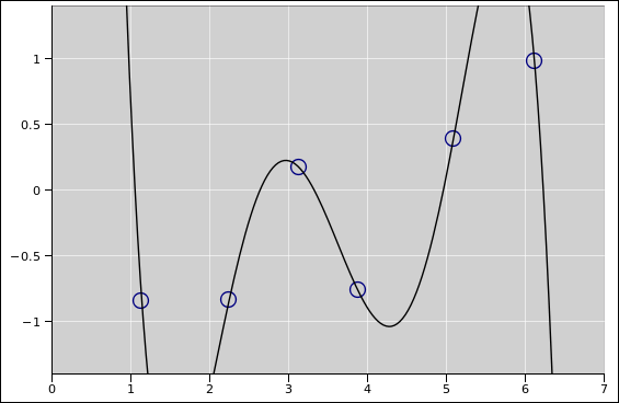
Here’s a parable. Once upon a time, a students were doing a Science Fair project. They decided to measure the effect that a certain chemical had on the growth of plants. They tried six different concentrations. They hypothesized that the effect would be well described by a polynomial. And sure enough, it was. Figure 6 shows the six data points, with a least-squares fit to a fifth-order polynomial:
As is the case with least-squares fitting in general, this is a maximum likelihood analysis. That is to say, it calculates the a priori conditional probability of getting this data, given the model, i.e.
| likelihood = P(data | model) (1) |
and we choose the model to maximize the likelihood. Note that we are using the word likelihood it a strict technical sense here.
We emphasize that likelihood, in the technical sense, is defined by equation 1. The likelihood is also called the a priori probability ... which stands in contrast to the a posteriori probability, as given by equation 2:
| apost = P(model | data) (2) |
which is emphatically not the likelihood.
This is important because in the context of data analysis, MAP is what we want, where MAP stands for maximum a posteriori as defined by equation 2. It is a scandal that almost everybody uses maximum likelihood instead of MAP. Maximum likelihood is easier, so this can be considered a case of “looking under the lamp-post” even though the thing you are looking for is surely somewhere else.
Returning to our students’ research, we can say that the polynomial fit is in fact a maximum likelihood solution, and we can also say that their data is entirely consistent with their model and consistent with their hypothesis.
On the other hand, common sense tells us that whatever this is, it isn’t what we want. Maximum likelihood isn’t sufficient (or necessary). Being consistent with the model isn’t sufficient. Being consistent with the hypothesis isn’t sufficient.
Science is about making predictions, and the students’ polynomial is a spectacularly bad predictor. Indeed
| y = 0 (3) |
is a better predictor of future data than
| y = polynomial(x) (4) |
would be, for the fitted polynomial or any similar polynomial.
You may say that this parable is unrealistic, because nobody would be so silly as to fit six data points with a fifth order polynomial. There is a rule against it.
More generally, there is a rule against overfitting.
Well, yes, such rules exist. But rather than learning those rules by rote, we would be much better off understanding the principles behind the rules.
To a first approximation, the principled analysis starts from the observation that there is almost never a single hypothesis but rather a family of hypotheses.
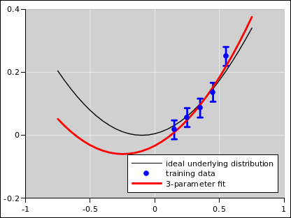
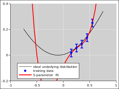
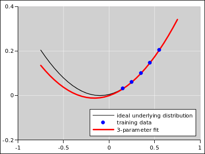
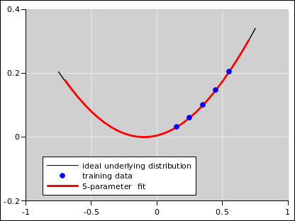
Consider the following scenario. The underlying physics is well represented by some transcendental function. In the language of probability, that is the underlying distribution. This is shown in black in figure 9 and the other figures in this section. Ideally we would know that distribution, but in reality we don’t. The best we can hope for is to observe some samples drawn from that distribution. Such samples are shown as blue dots in the figures.
|
| |
| Figure 7: Bias and Variance, 3 Parameters, No Noise | Figure 8: Bias and Variance, 5 Parameters, No Noise | |
Increasing the number of parameters decreases the bias. In the absence of noise, this is a good thing, as you can see as we go from figure 7 to figure 8. The five-parameter fit is so good that the fitted function is virtually indistinguishable from the underlying distribution, at the level of detail shown in these figures.
However, in the presence of noise, we get a dramatically different result, as shown in figure 9 to figure 10. In this case, increasing the number of parameters makes things worse. It decreases the bias but increases the variance.
The term “overfitting” is applied to the case there there is too little bias and too much variance.
To summarize: There is no magic number of parameters. The optimal number of parameters depends on the number of available training data points, and on the amount of noise. It also depends on the complexity of the underlying ideal distribution.
As we shall see, there is no such thing as data analysis based purely on statistics. You have to start with some understanding of the situation, and then add statistics. (The reasons for this are discussed in more detail in section 5.)
Suppose we are considering using a model that is a polynomial, perhaps
| (5) |
Note that the right answer has to model the observed data including the noise and systematic errors ... not just the underlying noiseless distribution.
So the real question is not just how many contributions to include, but which contributions to include.
This parallels the discussion in one section of reference 3.
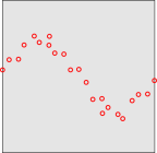
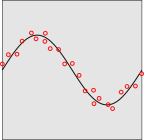
Suppose you were asked to fit a sine wave to a set of measured points as shown in figure 11. The obvious solution to this problem is shown in figure 12.
That looks like a good fit. The amplitude, frequency, and phase of the fitted function are determined to high precision, according to the standard formulas.
Even so, some crucial questions remain: How sure are you that this is the right answer? How well does this fitted function predict the position of the next measured point? These are tricky questions, because an unrestricted search for the sine wave that best fits the points is almost certainly not the best way to predict the next point. Figure 13 is the key to understanding why this is so.
It turns out that for almost any set of points, you can always find some sine wave that goes through the points, as closely as you please, if you make the frequency high enough. However, this can be considered an extreme example of overfitting and the over-fitted sine wave will be useless for predicting the next point. Another term that gets used in this connection is bias-variance tradeoff. These facts can be quantified and formalized using the Vapnik-Chernovenkis dimensionality and related ideas. A sine wave has an infinite VC dimensionality.
The sine wave stands in contrast to a polynomial with N adjustable coefficients, for which the VC dimensionality is at most N. That means if you fit the polynomial to a large number of points, large compared to N, the coefficients will be well determined and the polynomial will be a good predictor.
There are some deep ideas here, ideas of proof, disproof, predictive power, et cetera. For more on this, see the machine-learning literature, especially PAC learning. Reference 6 is a good place to start.
This sine-wave example calls attention to the fact that the family of fitting functions we are using (sine waves with adjustable amplitude, frequency, and phase) has an infinite VC dimensionality, even though there are only three adjustable parameters. We see that three data points – or even a couple dozen data points – are nowhere near sufficient to pin down these three parameters. This tells us that VC dimensionality is the important concept; in contrast, “number of parameters” is only an approximate concept, sometimes convenient but not always valid.
Another example of what can go wrong is shown in figure 14. The black curve represents the raw data. We have lots and lots of data points, with very high precision. We know a priori that the area under the black curve is the sum of two rectangles – a red rectangle and a blue rectangle. All we need to do is a simple fit, to determine the height, width, and center of the two rectangles. As you can see from the figure, there are two equally good solutions. There are two equally perfect fits. Alas, this leaves us with very considerable uncertainty about the area, width, and center of the blue rectangle.
Some problems in this category can be solved by introducing some sort of regularizer, as discussed in reference 7.
Additional examples to show how easy it is for people to fool themselves into “knowing” that they have “the” answer (when in fact they have not considered all the possibilities) can be found in reference 8.
There is always a question of how much to preprocess the data before modeling it.
In particular, given data that is intrinsically nonlinear, there is often a question as to whether one should
A linear representation has one huge advantage: When looking at a graph, the human eye is good at seeing linear relationships, and in detecting deviations from linearity.
However, there are serious disadvantages to preprocessing the data. The disadvantages usually outweigh any advantage. The devil is in the details. There are no easy answers, except in rare special cases.
Here’s a typical example: Suppose you are using a pressure gauge to monitor the amount of gas in a container. Assume constant temperature and constant volume. The gas is being consumed by some reaction. Suppose we have first-order reaction kinetics, so the data will follow the exponential decay law, familiar from radioactive decay.
All pressure gauges are imperfect. There will be some noise in the pressure reading. So the raw data (P) will be of the form:
| P = exp(−t) ± noise (6) |
During the part of the experiment where the reading is large compared to the noise, there is an advantage to plotting the data on semi-log axes, which results in a straight line that is easy to interpret.
However, during the part of the experiment where the readings have decayed to the point where the noise dominates, linearizing the data is a disaster. You will find yourself taking the logarithm of negative numbers.
In the borderline region, where the readings are only slightly larger than the noise, you’ve still got problems. The data will be distorted. The attempt to describe it by a straight line will be deceptive. The effect may be subtle or not so subtle. Figure 15 shows an example:
The data looks like the proverbial hockey stick. It is straight at first, then it bends over.
Alas, appearances can be deceiving. This data actually comes from a simple exponential decay, plus noise. You might think it “should” be linear on semi-log axes. In figure 16, the red line shows what the data would look like in the absence of noise.
Because of the nonlinearity of the logarithm, points that fall above the line are only slightly above the line, while points that fall below the line are often far (possibly infinitely far) below the line.
In both of these figures, the red triangles near the bottom are stand-ins for points that are off-scale. In some sense they are infinitely off-scale, since they correspond to the logarithm of something less than or equal to zero.
In general, it pays to be careful about off-scale data. The proverb about “out of sight, out of mind” is a warning. Plotting stand-ins, as done here, is one option. It doesn’t entirely solve the problem, but it at least serves to remind you that the problem exists.
For more about the fundamental notions of uncertainty that underlie any notion of error bars, see reference 9.
Constructive suggestion: In this situation, I recommend
Bottom line: There are no easy answers. Relying on the human eye to analyze data is a losing proposition.
| This document is a stub. There is much more that could be said about this. |